Create a Logo for Your Brand in 5 Steps

You Are Your Own Logo Maker: A Fun Guide to Personal Logo Branding
Are you on the hunt for a logo but don’t have the time to wait for a designer? Or maybe you’ve got that spark of creativity but custom logo design just isn’t in the budget? Don’t worry, you’re in the right place! I’m about to show you how to create your own logo that’ll make you look like a pro, without needing to break the bank or wait weeks.
Let’s face it: your logo isn’t just a pretty picture; it’s your calling card, your identity, the visual representation of your business. It’s the first thing people see, and trust me—it makes a big impact! Whether it’s on your website, social media, or business cards, your logo will pop up everywhere. So, it’s definitely worth taking a little time to get it right. Don’t worry; I’ll make sure it’s fun, simple, and something you can do with confidence.
Personal Logo Branding Made Easy
At Macarons and Mimosas, we love creating unique logos for our clients. We believe a good logo sets the tone for everything, and that’s why we take it seriously! But hey, we get it—not everyone has the budget for a custom design just yet. So, why not become your own logo maker? Let’s dive into the world of DIY logo design, with a few simple tips to create something that reflects your brand perfectly.
What Not to Do: Keep it Simple (and Stylish!)
Before we start getting into the fun stuff, let’s talk about a few things you don’t want to do with your logo. Follow these simple rules, and you’ll avoid some common logo pitfalls:
- Don’t mix more than 3 fonts. You want your logo to feel cohesive, not chaotic.
- Keep it readable. Choose fonts that are legible—no one wants to squint to figure out your business name.
- Don’t copy others. Be original! Stand out, don’t blend in with someone else’s design.
- Don’t stretch fonts. It’s tempting to try and fit everything into a tiny space, but stretched fonts can look weird and unprofessional.
- No crazy patterns. Keep backgrounds simple so your logo text is the star of the show.
- Stick to readable colors. Make sure your colors are contrasting enough that your logo stands out. No one should have to strain their eyes to read it.
- One script font max. Mixing two script fonts can be a disaster. Keep it classy with just one.
Alright, now that we know what to avoid, let’s move on to the fun part!
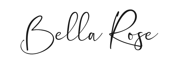
1. Choose Your Primary Font
This is where you get to shine! Your primary font is the one that’ll carry your brand’s personality, so pick something with character that matches your vibe. Whether it’s bold, playful, or elegant, choose a font that really reflects who you are. Have fun with this step! You can go with a script font, a quirky sans serif, or something a little more traditional. Just remember—readability is key! You want your logo to be eye-catching, not eye-straining.
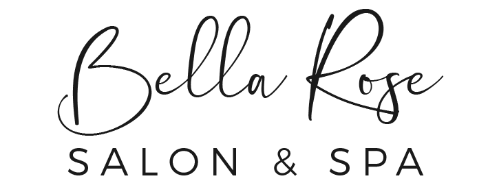
2. Pick a Secondary Font That Complements
Next up, you’ll need a secondary font to balance out the primary one. You want this font to be clean, simple, and not compete with your main font. Go for something like Montserrat, Raleway, or Baskerville—fonts that won’t steal the show but will still support your main design. Your secondary font should be the supporting actor to your primary font’s lead role, helping the logo feel professional without overpowering it.
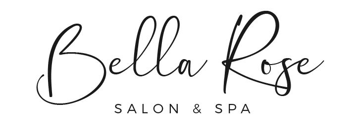
3. Play with Alignment and Size
This is where the magic happens! Now that you’ve got your fonts, it’s time to play around with their sizes and placement. Shrink down your secondary font to add contrast, and make your primary font pop! You can try using all caps, small caps, or even some cool italicized lowercase letters for a unique twist. The goal here is to make sure your brand name stands out above all else!
4. Add a Pop of Color
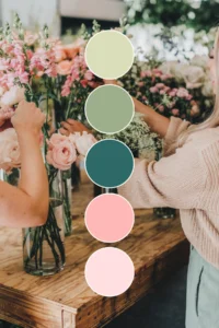
Now let’s talk color! Color is so important because it sets the mood for your entire brand. Pick a few colors that represent your vibe and industry. A good rule of thumb is to stick to two to three colors—this keeps your logo looking sleek and professional. For example, a mix of Navy Blue and Charcoal Grey with a splash of Sky Blue can create a harmonious, elevated look without feeling too busy. Want to take it up a notch? Try using different shades of one color to add a little depth while keeping things cohesive!
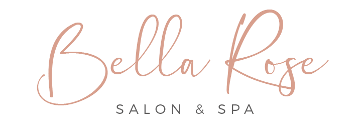
Fonts used in the sample logo are Sontiro Script and Montserrat
5. Save and Implement Everywhere
Congratulations, you’ve just created your very own logo! Now, let’s make sure it’s everywhere you need it. Pop it on your website, social media, business cards, and anywhere else your brand shows up. The key is to make sure your logo is consistent across all platforms—it should always feel like the same brand, no matter where your customers find you.
Pro Tip: Keep your primary font for your logo only, so it stands out against all the other elements of your branding. It’s your logo’s time to shine!
Look at you now – you are a logo maker! With these simple tips, you can create your own logo that’s both professional and personal. Your logo is an essential part of your business’s identity, and it’s worth putting some thought and love into it. Whether you’re just starting out or you’re looking to refresh your brand, you’ve now got the tools to make a logo that stands out and makes an impact.
So, are you ready to embrace your inner logo maker and create something that represents YOU and your business? Trust me, it’s easier than you think!
If you’re feeling stuck or need more guidance on how to make your own logo or a Canva logo design, don’t hesitate to reach out. At Macarons and Mimosas, we’re always here to help you take your brand to the next level!
More Posts You Might Like…
More Posts You Might Like…


