Choosing the Perfect Fonts for Your Brand

When it comes to fonts and branding, choosing the right fonts can make all the difference in how your audience perceives your brand. Fonts are more than just text—they convey your brand’s personality and set the tone for everything from your website to your marketing materials.
Let’s dive into the wonderful world of fonts and figure out how to choose the perfect ones for your brand. Trust me, it’s more fun than it sounds!
1. Know Your Brand Personality
Before diving into the endless font options, take a step back and think about what your brand’s personality is. Is it playful and quirky? Elegant and sophisticated? Bold and powerful? Your fonts need to reflect that vibe!
For example, if your brand is fun and creative (like many small businesses!), a playful script font like Dancing Script or Pacifico could be a great choice. On the other hand, for a more luxurious and modern vibe, try a clean serif font like Playfair Display, paired with a sans serif like Raleway to keep it stylish and balanced.
2. Pairing Fonts: Harmony Is Key
Now that you understand your brand’s personality, it’s time to choose a font family that complements it. The goal here is to create harmony, not competition. A well-balanced mix of fonts can elevate your brand’s identity and make your content more readable. Pro tip: Pair bold heading fonts with clean, simple body fonts to create a dynamic duo.
Here are a few winning font combinations:
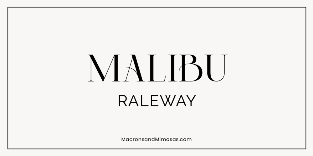
Malibu + Raleway
Picture Malibu sipping on a latte in a sunny café—it’s got a casual, laid-back vibe. Pair it with Raleway, the sharp, well-dressed architect sitting next to it. Malibu keeps it chill, while Raleway ensures your design has structure and sophistication. They’re the font version of “business casual,” ready to make any brand approachable yet polished.
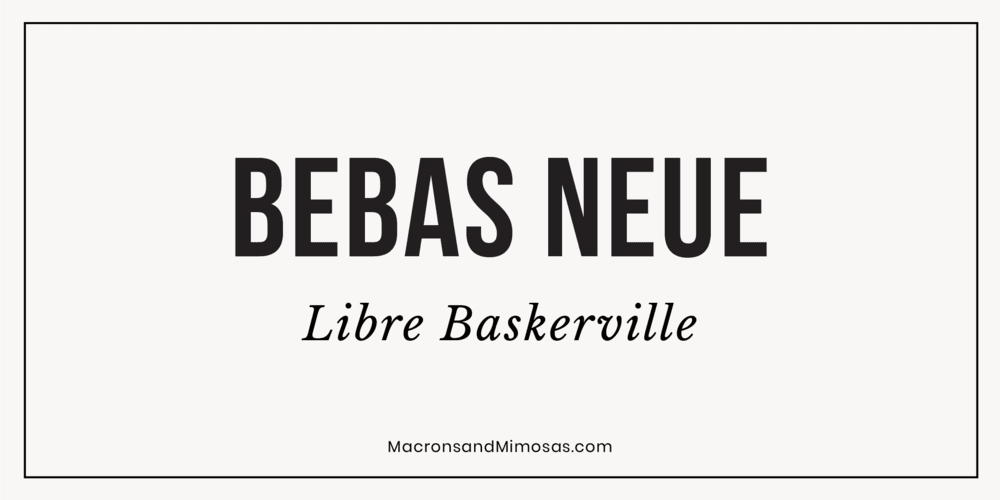
Bebas Neue + Libre Baskerville
Bebas Neue makes an entrance—bold, unapologetic, and impossible to ignore. Libre Baskerville is the calming voice of reason, bringing an air of timeless elegance. Think of this duo as the dynamic pair who could totally host a TED Talk on how to command attention without shouting.
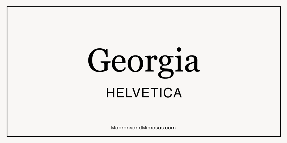
Georgia + Helvetica
Looking for a classy duo that never go out of style? Georgia is like a timeless leather-bound journal—classic, sophisticated, and full of stories. Helvetica is the minimal, modern planner keeping it all organized. Together, they bring balance: old-school charm meets clean simplicity.
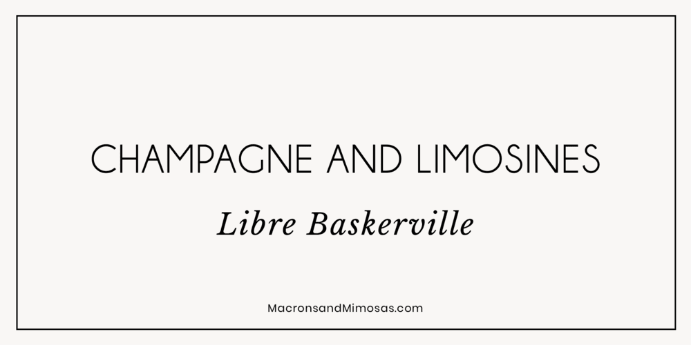
Baskerville + Champagne & Limousines
This pairing is like pairing a little black dress with a pair of fresh white sneakers. Libre Baskerville brings elegance—think Audrey Hepburn in Breakfast at Tiffany’s. Champagne & Limousines, on the other hand, is the chic friend who knows how to keep things practical and modern. Together, they’re perfect for brands that want a high-end look with a fresh twist.
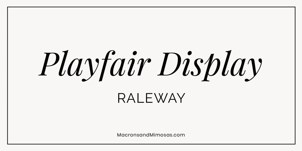
Raleway + Playfair Display
If fonts were characters in a rom-com, Raleway and Playfair Display would be the opposites-attract couple everyone roots for. Raleway is sleek and modern, like the no-nonsense architect who loves minimalism. Playfair Display is a romantic artist with a love for all things classic. Together? They’re perfection.
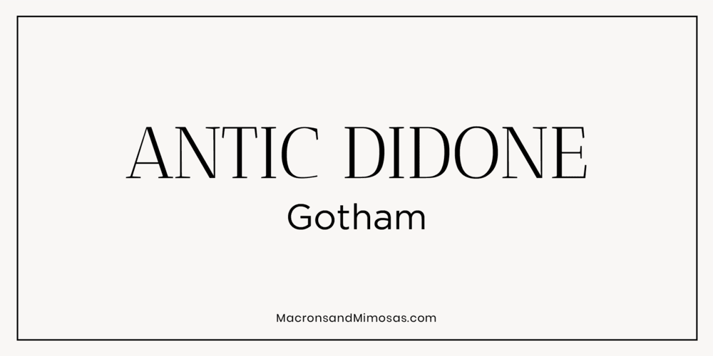
Antic Didone + Montserrat
Antic Didone + Gotham is a match made in font heaven: bold meets sleek. Antic Didone struts in with its classic, high-contrast elegance, while Gotham brings in modern, clean vibes with a touch of urban edge. Together, they’re the perfect blend of timeless sophistication and fresh, approachable charm—ideal for making a statement without screaming for attention. Perfect for everything from chic branding to high-end design with a little street-smart flair!
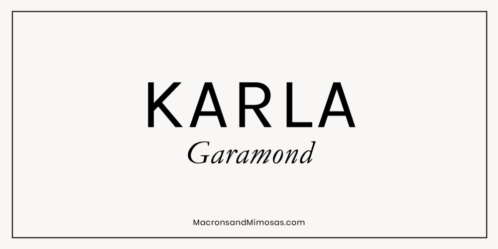
Garamond + Kara
Garamond is that effortlessly chic friend who always looks put together—think Parisian vibes with a beret and all. Karla, on the other hand, is the grounded, easygoing companion who keeps things approachable. Together, they create a balance of sophistication and friendliness, perfect for brands that want to charm without intimidation.
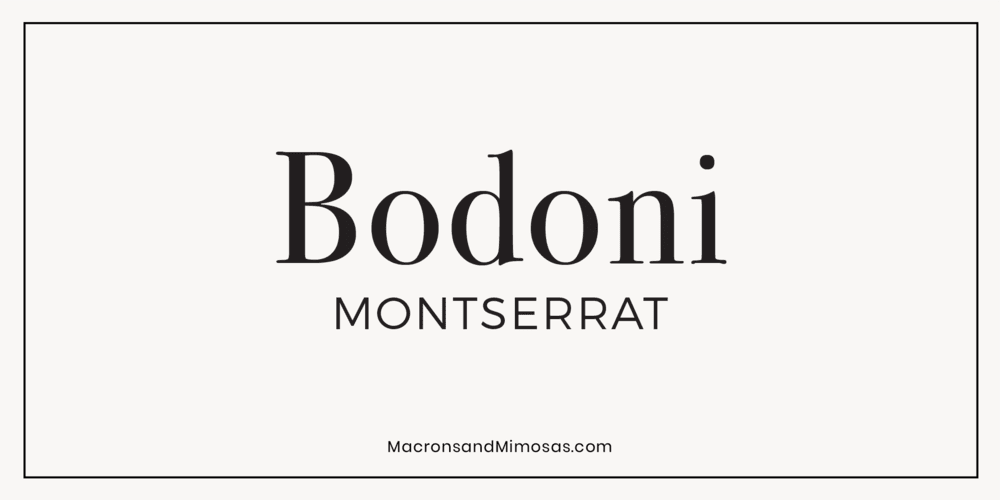
Bodoni + Montserrat
Ready for the dream team of classic meets modern? Bodoni brings the fancy, with its high-contrast strokes and old-school charm. Meanwhile, Montserrat keeps it cool and contemporary, offering clean lines that let Bodoni shine without stealing the spotlight. Together, they’re a perfect balance of elegance and edge. Use this combo for luxe vibes with a modern twist!
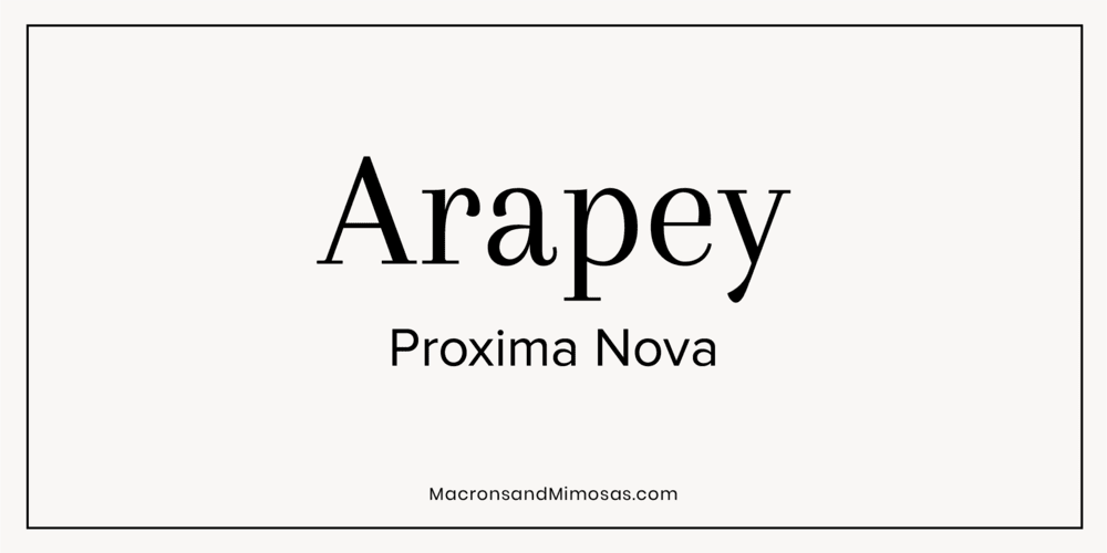
Arapey + Proxima Nova
Did you ask for the perfect mix of elegance and modernity? Arapey adds sophistication with its serif style, while Proxima Nova brings clean, geometric simplicity, making it a balanced, versatile pairing for both high-end and readable designs.
Script Fonts for Extra Flair
If you want to add a personal touch, consider incorporating script fonts, but make sure they’re easy to read. Here are some great options:
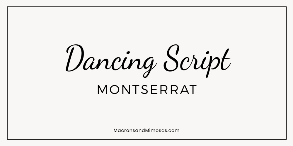
Dancing Script + Montserrat
This pairing is like a spontaneous dance party followed by a perfectly organized playlist. Dancing Script brings the energy and movement, while Montserrat keeps everything grounded and readable. It’s perfect for brands that want to show off their playful side without losing a polished edge.
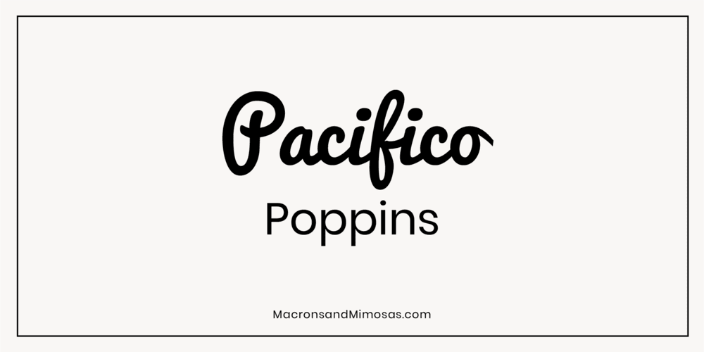
Pacifico + Poppins
Pacifico is the font equivalent of a warm hug—playful, friendly, and oh-so-inviting. Poppins is the practical, clean-cut friend who makes sure everything stays clear and easy to read. Together, they’re the ultimate power couple for brands that want to exude charm while staying professional.
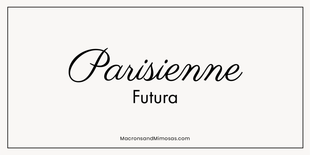
Parisienne + Futura
This is the perfect blend of playful and polished. Parisienne adds a whimsical, elegant script, while Futura keeps things sleek and modern with its geometric, clean lines. Together, they balance sophistication with a touch of fun, making this combo perfect for designs that need a little French flair with a contemporary twist!
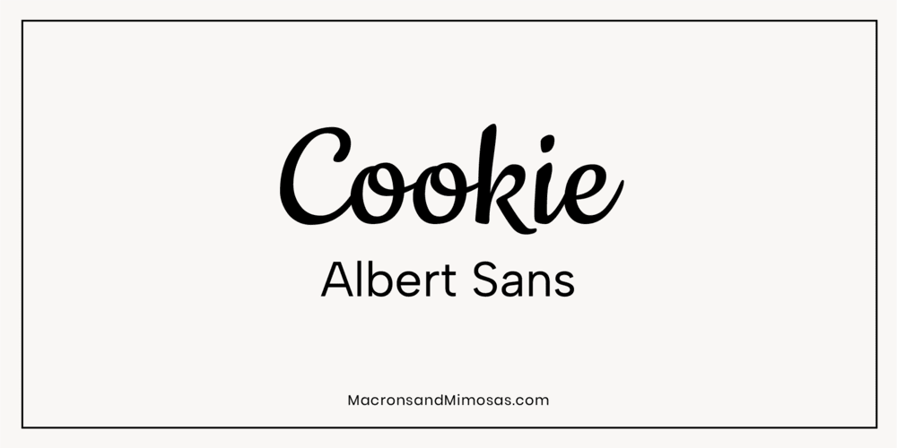
Cookie + Albert Sans
A fun and fresh pairing that mixes playful and professional. Cookie brings a quirky, handwritten vibe with its flowing script, while Albert Sans offers a clean, modern, sans-serif style to balance out the playful strokes of Cookie. Together, they create a whimsical yet polished look, perfect for projects that need a personal touch without sacrificing readability. Ideal for logos, invitations, or creative branding!
By pairing fonts thoughtfully, you’ll achieve a balanced, visually pleasing design that reflects your brand’s essence.
3. How Many Fonts Should a Brand Have?
When it comes to fonts and your branding, less is often more. A common question is: How many fonts should a brand have? In most cases, 2-3 fonts are plenty. This ensures that your branding is cohesive and not overwhelming. One font for headings, one for body text, and possibly a decorative font for accents or special elements.
Using too many fonts can make your brand appear chaotic. Stick to simplicity for the best results—choose fonts that play well together without stealing the spotlight.
4. Avoid Common Mistakes: Like Comic Sans
While it’s tempting to go with something quirky or fun, some fonts just aren’t appropriate for branding. For instance, Comic Sans may have a nostalgic charm for some, but it’s not the best fit for professional branding. This font is often seen as informal and unpolished, and can hurt your brand’s credibility if used in the wrong context.
It’s important to choose fonts that align with the message you want to convey. Stay away from fonts like Comic Sans unless you’re intentionally going for a humorous, casual approach—and even then, proceed with caution!
5. Readability Matters (A LOT)
While you want your fonts to be unique, they also need to be legible. No one will appreciate your amazing logo if they can’t even read your business name!
Be mindful of where your fonts will appear—on a website, a business card, or even social media—and test them in different sizes. Fonts that are easy to read on any screen or print material will win you extra points with your audience.
6. Using Custom Fonts for a Unique Brand
In the world of fonts and branding… if you want your brand to stand out, consider creating a custom font or modifying an existing one. Custom fonts can make your brand feel one-of-a-kind and truly reflect its personality.
If you’re not ready to invest in a custom font, look for fonts that allow for subtle modifications to give them a personal touch. Champagne & Limousines font is a great starting point, and with a little tweaking, you can make it uniquely yours.
7. The Emotional Power of Fonts
Did you know that fonts can influence emotions? Fonts and branding go beyond just aesthetics—they can help build an emotional connection with your audience. For example, Malibu font has a laid-back vibe, perfect for brands in the wellness or lifestyle sectors. On the other hand, a font like Garamond can make your brand feel more authoritative and traditional.
Let’s Get Font-Savvy!
Choosing the right fonts for your brand is a fun and creative process. It’s all about finding a balance between personality, readability, and emotional impact. And remember—less is more when it comes to the number of fonts you use. Stick to 2-3 complementary fonts for a polished and cohesive look.
So, are you ready to find the perfect font combinations for your brand? Start with a clear understanding of your brand’s identity, experiment with some font pairings, and always keep readability in mind. You’ve got this!
More Posts You Might Like…
More Posts You Might Like…


