
The Best Fonts and Color Palettes for Real Estate Agent Branding

Let’s be honest. Most real estate agent branding looks exactly the same. Navy blue. Generic serif font. Headshot on a business card that has not been updated since 2017. And somewhere in the corner, a logo that came free with a Canva subscription and has been used by approximately four hundred other agents across the country.
Your brand is not just a logo. It is the first showing. It is what a potential client sees before they ever talk to you, before they read your bio, before they decide whether to pick up the phone. And if it looks like everyone else’s, they have no reason to choose you over everyone else.
The good news is that getting your real estate branding right does not require a massive budget or a full rebrand from scratch. It starts with two things: the right color palette and the right fonts. Get those two things working together and everything else, your social posts, your listing graphics, your email templates, your buyer and seller guides, suddenly looks cohesive, intentional, and like it was made by someone who really knows what they are doing.
Which, after reading this post, you will.
IN THIS ARTICLE
Why Your Real Estate Brand Colors Matter More Than You Think
Color is not decoration. It is communication.
Before a single word on your website is read, your brand colors have already told potential clients something about you. Are you modern or traditional? Luxury or approachable? Established or fresh? Those are decisions that happen in milliseconds, and your color palette is making them whether you planned it that way or not.
Here is what the most common real estate brand colors actually signal:
Navy and deep blue trustworthy, stable, established. The classic real estate color for a reason, but heavily saturated in the market.
Black and white luxury, minimalism, authority. Works beautifully for high-end agents but can feel cold without a warm accent.
Warm neutrals (cream, taupe, sand) approachable, elevated, timeless. Trending heavily right now and still feel fresh.
Sage green calm, grounded, lifestyle-forward. Great for agents who lean into community and connection over hard sales energy.
Terracotta and warm earthy tones inviting, warm, distinctive. Makes a brand feel like a home before a client ever walks through a door.
Soft blush and gold feminine, elevated, boutique-feel. Perfect for agents who want to stand out in a traditionally male-dominated market.
The best real estate color palettes are not just one color. They are a system: a primary color, a secondary color, a neutral, and an accent. When those four work together, your brand has range. It can be formal or playful, bold or soft, depending on what the moment calls for.
6 Real Estate Color Palettes That Actually Stand Out
These are not the default Canva navy-and-white combos you have seen a thousand times. These are intentional, distinctive palettes built specifically for real estate agents who want a brand that actually gets remembered.
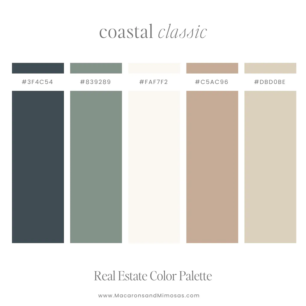
Palette 1: The Coastal Classic
For the agent whose brand feels grounded, modern, and quietly confident.
- Primary: Deep Moss
- Secondary: Sage Mist
- Neutral: Ivory
- Accent: Warm Tan
- Accent: Sand Linen
Understated and sophisticated without trying too hard. The deep slate anchors the palette with authority while the sage and warm neutrals keep it feeling approachable and lifestyle-forward. This is the palette for the agent who wants to stand out without shouting.
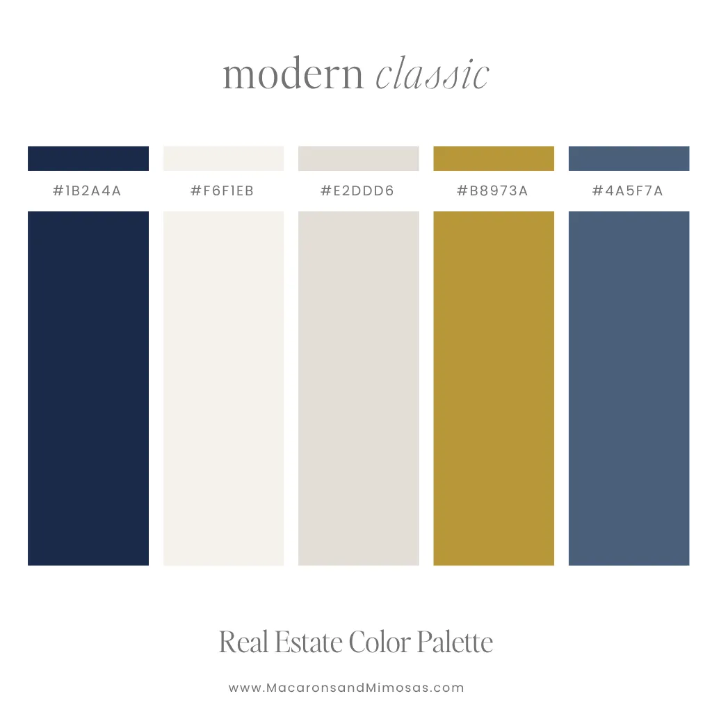
Palette 2: The Modern Classic
For the established agent who wants timeless, not trendy.
- Primary: Deep Navy
- Secondary: Warm White
- Neutral: Light Stone
- Accent: Antique Gold
- Accent: Steel Blue
Navy done right. The warm white and stone neutrals stop it from feeling cold and corporate, and the antique gold gives it a sophistication that the typical navy-and-white combo completely misses.
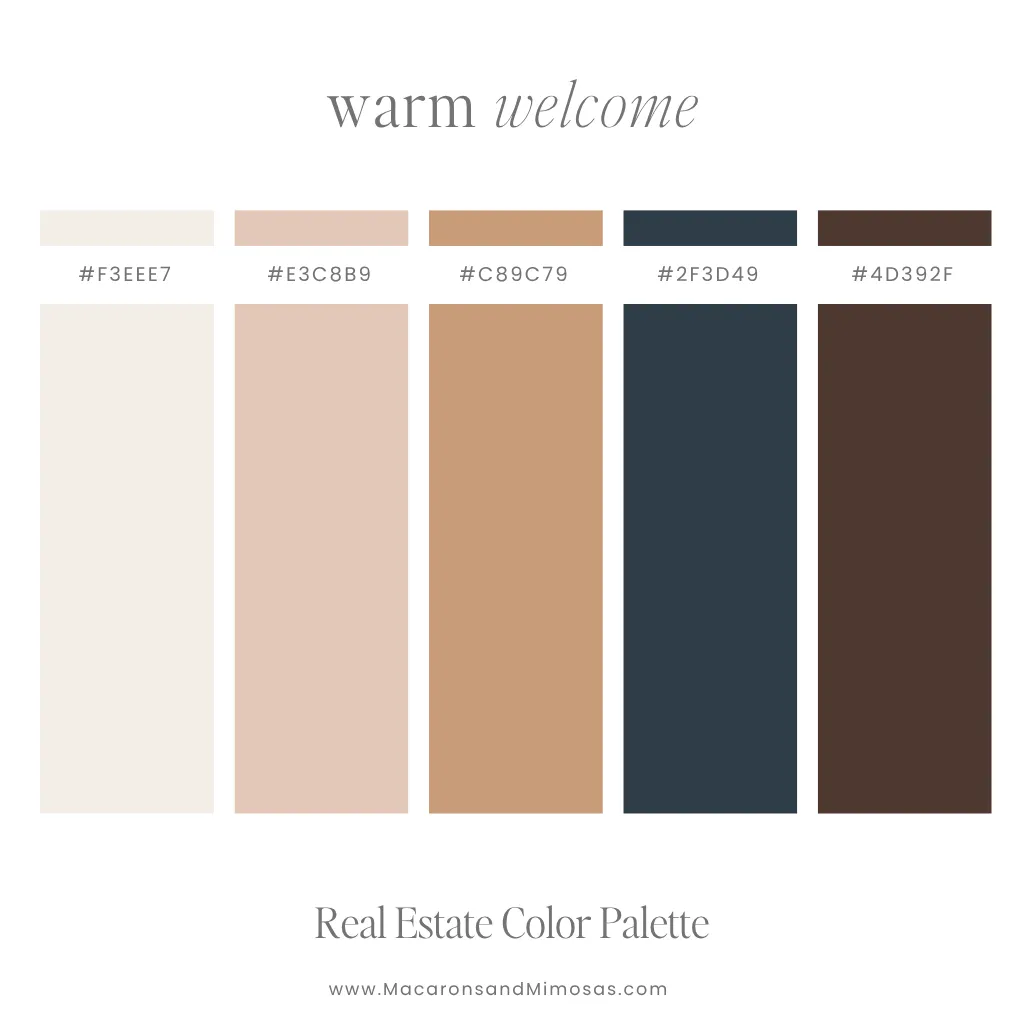
Palette 3: The Warm Welcome
For the agent who leads with warmth and closes with confidence.
- Neutral: Soft Ivory
- Secondary: Blush
- Accent: Warm Camel
- Accent: Deep Navy
- Primary: Deep Espresso
Warm neutrals meet deep anchors in a combination that feels both inviting and polished. The blush and camel keep it approachable; the navy and espresso give it the weight and credibility clients need to trust you with one of the biggest decisions of their lives.
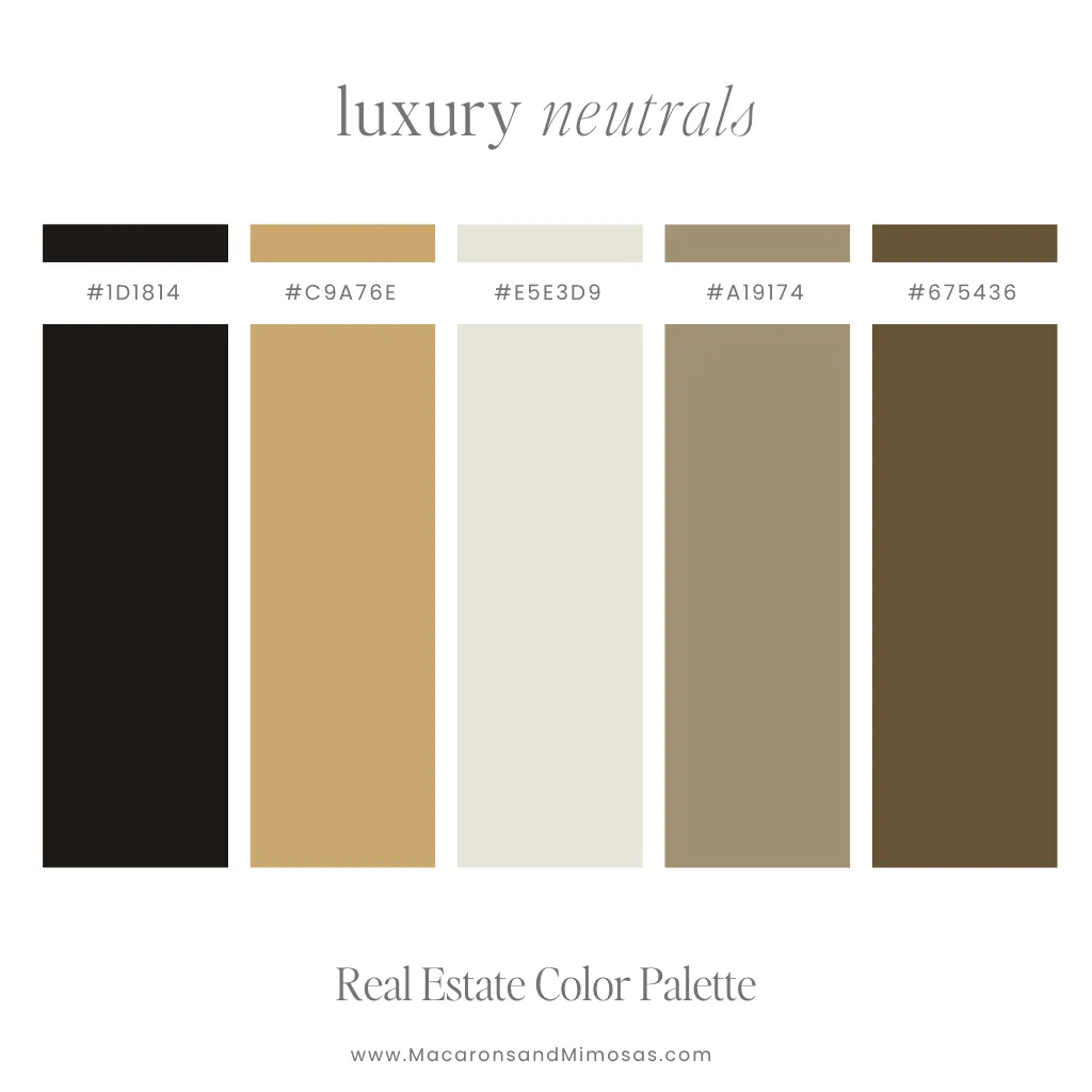
Palette 4: The Luxury Neutral
For the agent who sells lifestyle, not just listings.
- Primary: Near Black
- Secondary: Brushed Gold
- Neutral: Warm Linen
- Accent: Warm Khaki
- Accent: Deep Tobacco
This palette means business. The near-black anchor with warm gold tones reads like a five-star hotel lobby, not a real estate office. Rich, warm, and completely unforgettable.
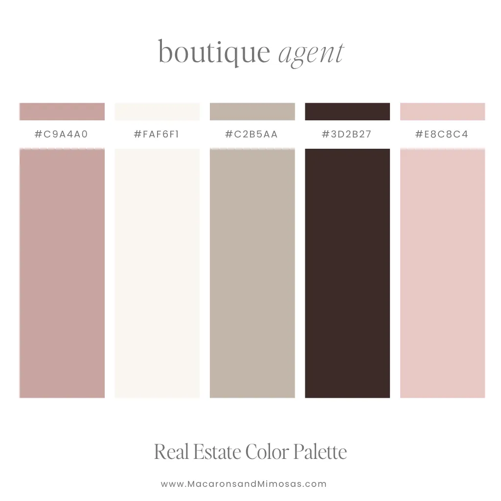
Palette 5: The Boutique Agent
For the agent who built a personal brand, not just a business.
- Primary: Dusty Rose
- Accent: Cream
- Neutral: Warm Taupe
- Secondary: Deep Mocha
- Accent: Blush Mauve
Elevated, feminine, and boutique without being precious about it. This palette works across social media, print, and digital seamlessly and photographs beautifully. If your personal brand is as much a part of your business as your listings, this is your palette.
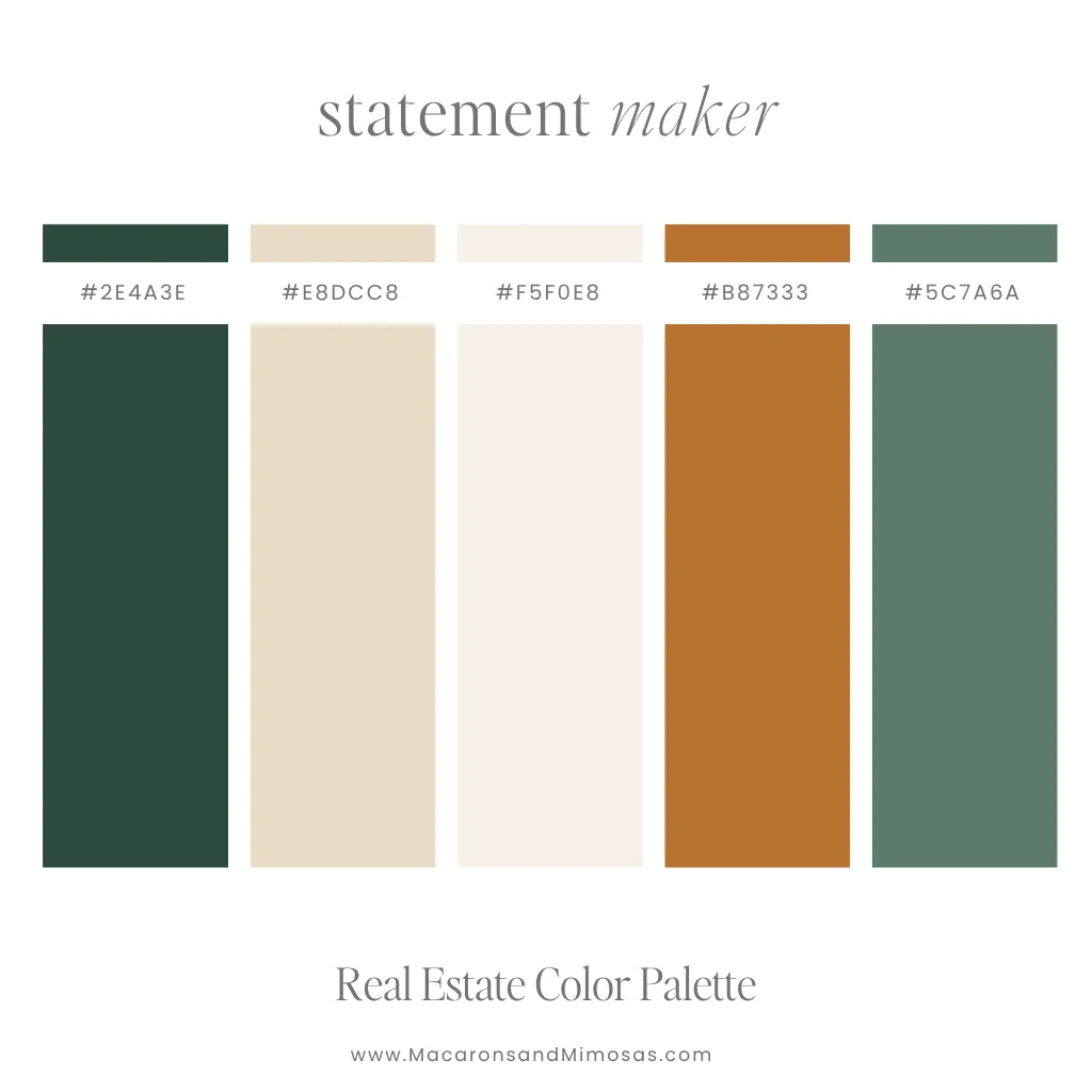
Palette 6: The Statement Maker
For the agent who refuses to blend in.
- Accent: Deep Forest
- Neutral: Warm Sand
- Accent: Soft Ivory
- Primary: Burnished Copper
- Secondary: Sage Green
Bold, unexpected, and completely memorable. Deep forest green paired with warm sand and copper accents is the kind of palette that stops people mid-scroll. For the agent who has built a distinct point of view and wants a brand that reflects it.

The Best Canva Font Pairings for Real Estate Agent Branding
Fonts do the same job as colors they communicate before anyone reads a single word. A clean serif says established and trustworthy. A modern sans-serif says current and approachable. A script accent says personal and warm.
The best real estate brands use a font system, not just a font: a display font for headlines, a body font for readability, and sometimes a script or accent font for personality. Here are the pairings that work.
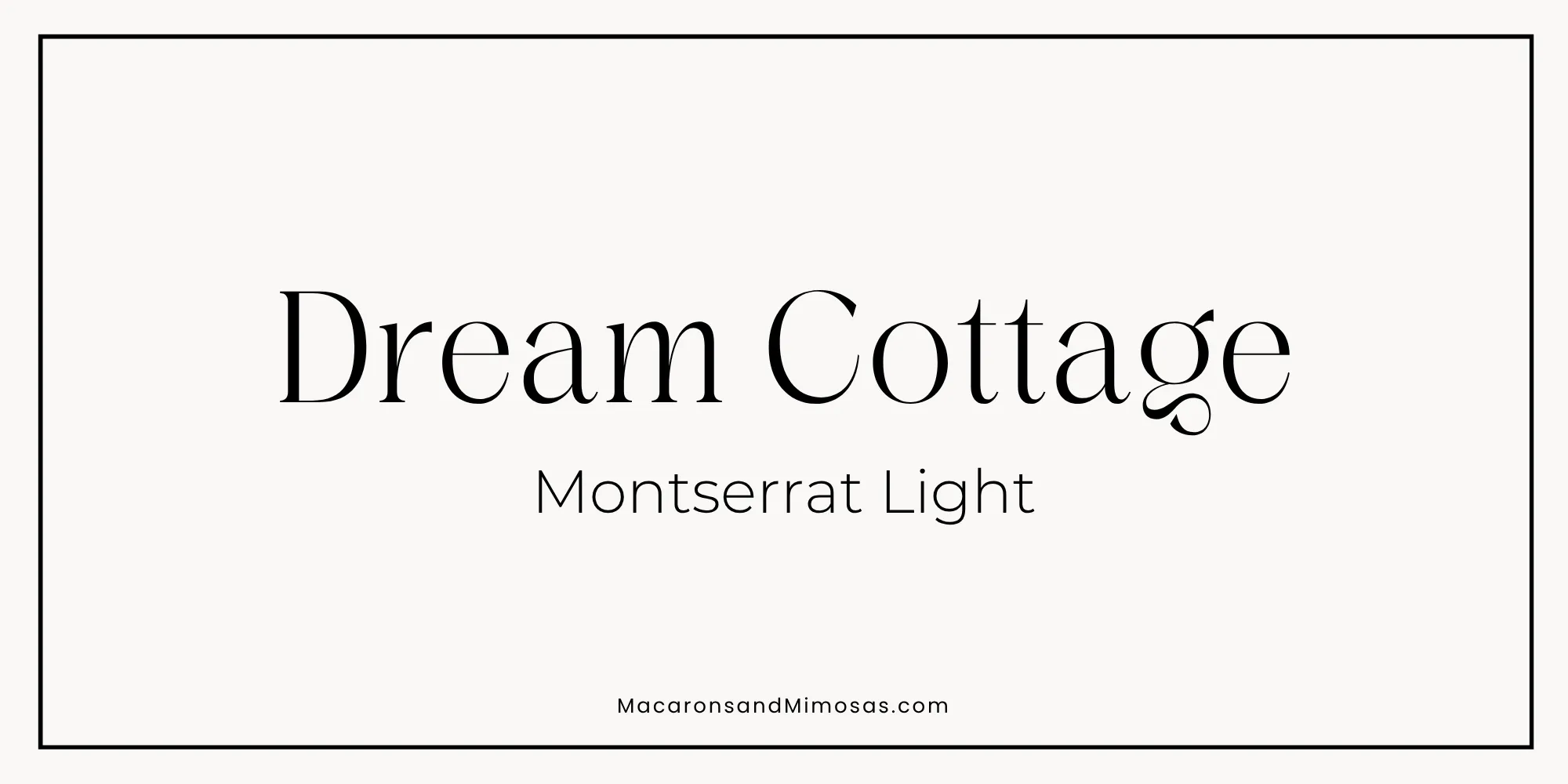
Pairing 1: The Classic Authority
Headline: Dream Cottage | Body: Montserrat Light
Dream Cottage brings a quiet sophistication that most real estate fonts completely miss – it is distinctive without being loud, elegant without feeling cold. Montserrat Light keeps the body copy clean, modern, and highly readable at any size. Together they create a brand that feels curated and considered, the kind of agent who knows exactly what they are doing and does not need to announce it.
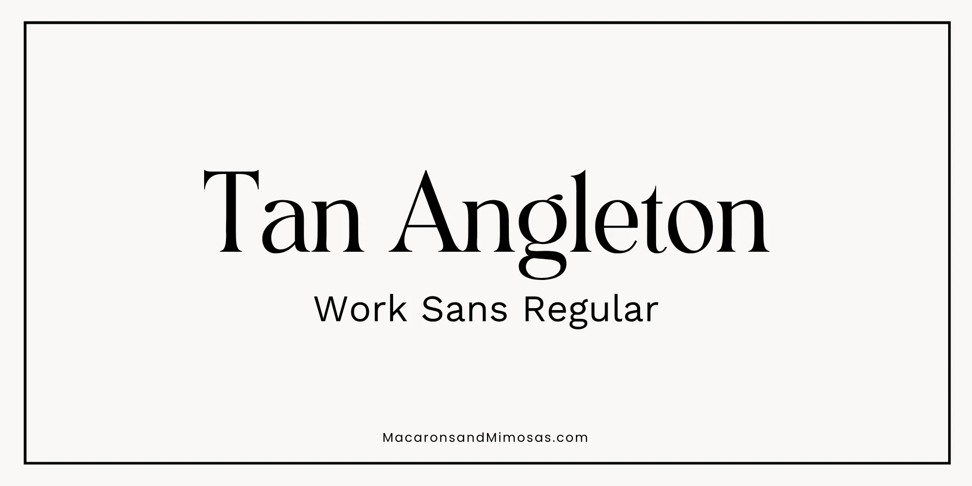
Pairing 2: The Modern Authority
Headline: Tan Angleton | Body: Work Sans Regular
Tan Angleton is architectural and confident the kind of font that says “I close deals” without raising its voice. Work Sans keeps the body copy clean and no-nonsense. This pairing is built for the agent who wants a brand that feels current, sharp, and completely in control. Zero fuss. Maximum presence.
Pairing 3: The Approachable Expert
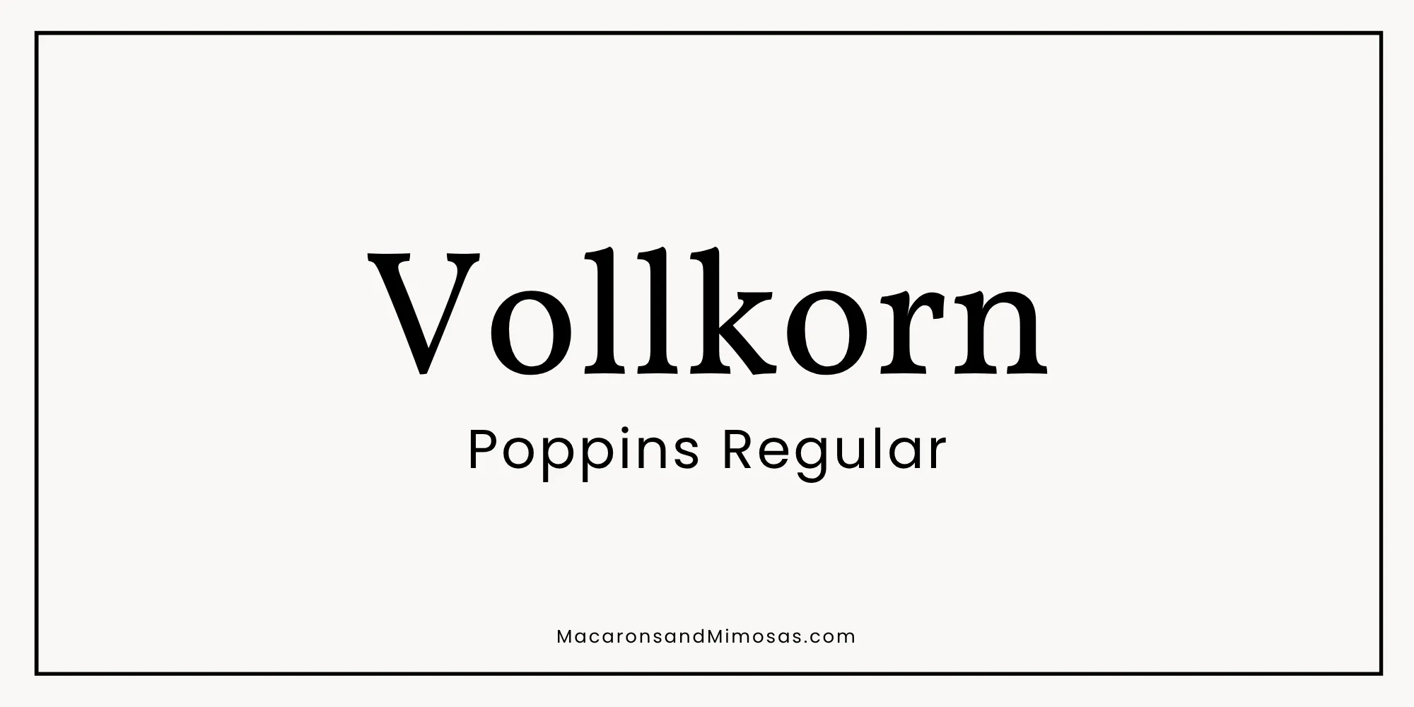
Headline: Vollkorn | Body: Poppins Regular
Vollkorn is a warm, bookish serif with real character – it feels like someone who has read everything and can explain it clearly. Poppins keeps the body copy approachable and easy to scan. This combination says knowledgeable, trustworthy, and genuinely helpful without a single stiff or corporate moment. For the agent whose clients refer them to everyone they know.
Pairing 4: The Confident Minimalist
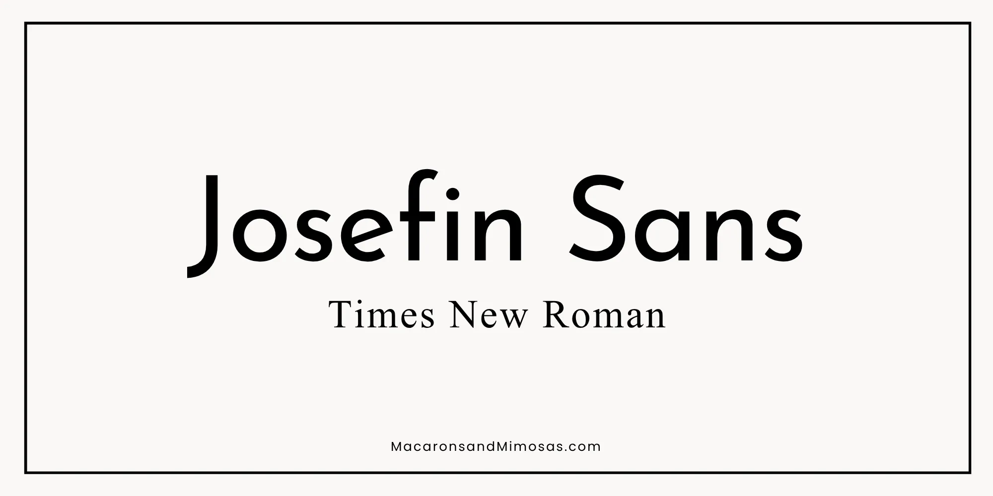
Headline: Josefin Sans | Body: Times New Roman
Josefin Sans is geometric, precise, and quietly bold – a headline font with real personality that does not need to shout. Pairing it with Times New Roman flips the expected script: the modern geometric leads and the classic serif grounds it. The result is a brand that feels both fresh and established, perfect for the agent who has been in the market long enough to know what works and is not afraid to do things differently.
Pairing 5: The Elegant Statement
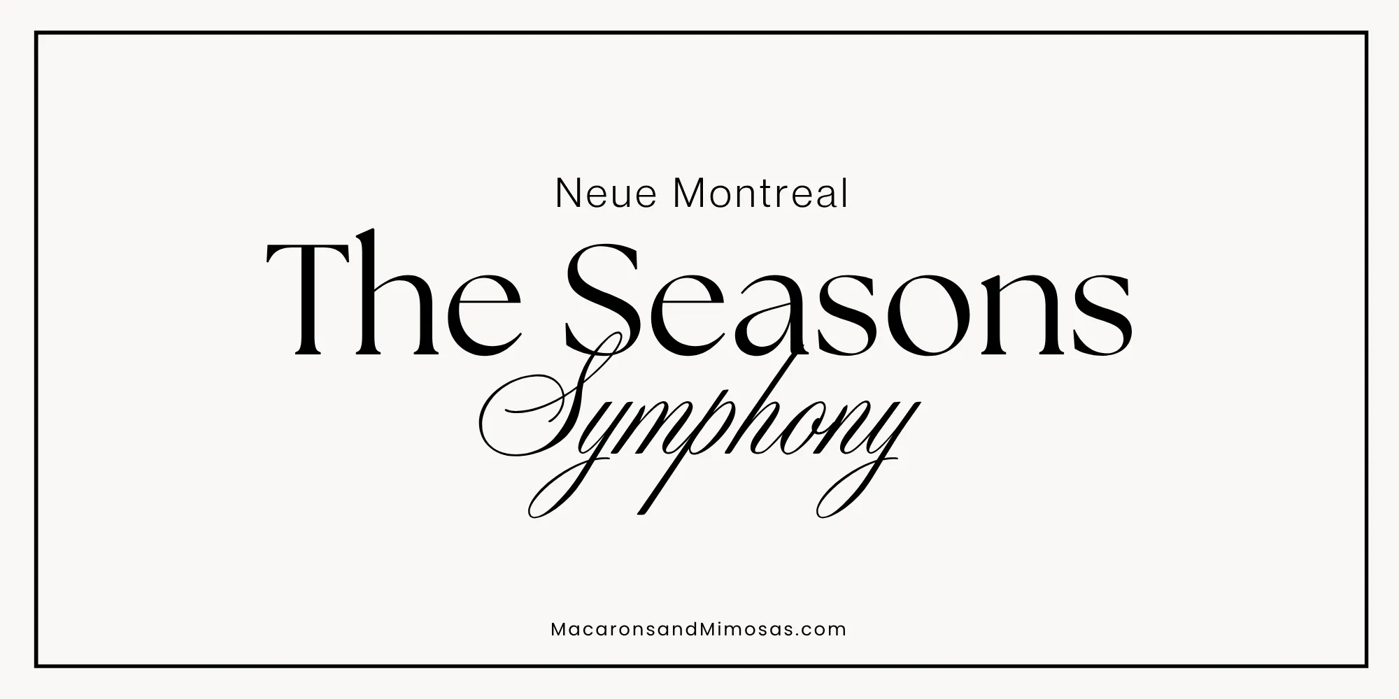
Headline: The Seasons | Body: Neue Montreal | Script Accent: Symphony
The Seasons is a headline font with serious presence — high contrast, deeply sophisticated, the kind of font that makes even a simple word look intentional. Neue Montreal keeps the body copy crisp and contemporary. Symphony as a script accent adds a flourish of elegance that feels genuinely luxurious without trying too hard. This is the pairing for the agent who wants their brand to feel like it belongs in a design magazine.
Pairing 6: The Editorial Luxury
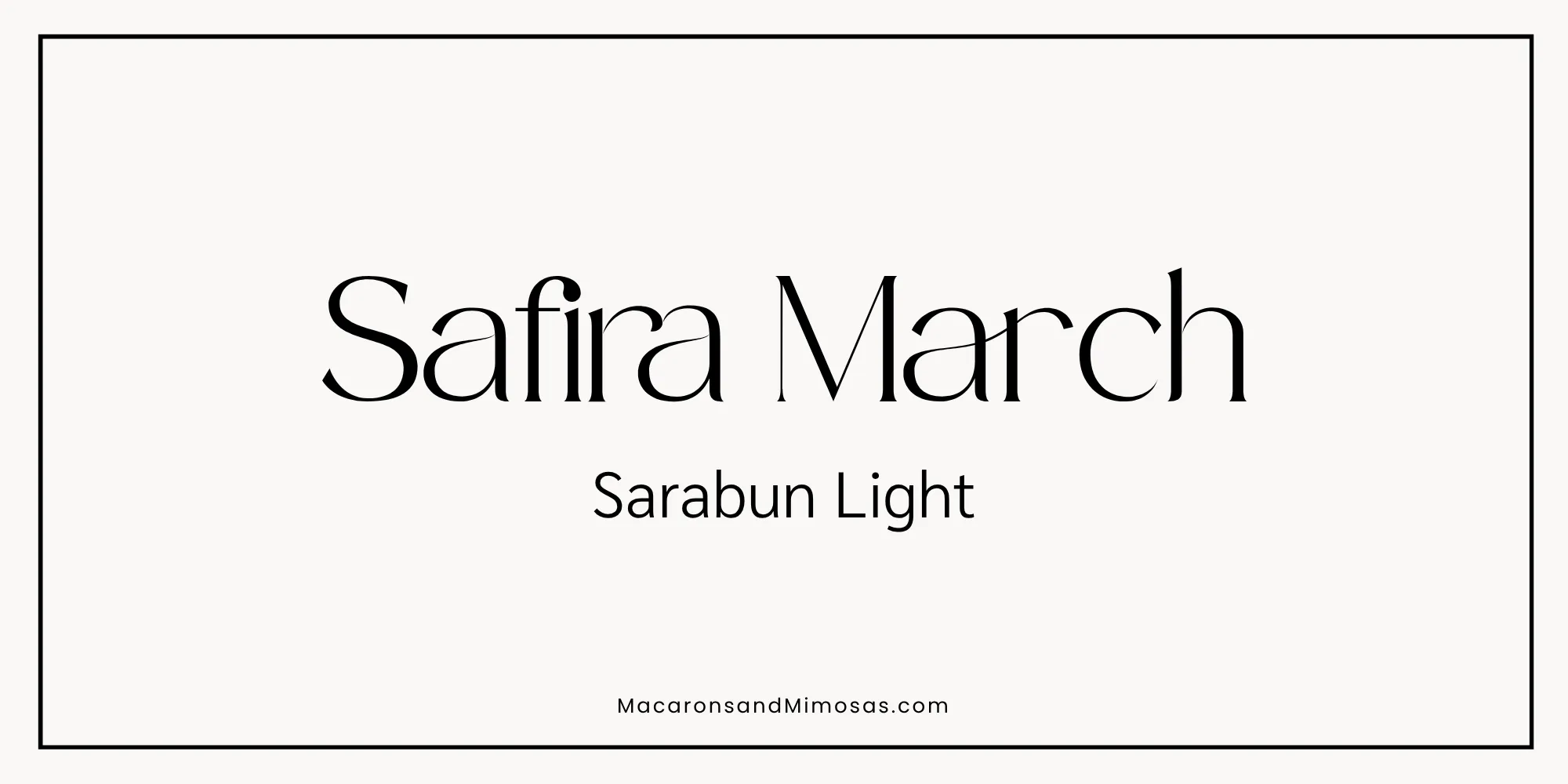
Headline: Safira March | Body: Sarabun Light
Safira March is the kind of headline font that makes people stop and look twice. High contrast, deeply elegant, and completely distinctive – it belongs on the pages of an architecture magazine, not a generic real estate flyer. Paired with the clean, airy Sarabun Light for body copy, this combination reads as polished and intentional from the very first glance. For the luxury agent whose brand needs to feel like it costs something before a client ever sees a price tag.
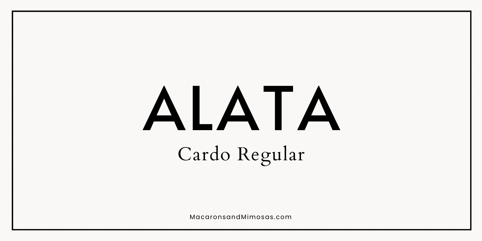
Pairing 7: The Statement Brand
Headline: ALATA | Body: Cardo Regular
ALATA in all caps is a headline that commands the room. Wide, bold, and completely unmistakable, it is the font equivalent of walking into a listing presentation and owning it from the first handshake. Cardo brings warmth and readability to the body copy so the brand never tips into intimidating. For the agent who has a point of view, has built the reputation to back it up, and wants a brand that reflects exactly that.
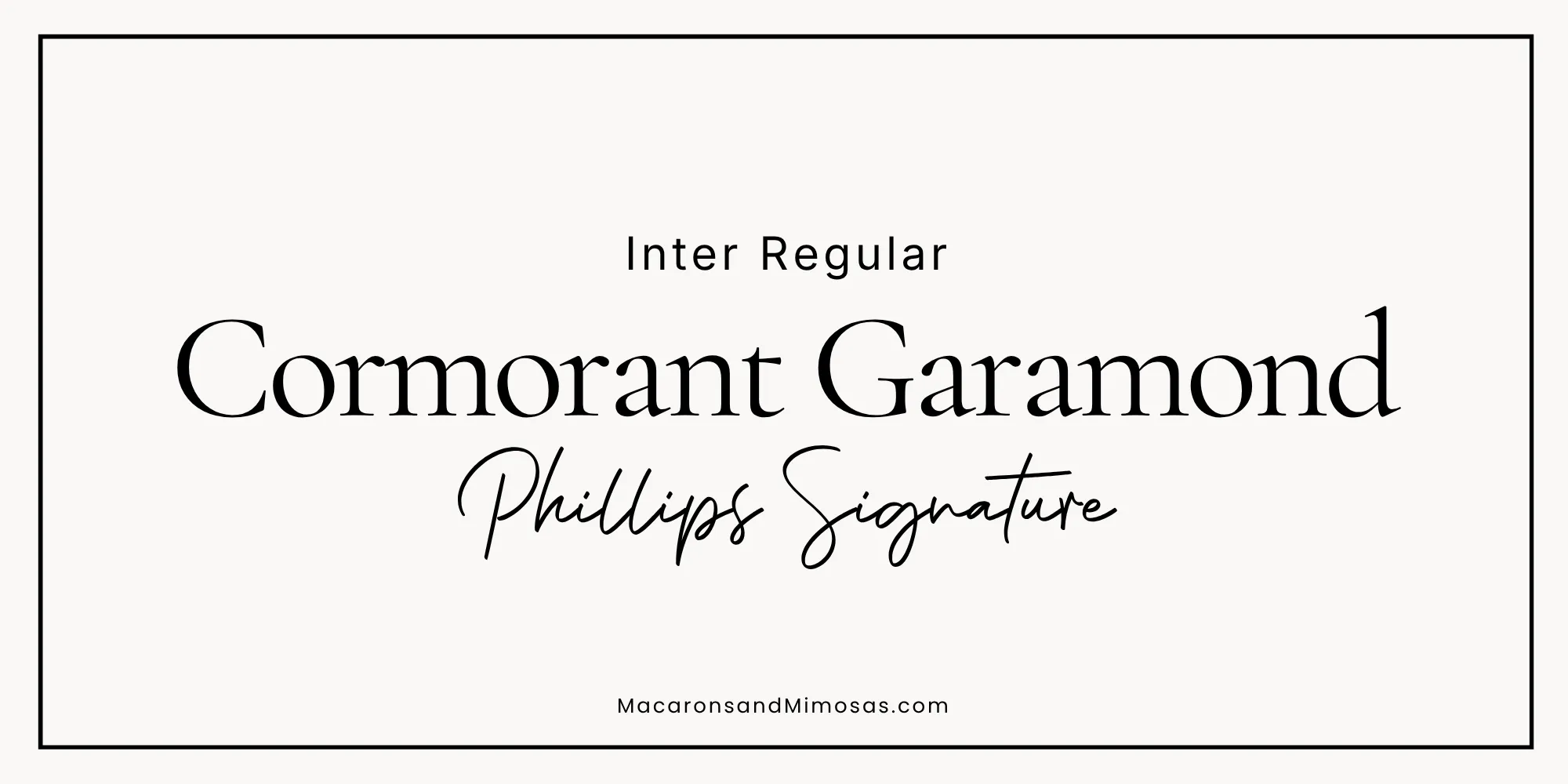
Pairing 8: The Signature Touch
Headline: Cormorant Garamond | Body: Inter Regular | Script Accent: Phillips Signature
Cormorant Garamond brings the editorial weight, Inter keeps everything clean and modern, and Phillips Signature adds that personal, handwritten moment that makes a brand feel human. Use the script sparingly – your name on a buyer guide cover, a tagline on a business card, a single word on a social graphic. That restraint is exactly what makes it land. For the agent who wants their brand to feel like it came from a person, not a template.
Should real estate agents use Brittany Script? Short answer: no. It is one of the most downloaded script fonts on Canva, which means it is already on thousands of real estate logos, templates, and business cards across every market. A font that recognizable stops being a brand asset and starts being wallpaper. Phillips Signature gives you the same warm, handwritten personality without the oversaturation – and that is exactly the point.
How to Apply Your Brand to Everything: Buyer and Seller Guides
Here is where most real estate agents miss a huge opportunity.
You invest in a great color palette and a beautiful font pairing. You update your social media templates. Maybe you even redo your business cards. And then a client asks for your buyer guide and you send them a generic PDF that looks like it was put together in ten minutes with a Word template from 2012.
Your buyer and seller guides are some of the most high-touch pieces of marketing you will ever hand a client. They are sitting with that document before they make one of the biggest financial decisions of their life. What that document looks like matters.
A professionally designed, fully branded buyer or seller guide tells your clients: this agent is organized. This agent is prepared. This agent takes this seriously. Before you have said a single word in that consultation, your materials have already made the case for you.
That is exactly why we created the Macarons and Mimosas Real Estate Buyer and Seller Guide Canva Templates. Fully editable in Canva, completely customizable to your brand colors and fonts, and designed to look like something a luxury brokerage would charge thousands to produce.
Grab the FREE Moving Guide for Your Clients 🏡
Looking for something to offer your clients that makes you the agent they remember long after closing day?
We created a free Moving Guide you can download, brand with your logo and colors, and hand to every buyer you work with. It is a genuinely useful resource that keeps your name in front of clients during the chaotic weeks after closing which is exactly when referrals happen.
Drop your email below and we will send it straight to you.
FAQs: About Real Estate Agent Branding
The most effective real estate brand colors are distinctive in your market, not just the industry. Navy, red, and white are so oversaturated they no longer differentiate anyone. Agents standing out right now are using warm neutrals, sage green, terracotta, and earthy tones that feel personal rather than corporate. Build your palette with four elements: a primary, secondary, neutral, and accent.
Luxury real estate brands use high-contrast serif fonts for headlines Playfair Display, Cormorant Garamond, and Bodoni Moda are popular choices. Paired with a clean sans-serif like Montserrat or Lato for body copy, the combination reads as sophisticated and polished without being hard to read.
Yes, and Canva is one of the best tools for it. Set up your Brand Kit with your exact hex codes and chosen fonts before you design anything, so every social post, listing graphic, and marketing piece you create is automatically on-brand. Consistency is what makes a brand look professional.
Three upgrades make the biggest difference: switch from bright saturated colors to deeper or muted tones, move from generic display fonts to a refined serif headline font, and add more white space to every design. Cluttered and bright reads budget. Clean, restrained, and intentional reads luxury.
A buyer guide should cover the process from pre-approval through closing, what to expect at each step, and what questions to ask at showings. A seller guide should cover pricing, the listing process, how offers work, and closing expectations. Both should be fully branded with your colors, fonts, and contact information.
More Posts You Might Like…


Leave a Reply