30+ Pastel Color Palettes with Color Codes for Your Brand!
Pastel colors bring a gentle and soothing charm, giving your brand that playful and lighthearted feel. It’s like adding a sprinkle of magic to your brand’s visual identity!
Unleash your creativity by exploring an endless array of color combinations to create your brand’s color palette. After all, there are unlimited possibilities to mix and match colors. You can choose a palette that’s dark and sophisticated, opt for something bright and fresh, or strike a balance between the two. However, if you’re aiming for a soft, light and airy vibe, consider embracing a pastel color palette for your brand!
What are Pastel Colors?
Pastels, also known as “tints,” are lighter shades of colors created by adding a good amount of white to the original hue. For example, pastel purple is a lighter version of regular purple. Technically, any color can become a pastel by adding white, and the more white you add, the lighter the pastel becomes. Taking red and adding white to it, turns the color to pink the more white added, the lighter pink the color becomes.
Pastel colors have a softer look compared to bright, intense colors. They are often described using terms like “soft,” “washed out,” “pale,” “muted,” and “light.”
What do pastel colors say to your audience?
Colors are extremely powerful and important! Using the right color tones and shades can add leverage to your brand and evoke emotions and feelings. I dive a little deeper into Color Psychology and feelings here.
Pastel colors are:
- Romanic
- Peaceful
- Calming
- Purifying
- Sophisticated
- Charming
Tips for using Pastel Colors in your brand
Pastel colors can enhance the appearance of a website and brand giving way to a more refined and sophisticated look.
Florists, Wedding Photographers, Gift Shops, Baby and Kids Stores, Artists, Painters, Jewelry Makers and Creative Business owners can benefit from a pastel color palette.
Designing with “light pastel” colors can be tricky…but well worth it, considering that “airy” shades can brighten everyone’s mood.
A Well-Balanced Palette: Make sure your palette is balanced with different hues of the pastels you choose. Try to opt for a few deeper shades, mixed with a few lighter airy ones.
Not all pastels are created equal: While pastels are stunning, and evoke a sophisticated and romantic vibe, pastels are not created for all brands. While pastels are great for a wedding photographer, they might not exactly work for a retro millennial brand or rugged men’s company. Before you incorporate pastels into your brand, make sure that they work with your industry.
Rainbow Pastel Color Palettes
Sometimes you just can’t decide, so why limit yourself to just one color when you can have the whole rainbow? Why not mix all the cute colors together to create something unique, and refreshing?
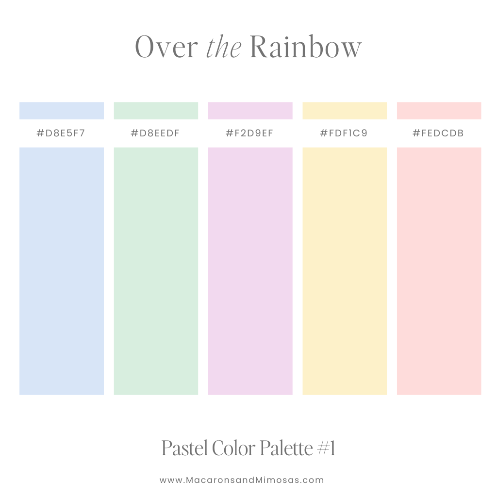
Over the Rainbow – Multicolor Pastel Color Palette
A joyful pastel rainbow palette that feels like a celebration of springtime magic. Perfect for playful branding, children’s projects, or whimsical designs.
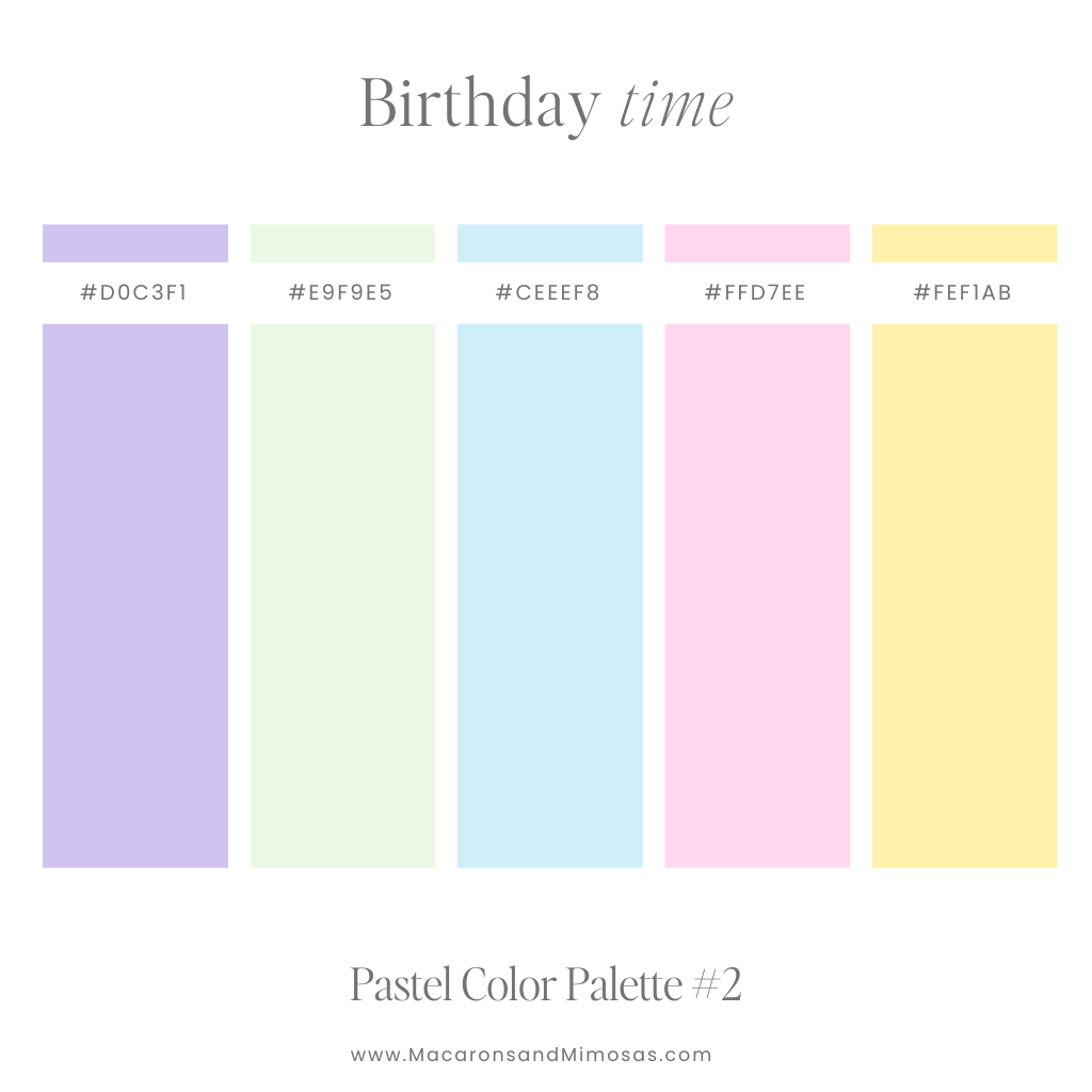
Birthday Time – Pink, Blue & Purple Color Palette
Bright and cheerful, this palette captures the festive spirit of balloons and party hats. Ideal for celebratory graphics, event designs, or kid-friendly projects.
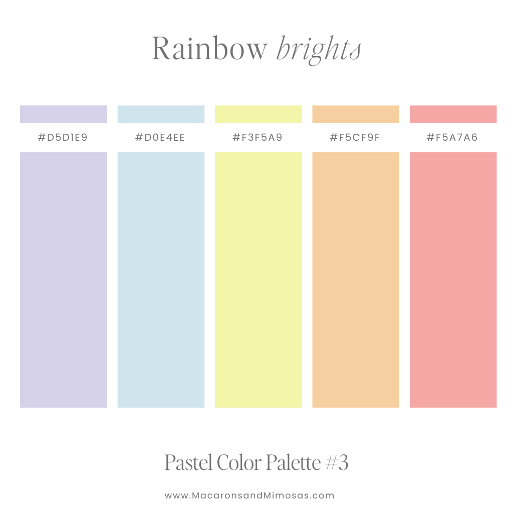
Rainbow Brights – Bright Multicolor Pastel Palette
Bold yet soft, this palette adds energy to any design while maintaining a pastel charm. Perfect for dynamic branding, modern illustrations, or statement-making visuals.
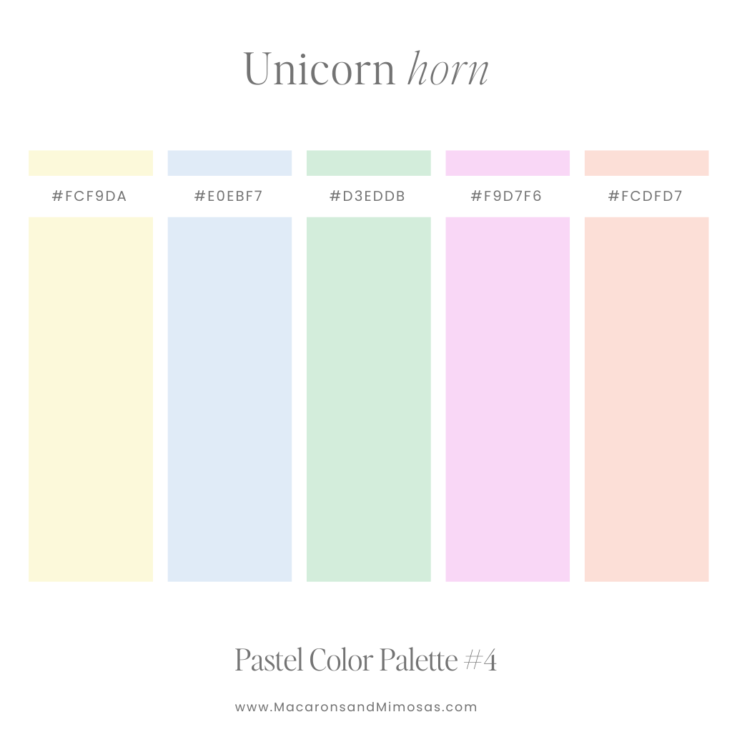
Unicorn Horn – Fun Soft Pastel Color Palette
Magical and dreamy, this pastel blend feels like stepping into a fairytale. Perfect for fantasy-inspired designs, feminine branding, or children’s illustrations.
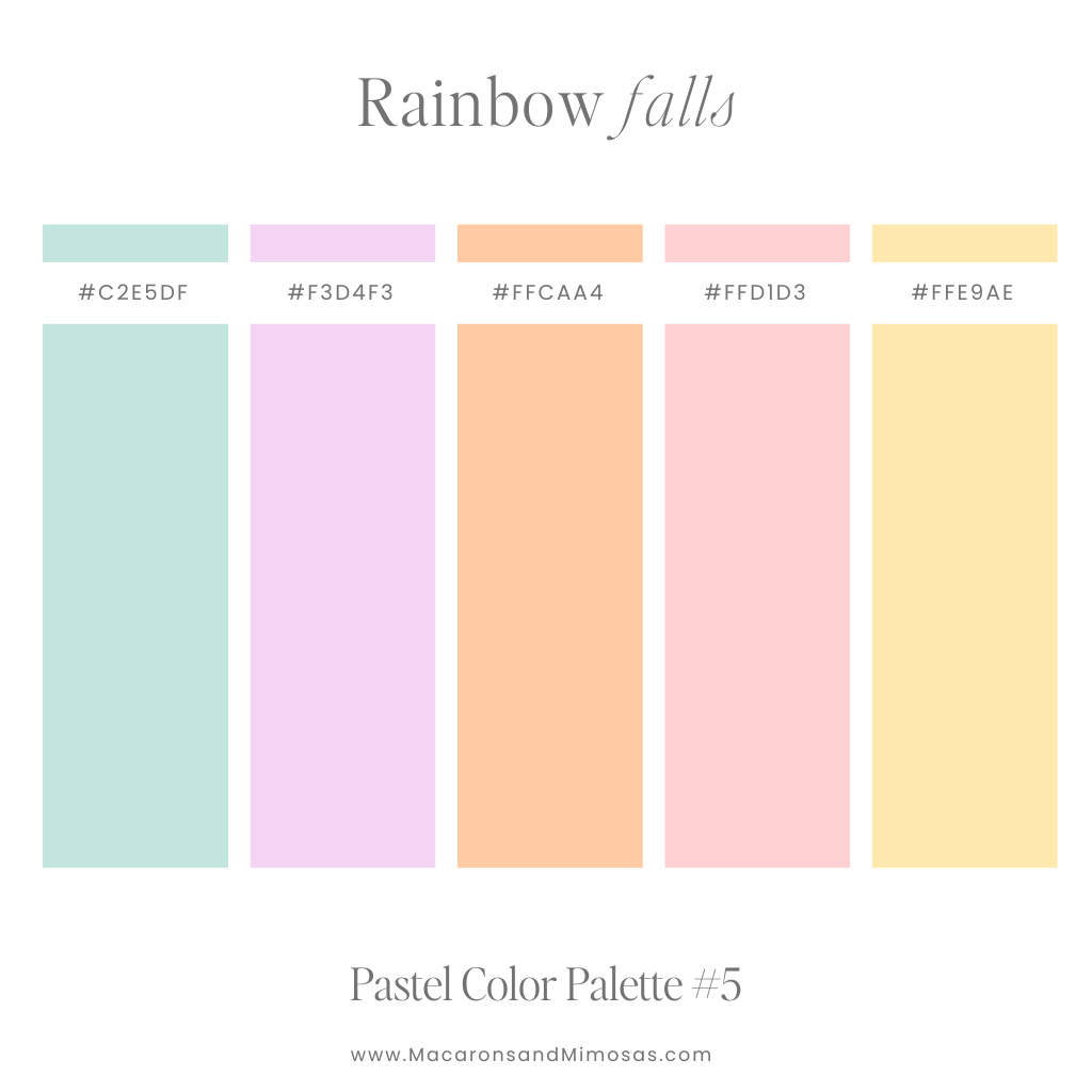
Rainbow Falls – Cool Tone Pastel Color Palette
Soft, nature-inspired hues evoke the serenity of cascading waterfalls and natural rainbows. Ideal for eco-friendly branding, tranquil graphics, or travel-inspired designs.
Pastel Pink Color Palettes
Who can resist the charm of a color palette adorned with lovely shades of pink? Pink is the perfect pastel version of red. Why not dive into the sweet world of a pink pastel color palette to add a playful touch to your designs.
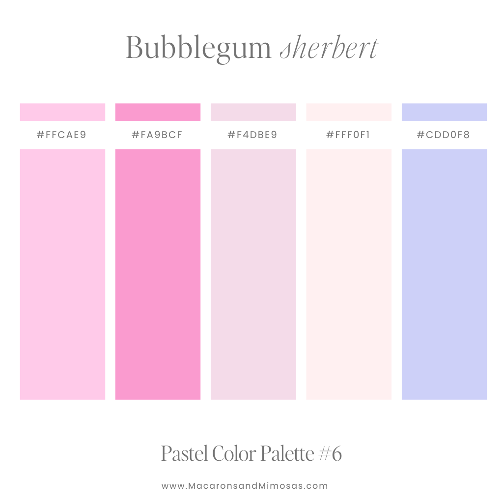
Bubblegum Sherbert – Soft Pink Color Palette
Sweet and playful, this palette is perfect for designs that need a burst of sugary charm. Great for lifestyle branding, packaging, or cheerful event invitations.
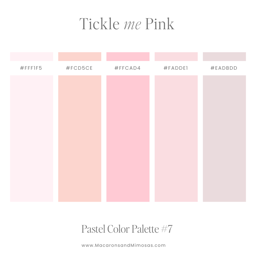
Tickle Me Pink – Pink & Peach Color Palette
Romantic and warm, this palette adds a glowing softness to any project. Perfect for feminine branding, wedding designs, or cozy digital content.
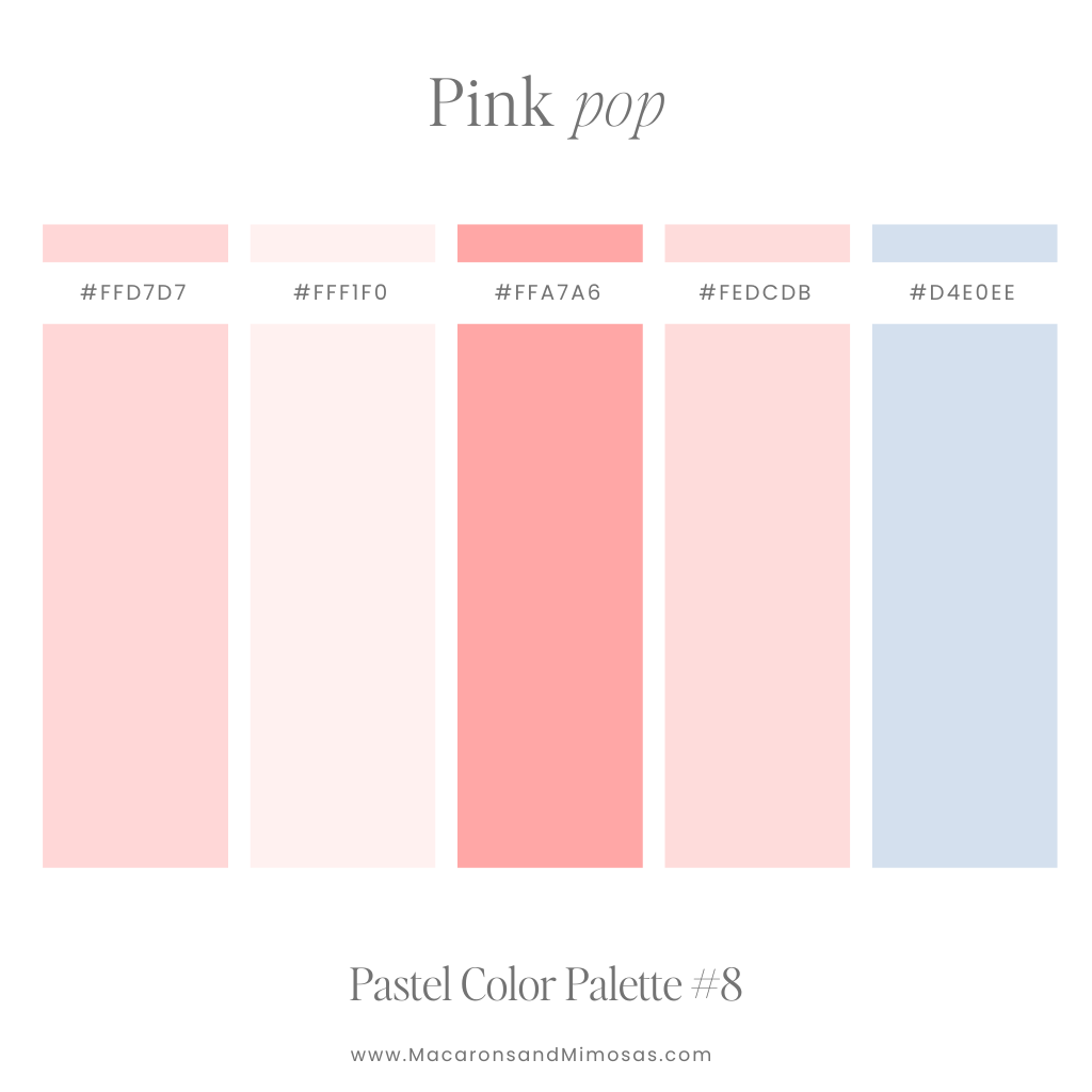
Pink Pop – Pink & Blue Pastel Color Palette
Vibrant pinks with a twist of blue bring modern energy to this palette. Ideal for bold branding, fashion campaigns, or eye-catching social media graphics.
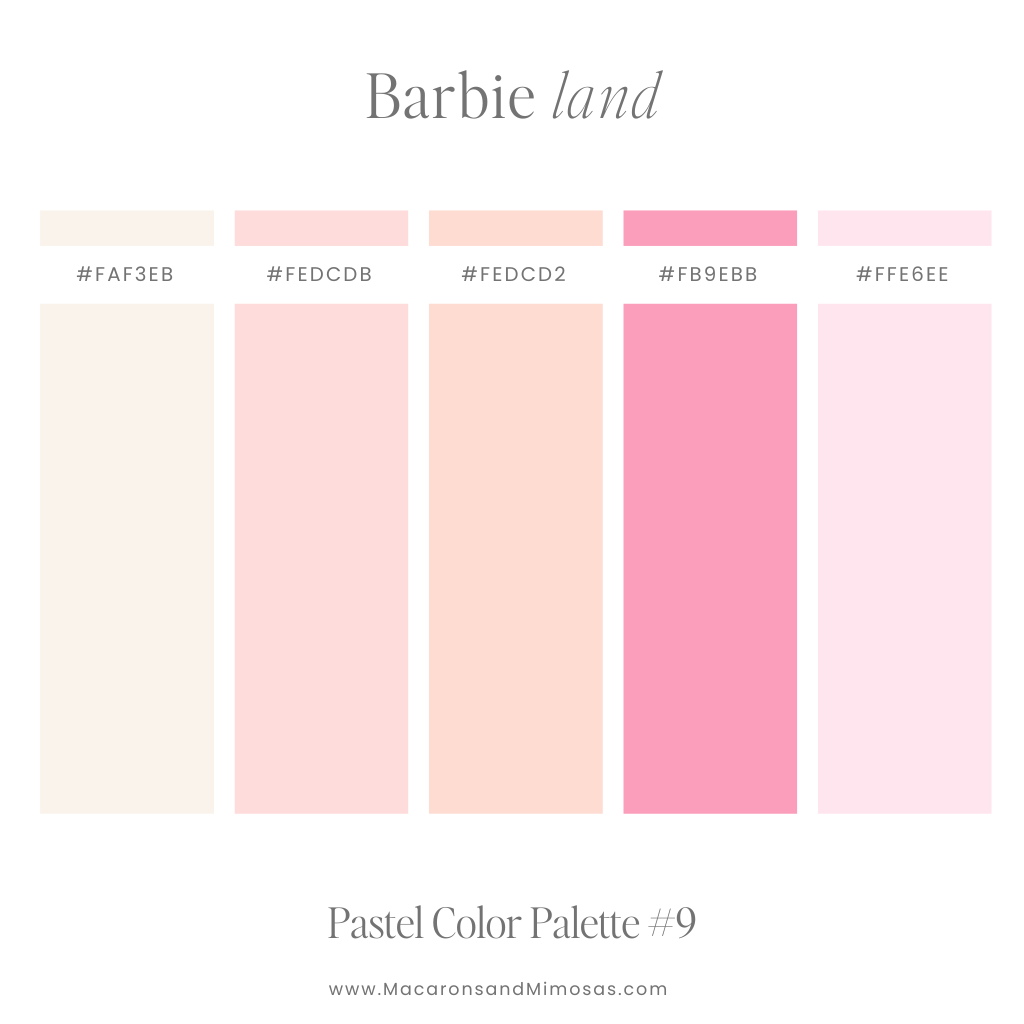
Barbie Land – Soft Pink Pastel Color Palette
Chic and nostalgic, this palette channels iconic Barbie glamour. Perfect for beauty branding, playful packaging, or vintage-inspired designs.
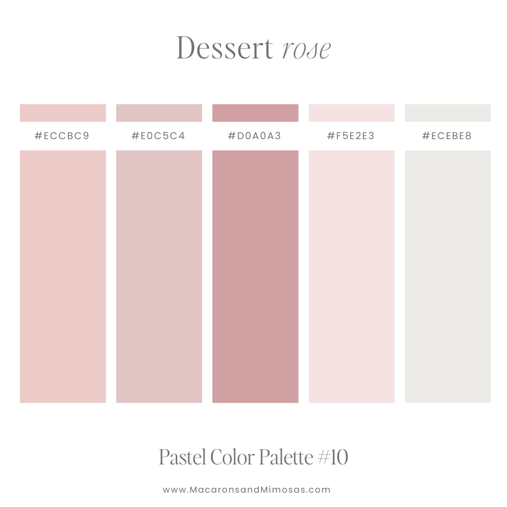
Desert Rose – Dusty Pink Tone Color Palette
Muted and elegant, these dusty pinks feel grounded and timeless. Ideal for minimalist branding, neutral wedding palettes, or natural product designs.
Can’t get enough of these pink palettes? Check these Girly color palettes out too!
Pastel Blue Color Palettes
Opting for a pastel blue color palette adds a serene and calm vibe to your brand, creating a peaceful atmosphere. The soft, muted tones of pastel blue are visually soothing, and its versatility allows for easy pairing with different colors, giving you plenty of creative options.
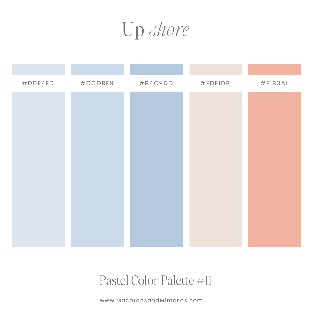
Up Shore – Blue & Coral Pastel Color Palette
Soft blues and coral tones bring the breezy calm of the coast to life. Perfect for beach-inspired designs, travel branding, or airy summer campaigns.
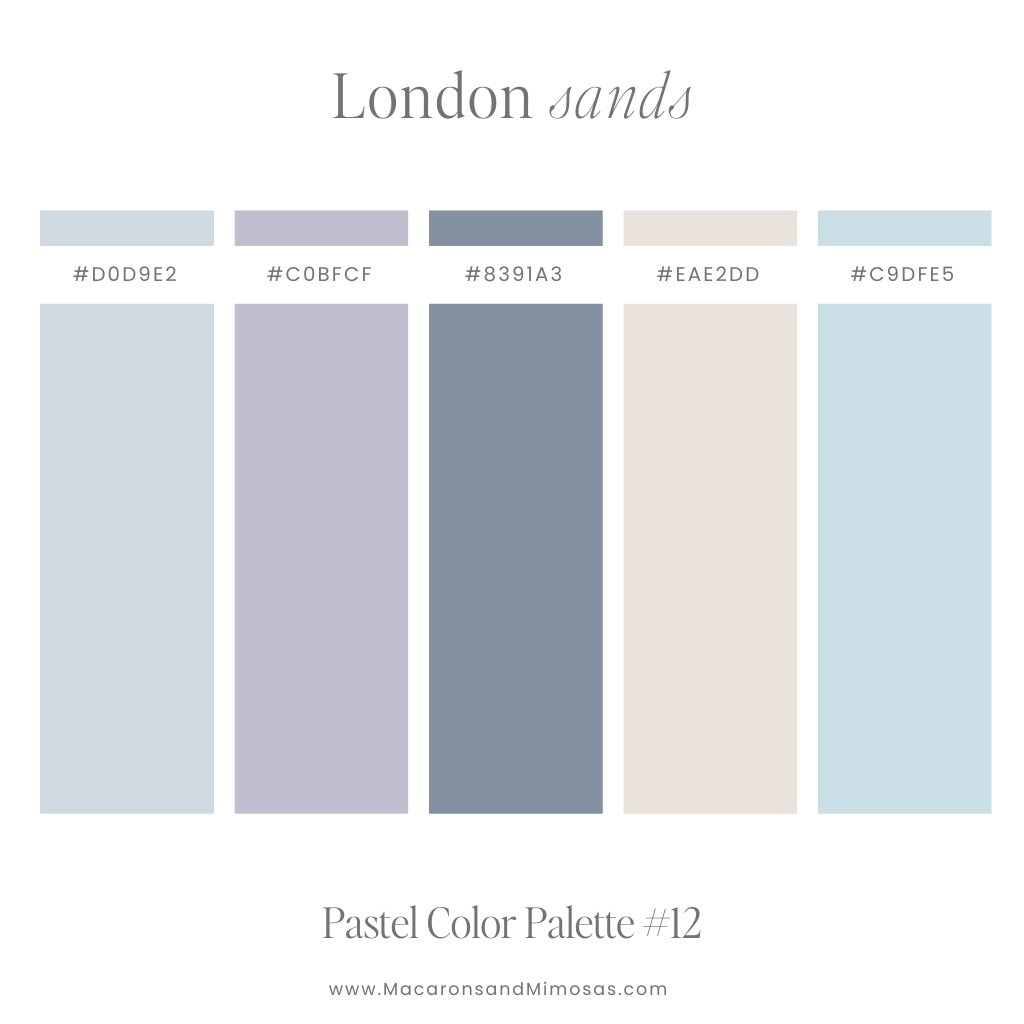
London Sands – Pastel Blue, Taupe & Purple Color Palette
Timeless and understated, this coastal-inspired palette feels both elegant and serene. Ideal for sophisticated branding, nautical themes, or calming digital spaces.
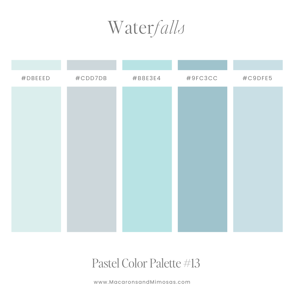
Waterfalls – Blue & Aqua Pastel Color Palette
A tranquil mix of blues and teals captures the essence of flowing water. Perfect for spa branding, wellness designs, or nature-inspired visuals.
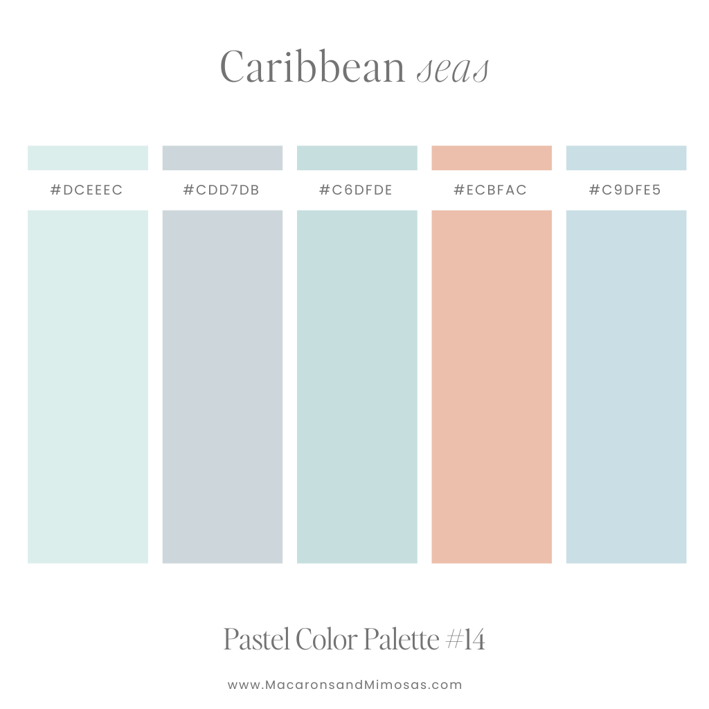
Caribbean Seas – Warm Pastel Color Palette
Vibrant yet calming, this tropical palette evokes the refreshing tones of the ocean. Ideal for summer-themed projects, island-inspired branding, or travel content.
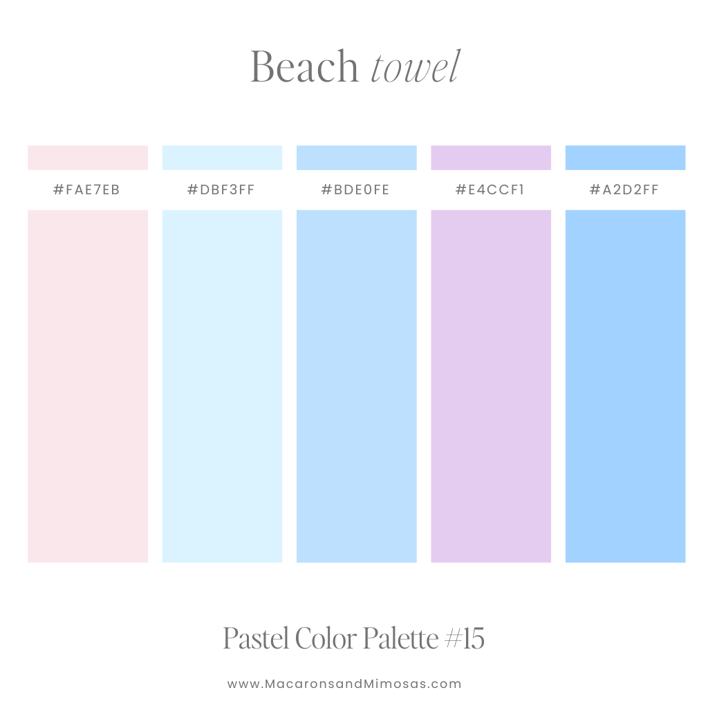
Beach Towel – Cool Pink, Purple & Blue Color Palette
Playful and sunny, this palette captures the happiness of a beach day. Perfect for vibrant social media posts, children’s designs, or travel campaigns.
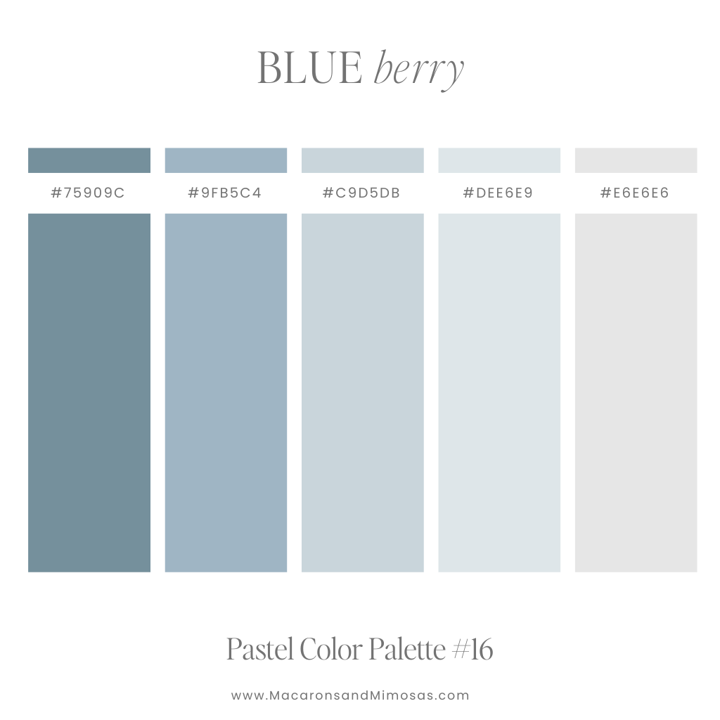
Blue Berry – Warm Blue Pastel Color Palette
Dusty blues and soft greys create a calm and grounded aesthetic. Ideal for rustic branding, winter designs, or timeless digital projects.
Pastel Green Color Palettes
Add a calm and soothing vibe to your brand, with a pastel green color palette, reminiscent of the freshness of spring. The soft tones add a gentle touch, creating a tranquil and harmonious atmosphere. Also, pastel green plays well with various colors, giving you endless design options.
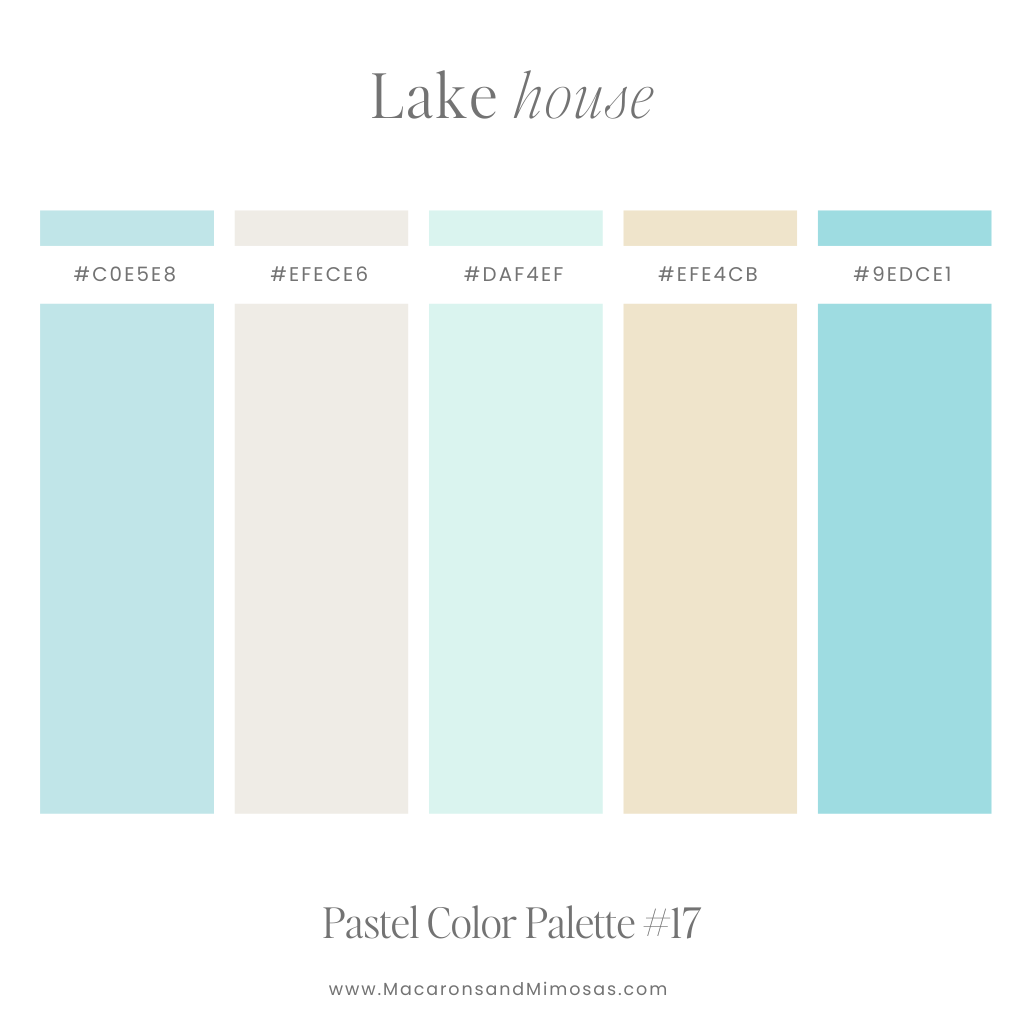
Lake House – Tropical Pastel Color Palette
Tranquil teals and earthy taupes create a serene, nature-inspired palette. Perfect for cozy home branding, outdoor lifestyle designs, or eco-friendly projects.
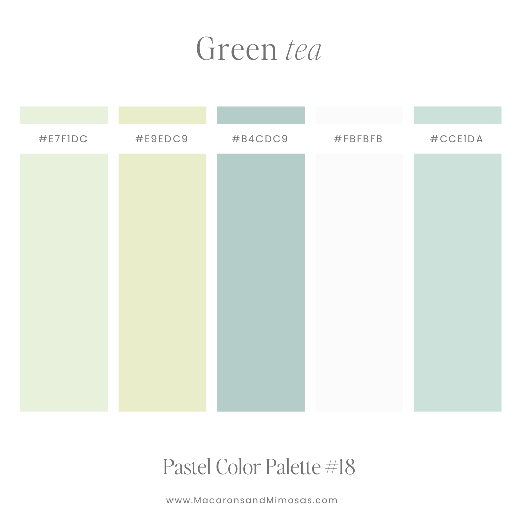
Green Tea – Earthy Pastel Color Palette
Soft greens with hints of brightness evoke the calming freshness of a tea garden. Ideal for wellness branding, botanical illustrations, or zen-inspired designs.
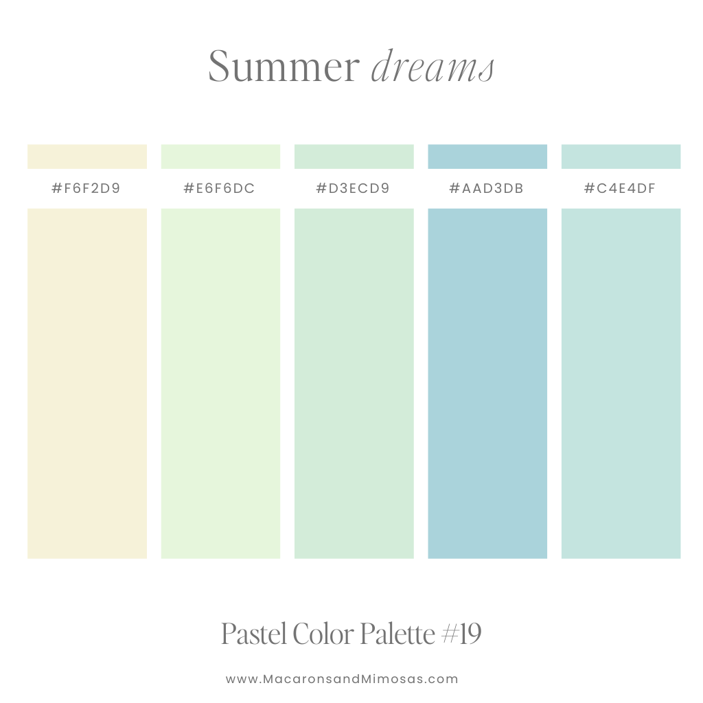
Summer Dreams – Fresh Green Pastel Color Palette
Lush greens and muted yellows bring a warm, nostalgic summer feel. Perfect for vibrant seasonal campaigns, garden-inspired projects, or playful designs.
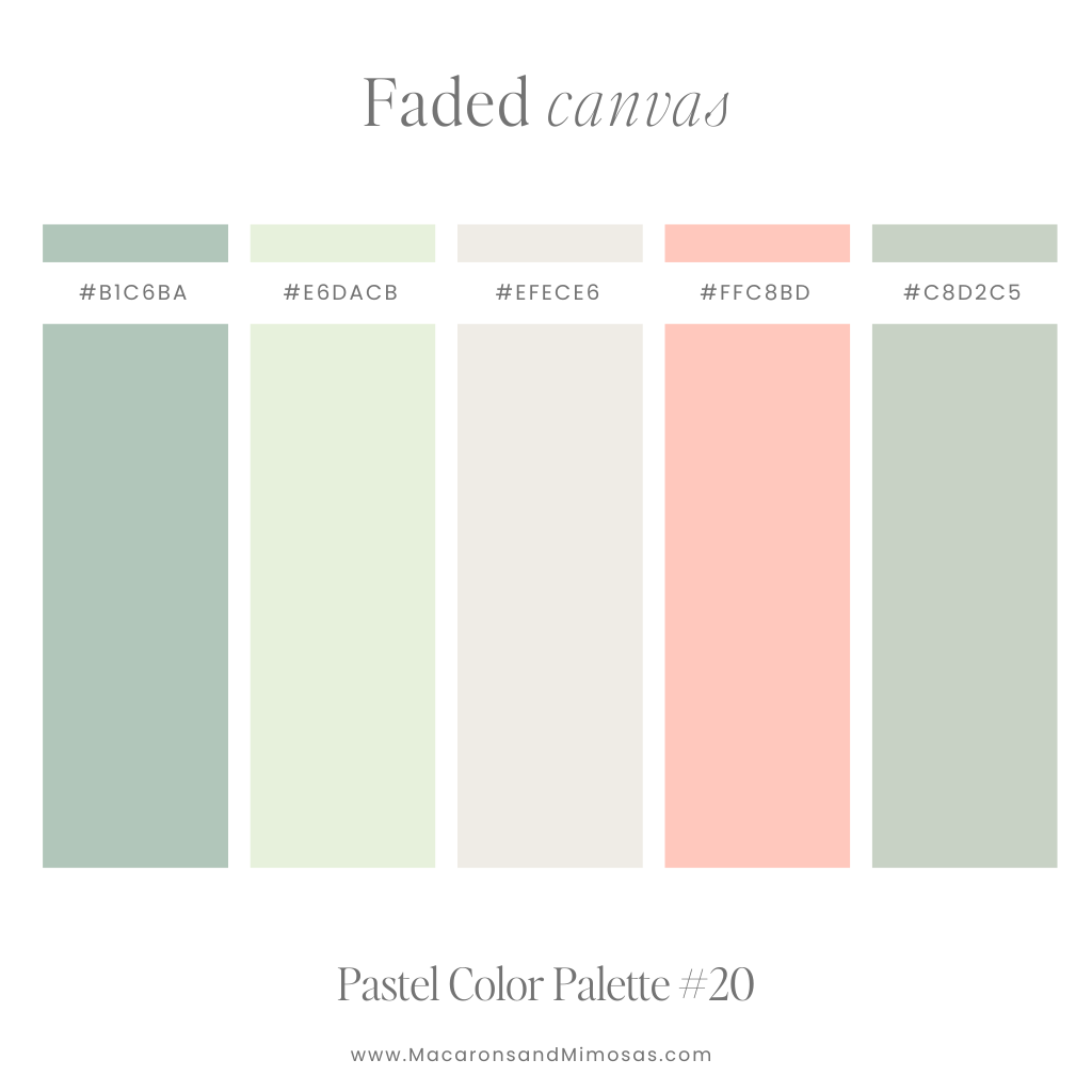
Faded Canvas – Retro Pastel Color Palette
Earthy greens paired with a pop of coral feel vintage yet fresh. Ideal for retro-inspired designs, organic branding, or rustic product packaging.
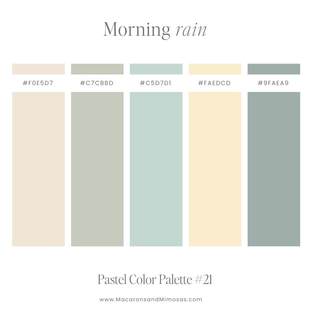
Morning Rain – Neutral Earth Tone Color Palette
Subtle greens and muted taupes evoke the soft tranquility of a misty morning. Perfect for minimalist designs, spa branding, or nature-inspired visuals.
Pastel Purple Color Palettes
A pastel purple color palette adds a touch of elegance and sophistication to your brand, thanks to the subtle charm of these softer shades. Plus, pastel purple is easy to mix and match with different colors, giving you a bunch of creative choices for your design.
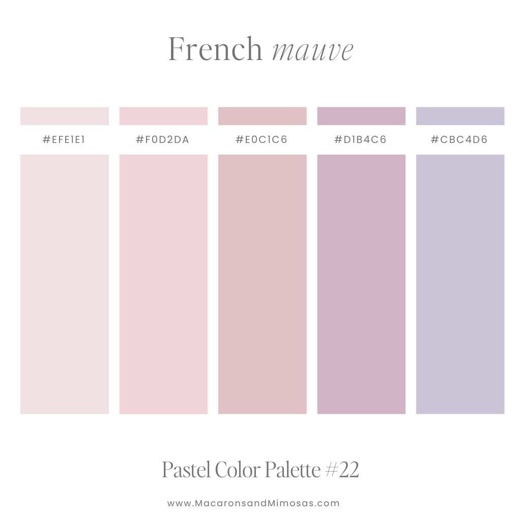
French Mauve – Muted Purple Pastel Color Palette
Delicate and muted, this palette exudes sophistication and elegance. Perfect for romantic branding, vintage designs, or dreamy event graphics.
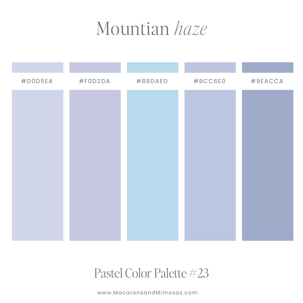
Mountain Haze – Blue & Purple Pastel Color Palette
Soft purples with a hint of blue capture the misty beauty of mountain ranges. Ideal for travel-inspired designs, calming graphics, or outdoor-themed projects.
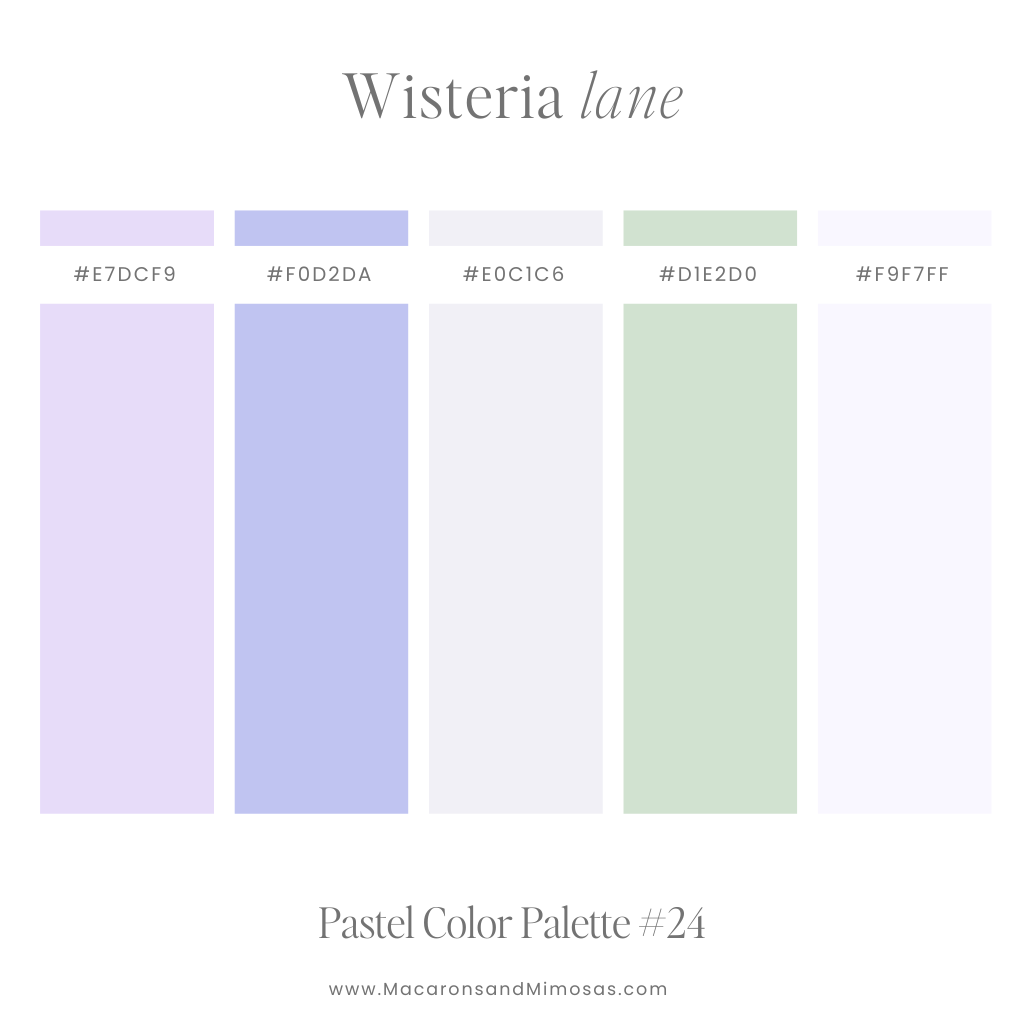
Wisteria Lane – Warm Purple & Green Color Palette
Pretty purples with pops of green feel like walking through a blooming garden. Perfect for botanical branding, wedding designs, or feminine digital content.
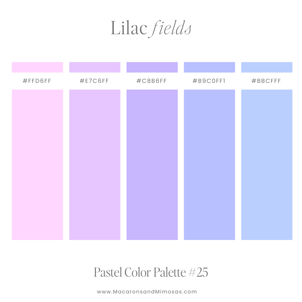
Lilac Fields – Soft Purple Color Palette
Bright and uplifting, this palette feels like the start of spring. Ideal for joyful event designs, seasonal branding, or cheerful social media posts.
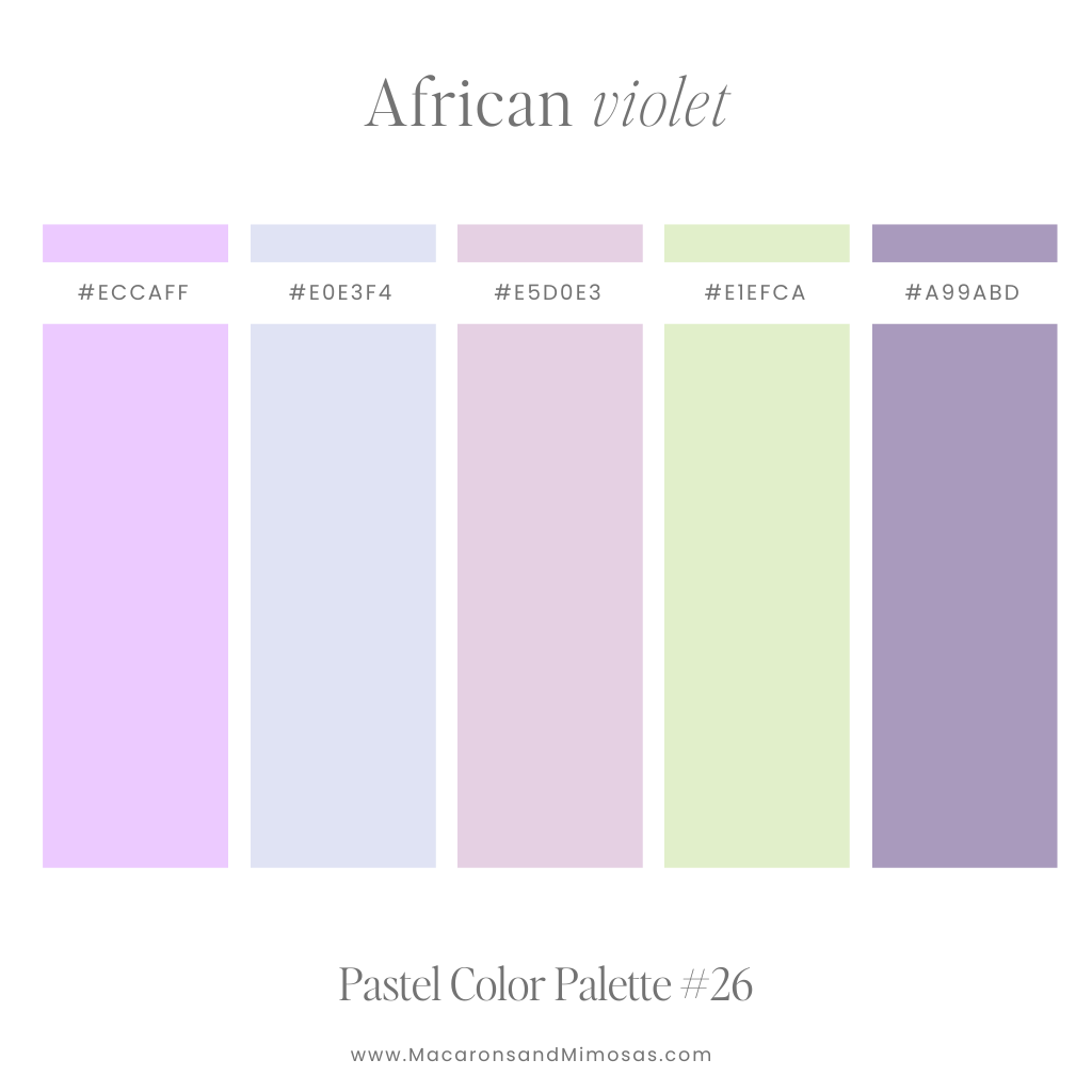
African Violet – Pastel Purple & Green Color Palette
Soft purples with subtle green tones create a grounded yet elegant aesthetic. Perfect for natural product branding, floral themes, or calming illustrations.
Neutral Color Palettes
Neutral pastel color palettes are all about soft, dreamy hues—think ivory, pale peach, and the coziest shade of taupe. They bring just the right amount of warmth without stealing the show, making them perfect for minimalist designs that still want a little personality. With their modern, effortlessly chic vibe, neutral pastels are a go-to for branding, website designs, and any project that calls for a touch of sophistication.
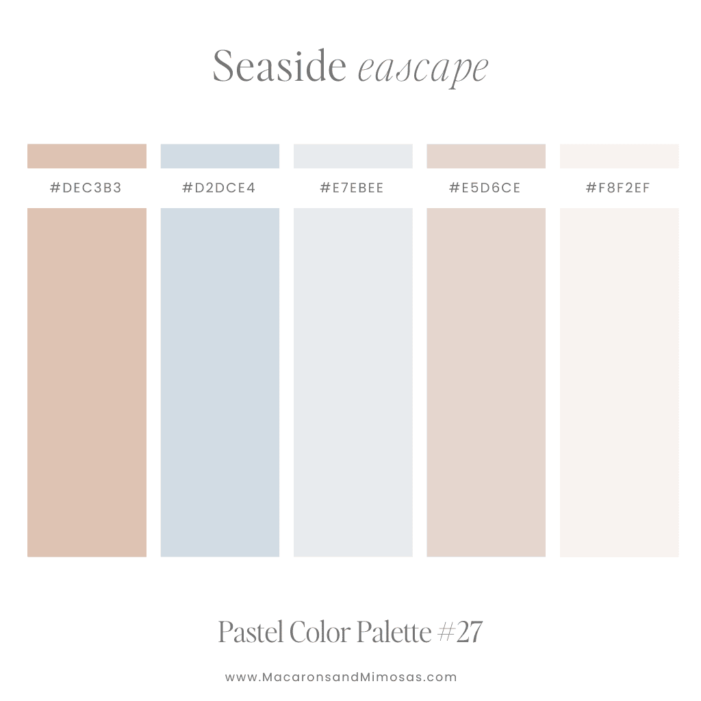
Seaside Escape – Neutral Pastel Color Codes
Soft corals, and baby blues with subtle beige tones create a grounded yet elegant aesthetic. Perfect for natural product branding, floral themes, or calming illustrations.
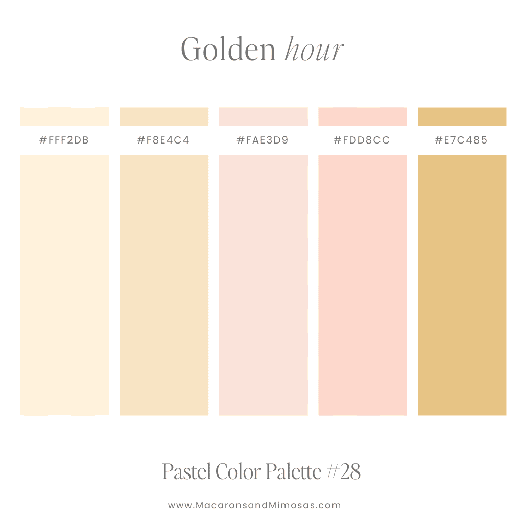
Golden Hour – Neutral Pastel Pink and Golds
Soft golden yellows and delicate pinks come together for a warm, natural glow. Perfect for branding that feels inviting, feminine, and effortlessly elegant.

Seaside Escape – Neutral Soothing Blue and Browns
A soothing blend of ocean blues and sandy browns, capturing the effortless beauty of the shore. Ideal for nature-inspired brands, beachy aesthetics, or timeless, grounded designs.
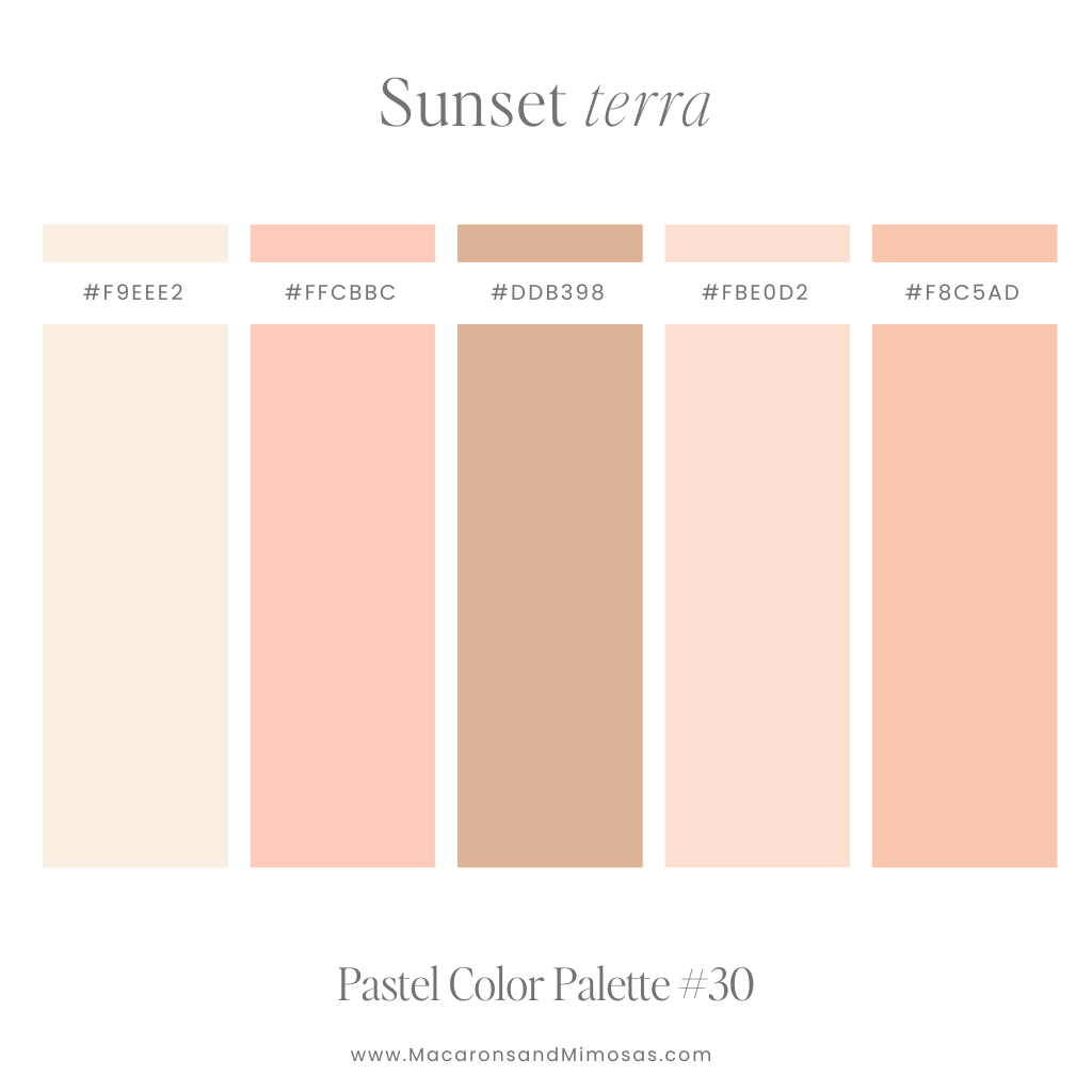
Sunset Terra – Neutral Corals and Browns
Warm corals and rich browns blend seamlessly to create a sun-drenched, earthy feel. Perfect for boho brands, cozy packaging, or any design that needs a warm, inviting glow.
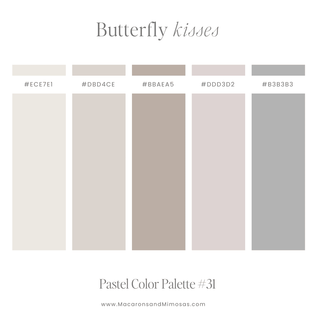
Butterfly Kisses – Neutral Mauves and Grey
Neutral beige meets dusky mauves and cool greys, creating a dreamy, understated palette. Perfect for minimalist brands, timeless designs, and elegant, calming aesthetics.
Pastel Color Names & Hex Codes (Quick Reference) 🌸
Looking for hex codes to build your own pastel color palette? Here’s a quick-reference chart of the most searched pastel shades—perfect for everything from packaging to Pinterest pins:
| Swatch | Color Name | Hex Code | RGB Value |
|---|---|---|---|
| Pastel Pink | #FFD1DC | rgb(255, 209, 220) | |
| Pastel Blue | #AEC6CF | rgb(174, 198, 207) | |
| Pastel Green | #B0E0A8 | rgb(176, 224, 168) | |
| Lavender (Soft Purple) | #E6E6FA | rgb(230, 230, 250) | |
| Light Peach | #FFE5B4 | rgb(255, 229, 180) | |
| Pale Yellow | #FFFACD | rgb(255, 250, 205) | |
| Mint | #AAF0D1 | rgb(170, 240, 209) | |
| Baby Blue | #BFEFFF | rgb(191, 239, 255) |
These hex codes are perfect if you’re looking for a pastel color chart to plug into Canva, Shopify, or your website’s CSS.
Looking for more pastel color inspiration? Scroll up to see full palettes you can swipe and customize for your brand!
FAQs: Pastel Color Codes + Branding Tips
What are the hex codes for pastel colors?
Pastel hex codes are soft, muted versions of primary and secondary colors. Examples include pastel pink #FFD1DC, pastel green #B0E0A8, and baby blue #BFEFFF. You can use these in Canva, Figma, or your website’s CSS for a dreamy, cohesive palette.
What is the difference between pastel and muted colors?
Pastel colors are typically soft, light shades created by adding white to pure hues, while muted colors include more gray, giving them a faded or vintage feel. Both are great for branding—but pastels tend to feel more playful and airy.
Can I use pastel colors for a bold brand?
Yes! Pastels don’t have to be soft and sweet. When paired with strong typography, high-contrast elements, or unexpected layouts, they can still pack a punch—while keeping your brand aesthetic polished and modern.
What’s the best way to test a pastel color palette before launching?
Use a moodboard! A visual collage can help you see how your pastel colors work together with your fonts, logo, and product photos. You can grab my free moodboard template here to get started.
Are pastel colors good for small business branding?
Absolutely. Pastels are popular among product-based businesses (like skincare, candles, art prints, and apparel) because they feel soft, approachable, and modern. Just make sure your palette aligns with your audience and price point.
What are your thoughts on our pastel color palette combinations? Which pastel color palette is your favorite?
While creating a beautiful pastel palette is pretty straightforward, the task of selecting the perfect colors for your brand might feel a bit overwhelming. If you’re facing challenges in choosing the right color scheme for your brand, fear not – Macarons and Mimosas is here to assist! Feel free to reach out for a tailor-made custom brand design.
✨ Looking for something bolder? Check out my Bright Color Palettes for bold, eye-catching combos—or explore my Canva Font Pairing Guide to match your new palette with the perfect fonts.
And if you want to build your brand visuals from scratch, don’t miss the free moodboard template waiting inside The Creative Vault. 💌
✨ Updated for 2025: More pastel hex codes, branding tips, and color combos added!