The Power of Colors in Your Brand

Color isn’t just decoration; it’s a whole vibe! 🎨 The color psychology chart can reveal so much about how hues connect emotionally with your audience. Think of colors as little ambassadors for your brand, each whispering its own story. And with a splash of color theory knowledge, you’ll have the tools to pick a palette that’s not only trendy but totally you!
Why Colors Matter (So Much!)
Colors say everything before you even have to! Your brand’s colors don’t just make things pretty; they tell potential clients who you are and how you’ll make them feel. Let’s break down the color psychology chart and see how these hues can transform your brand vibes.
Here’s a sneak peek into color magic:
- Pink: Sweet, playful, and a little dreamy—a favorite for brands wanting to evoke warmth and compassion.
- Blue: Chill, dependable, and reassuring—perfect for those aiming to build trust.
- Yellow: Joyful, optimistic, and welcoming, giving off major positive energy!
1) Stand Out from your Competitors
Your colors are your brand’s signature, helping you stand out like the unique gem you are. Even if Pinterest’s trending colors are tempting, your palette should focus on being memorable and aligned with your vibe. The color psychology chart can help you choose shades that capture your brand’s personality—no blending in allowed!
2) Connect with Your Audience
The secret weapon? Color theory. By identifying your values and target audience, you can choose colors that make clients feel instantly connected. Want a warm, inviting feel? Shades of peach or blush might be perfect! Each color on the color psychology chart can evoke a distinct feeling that brings clients closer to your brand.
3) Evoke Emotions with the Best Brand Colors
Ever noticed how yellow feels cheerful or blue feels calm? That’s color theory in action. Each hue can stir up emotions, so pick colors that match the mood you want for your brand. Imagine clients landing on your site and immediately feeling uplifted, inspired, or empowered—all thanks to the colors you chose thoughtfully.
4) Think Long-Term
A timeless palette means a timeless brand. Sure, trends come and go, but building a brand on intentional colors keeps it fresh for years. When you use the color psychology chart to select shades with meaning, you’re investing in a brand story that won’t need a makeover every season. Plus, it’s a solid way to foster loyalty and recognition over time.
Picking Colors that Last
Trends are great, but your brand deserves a long-lasting vibe. With a solid color psychology chart, you’ll confidently choose colors that truly reflect your style while using color theory to guide each choice.
Diving into Color Psychology & Feelings
| Pink | affection, optimism, gentleness, compassion | |
| Red | ambition, love, strength, power, attention, passion | |
| Orange | optimistic, creative, energy, confidence, curiosity | |
| Yellow | luxury, creativity, ambition, mystery, sensitivity | |
| Gold | success, wealth, tradition, wisdom, valuable | |
| Brown | earthy, comforting, longevity, friendly, stability | |
| Green | fresh, kindness, prosperity, balance | |
| Blue | patience, wisdom, tranquility, loyalty, integrity | |
| Light Blue | peace, imagination, protection, healing, wisdom | |
| Purple | luxury, creativity, ambition, mysterious, sensitivity | |
| Grey | luxury, creativity, ambition, mysterious, sensitivity | |
| White | purity, clean, fresh, imagination, goodness | |
| Black | protection, dramatic, elegance, nobility, authority |
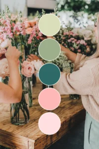
Trending color palettes
Apply this strategic approach to every aspect of your brand’s design, when creating your color palette. Learn how to create your brand color palette to stand out and attract more of your ideal clients in 2024. The right colors can make all the difference in establishing a memorable brand that resonates with your audience.
More Posts You Might Like…
More Posts You Might Like…


