Soft Summer Color Palette Ideas: 30 Dreamy Combos
Looking for that perfect Soft Summer Color Palette for your brand, website, or creative project? You’re in the right sunny spot. Whether you’re craving muted pinks, dusty greens, or ocean-inspired tones, this post is full of swoon-worthy color combos to inspire your next design move.
I’ve rounded up 30 summer color palettes that feel fresh, timeless, and totally on-brand. The first 16 are all about those Light Summer Colors—think soft corals, seafoam blues, creamy peaches, and delicate florals. Then I add a splash of bright summer joy with 14 bolder palettes that still play nice with your aesthetic.
You’ll also find ideas on how to use each palette for branding, website design, social media, or even your fashion and lifestyle content. (Hello, color magic!)
What is a Summer Color Palette?
A Soft Summer Color Palette blends gentle, dusty shades with cool undertones and a romantic, breezy vibe. These aren’t the loud neons or harsh contrasts of summer’s flashiest moments — they’re the rosé on the patio, ocean breeze at dusk, and linen dress in a wildflower field kind of colors.
They’re perfect for:
- Websites with an elegant, feminine, or wellness vibe
- Brands that want softness, calm, and sophistication
- Creatives who love muted tones with a touch of whimsy
- Pink and green color palette lovers (yes, we see you!)
🌸 16 Soft Summer Color Palettes You’ll Swoon Over
Here’s your dose of pastel sunshine with a breezy twist — each one has a personality and a purpose. Scroll through, screenshot your faves, and get inspired.
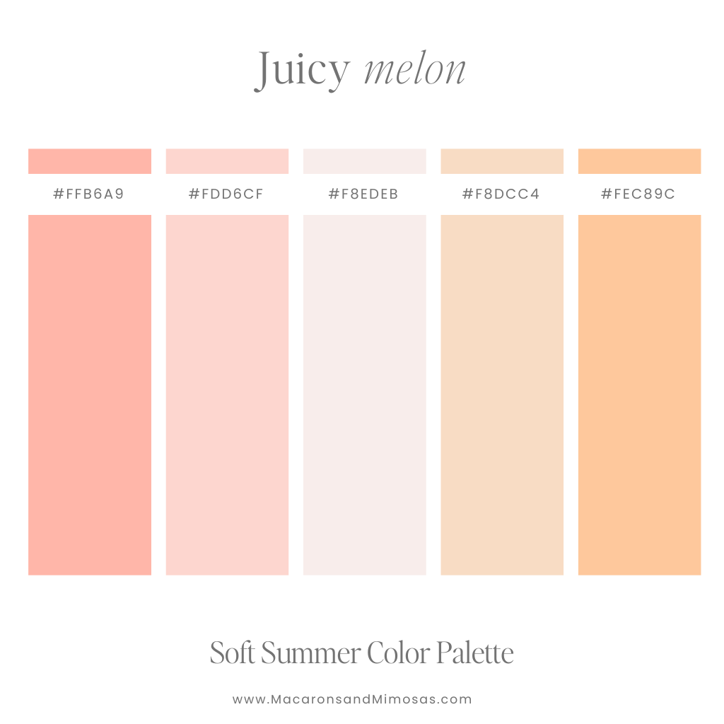
1. Juicy Melon
Vibe: Sweet, fresh, and peachy-perfect
Use it for: Beauty brands, lifestyle blogs, Instagram feeds with a feminine glow
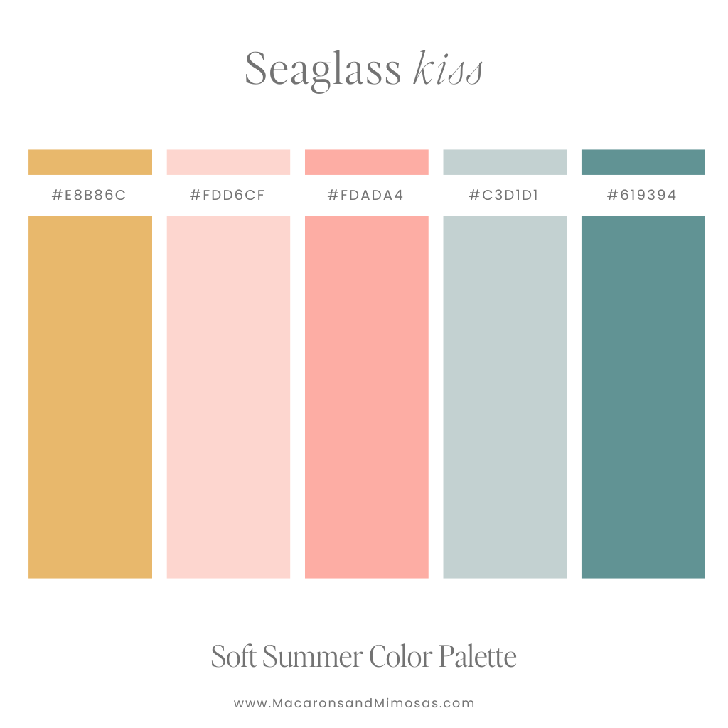
2. Seaglass Kiss
Vibe: Dusty teal, muted mustard, soft pinks — like a beach day in slow motion
Use it for: Website accents, packaging, and branding with a coastal twist
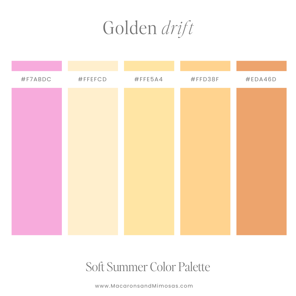
3. Golden Drift
Vibe: Bubblegum pink, soft yellows, and orange sorbet hues
Use it for: Content creators, playful brands, product-based shops
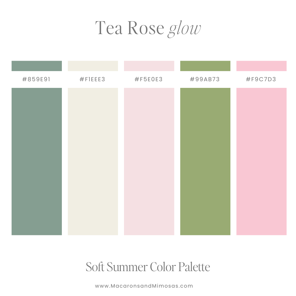
4. Tea Rose Glow
Vibe: Think garden party at golden hour — pinks, creams, soft leafy greens
Use it for: Wedding vendors, photographers, floral brands
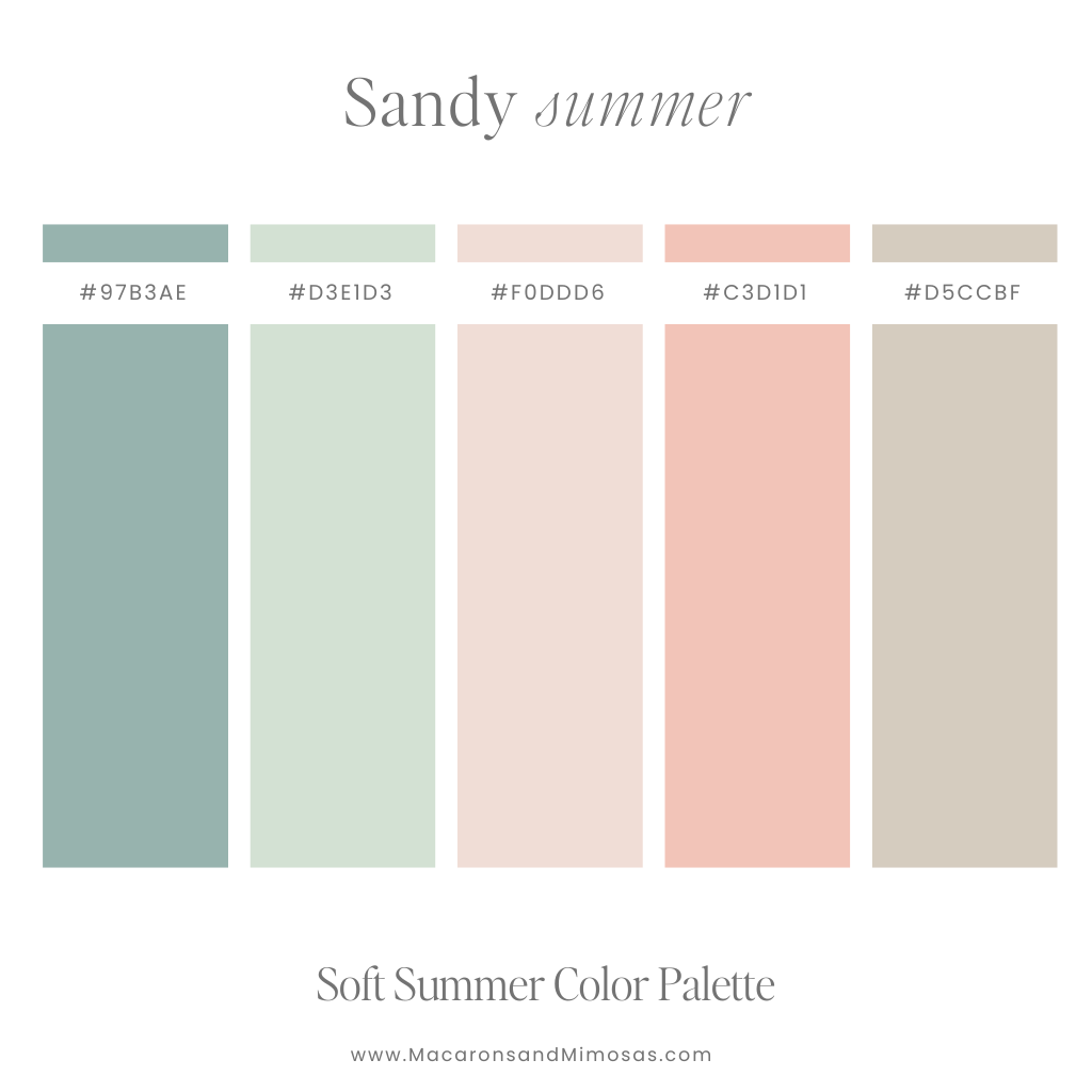
5. Sandy Summer
Vibe: Soft corals, sandy beige, and sun-faded greens
Use it for: Boho brands, interior blogs, boutique shops
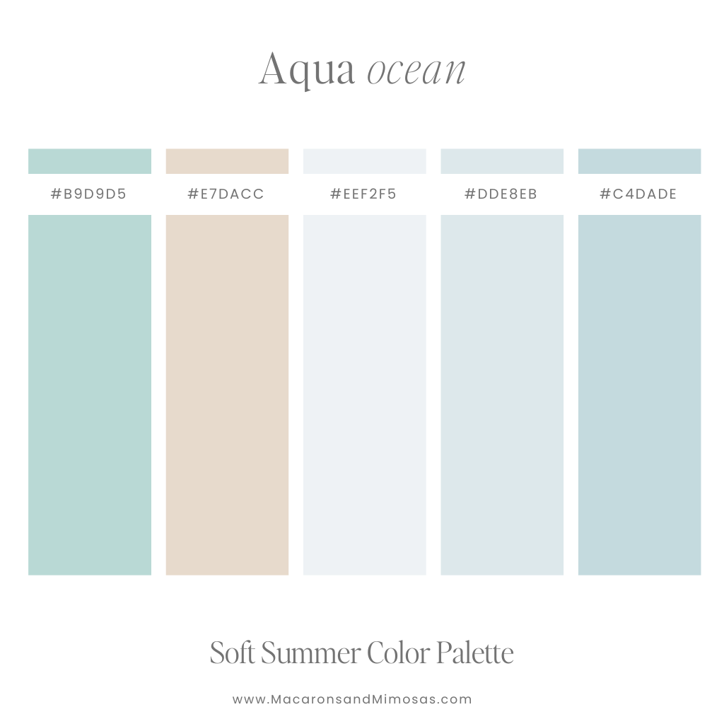
6. Aqua Ocean
Vibe: Breezy blues and greens with a mellow, spa-like vibe
Use it for: Wellness brands, skincare, yoga instructors
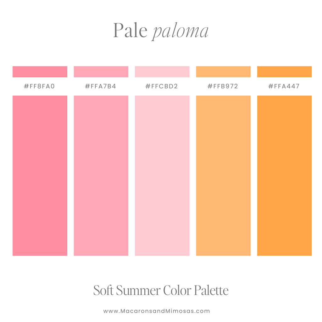
7. Pale Paloma
Vibe: A zesty twist on soft — oranges, peaches, and blush pink
Use it for: Food bloggers, travel brands, drinkware or candle labels
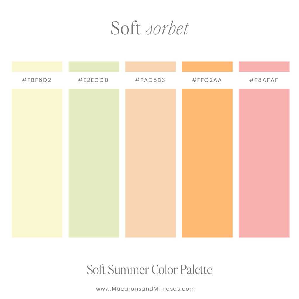
8. Soft Sorbet
Vibe: Muted citrus with a pastel pink swirl
Use it for: Instagram grid designs, feminine product packaging, fun moodboards
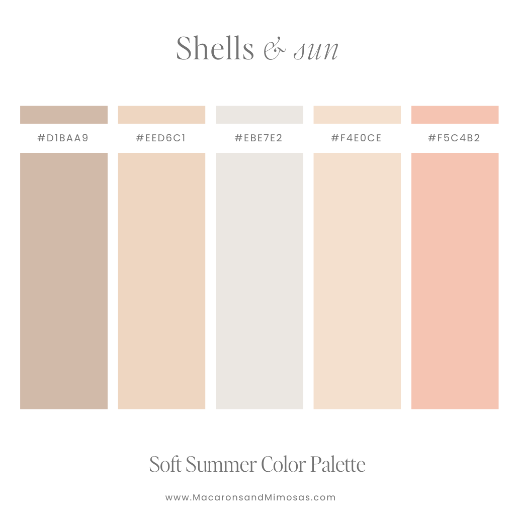
9. Shells & Sun
Vibe: Muted coral, soft pinks, driftwood browns
Use it for: Beachwear brands, Etsy shops, natural skincare
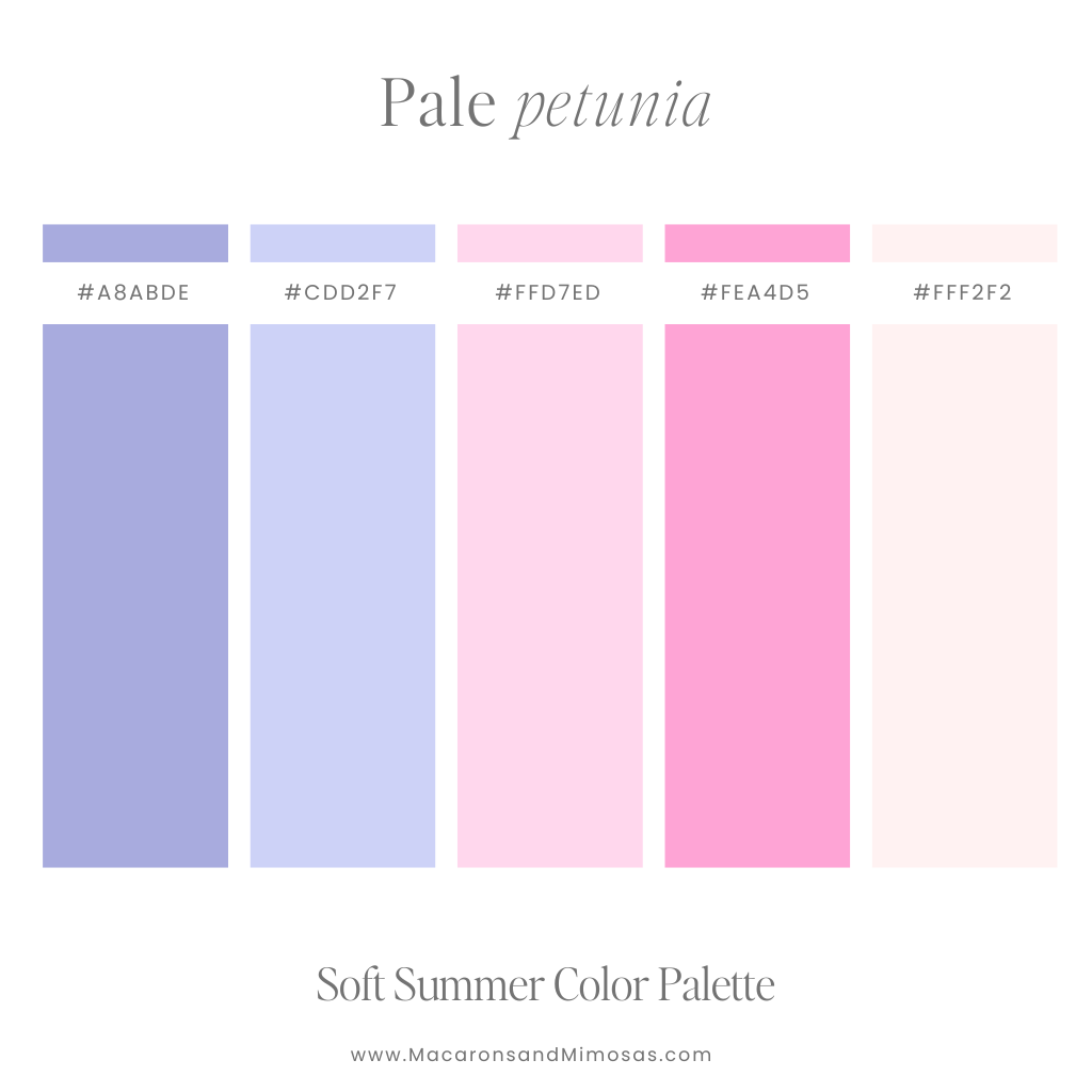
10. Pale Petunia
Vibe: Lavender haze, pink petals, and cream
Use it for: Fashion brands, wedding creatives, pastel-loving planners
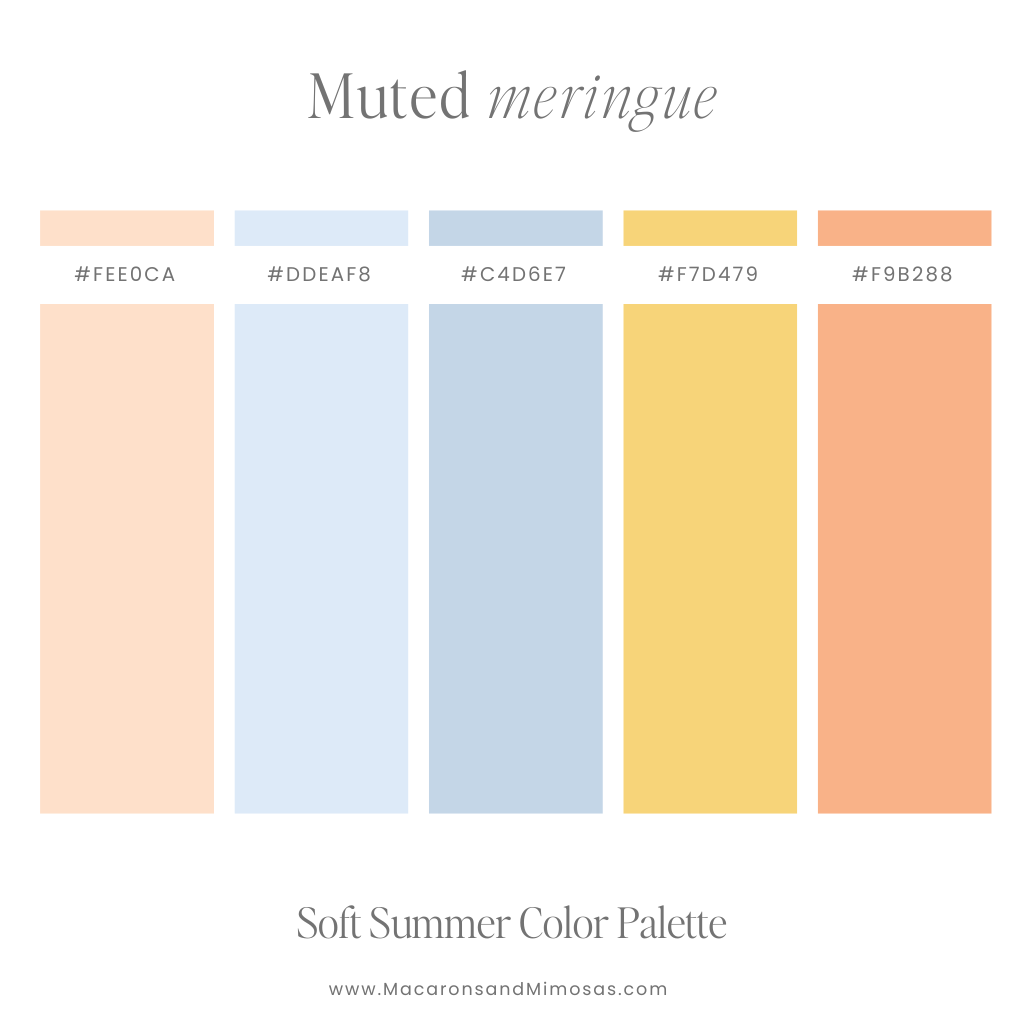
11. Muted Meringue
Vibe: Soft blues with a kiss of peach and coral
Use it for: Coastal brands, paper goods, lifestyle design
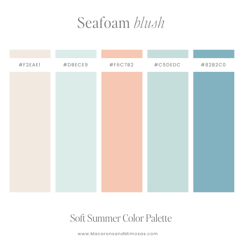
12. Seafoam Blush
Vibe: Sea greens and pinks, like a mermaid’s day off
Use it for: Wellness, coaching brands, minimalist moodboards
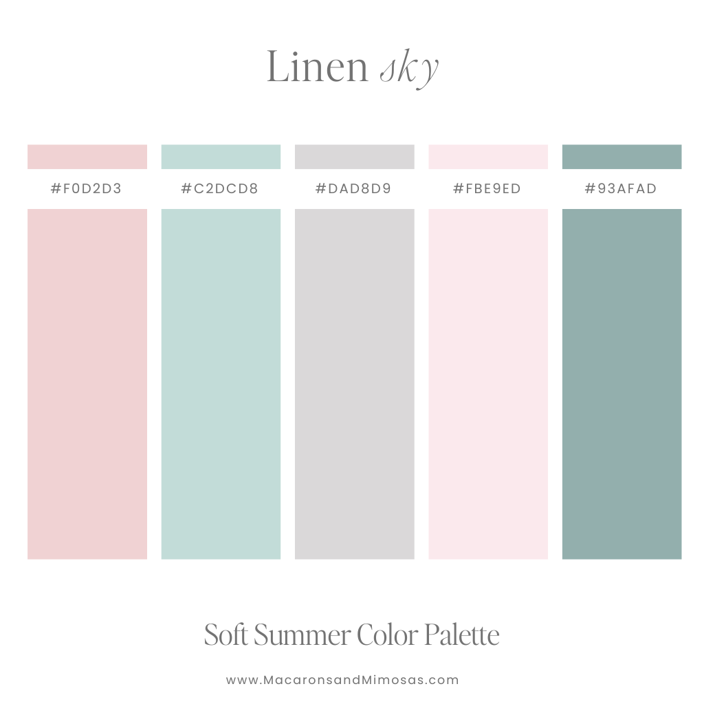
13. Linen Sky
Vibe: Dusty purple meets pink clouds and sage green
Use it for: Clean brand design, aromatherapy, calming digital products
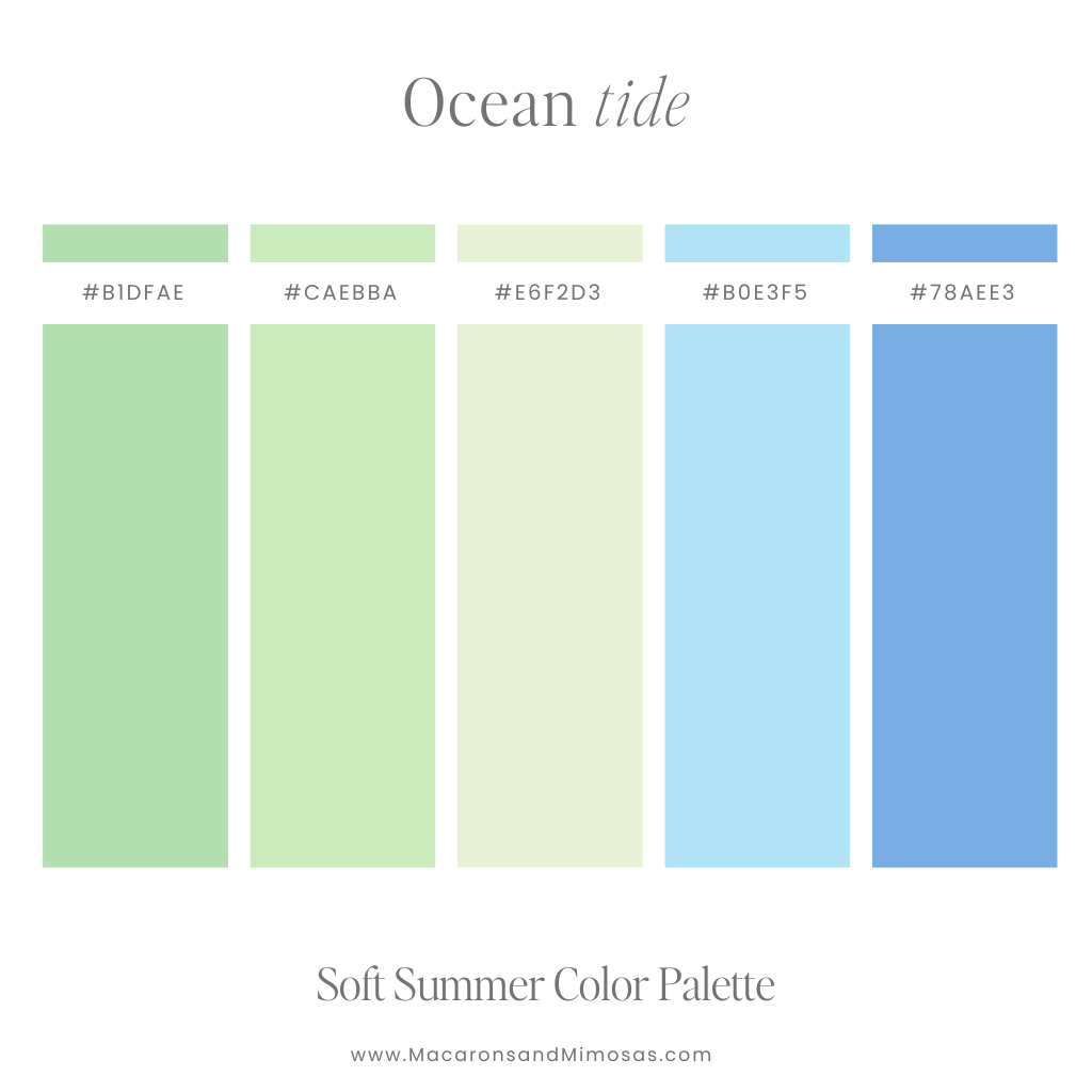
14. Ocean Tide
Vibe: Deep sea blues and mellow greens
Use it for: Male-friendly brands, nature content, eco themes
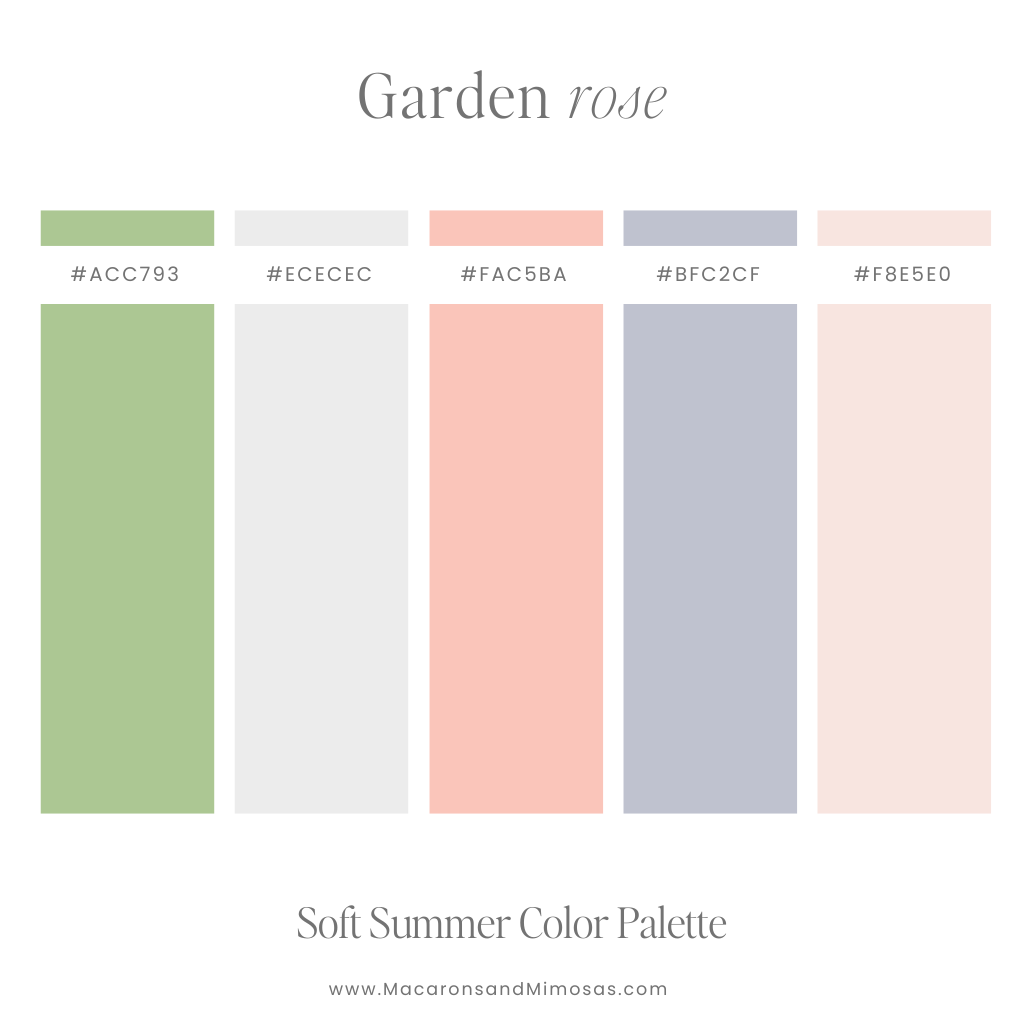
15. Garden Rose
Vibe: Soft pinks, muted green leaves, a hint of lavender
Use it for: Floral businesses, stationery brands, romantic site themes
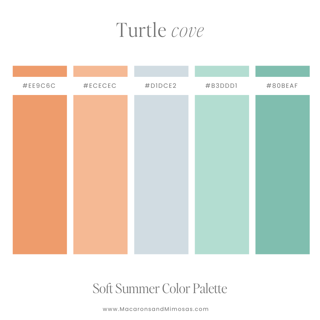
16. Turtle Cover
Vibe: Earthy peaches, soft orange, dusty teal
Use it for: Sustainable brands, handmade shops, outdoor content creators
Where to Use These Light Summer Colors
These Soft Summer Color Palettes are more than just pretty — they’re strategic. Try them in:
- Website color schemes (headers, buttons, backgrounds)
- Instagram highlight covers or story templates
- Branding kits for small businesses or creatives
- Packaging and labels for candles, skincare, or handmade goods
- Moodboards for seasonal content or product shoots
- Fonts and overlays on Pinterest pins or Reels
And yes — they also work beautifully for fashion styling, capsule wardrobes, and interior moodboards. #MultitaskingColors
☀️ 14 Bright Summer Color Palettes That Pop (Bonus Combos!)
Because even soft girls have their bold moments — here are 14 Bright Summer Color Palettes to spice things up. These Summer Colors bring energy, personality, and a whole lotta sunshine to your brand or website.
They’re playful, scroll-stopping, and designed to catch the eye — while still pairing beautifully with softer tones if you’re into mixing vibes.
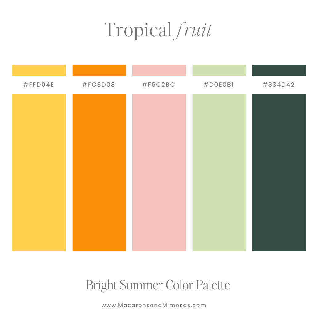
17. Tropical Fruit
Vibe: Bold orange, hot pink, and zesty green — like a smoothie in palette form
Use it for: Bold branding, creative agencies, online shops with a Gen Z vibe
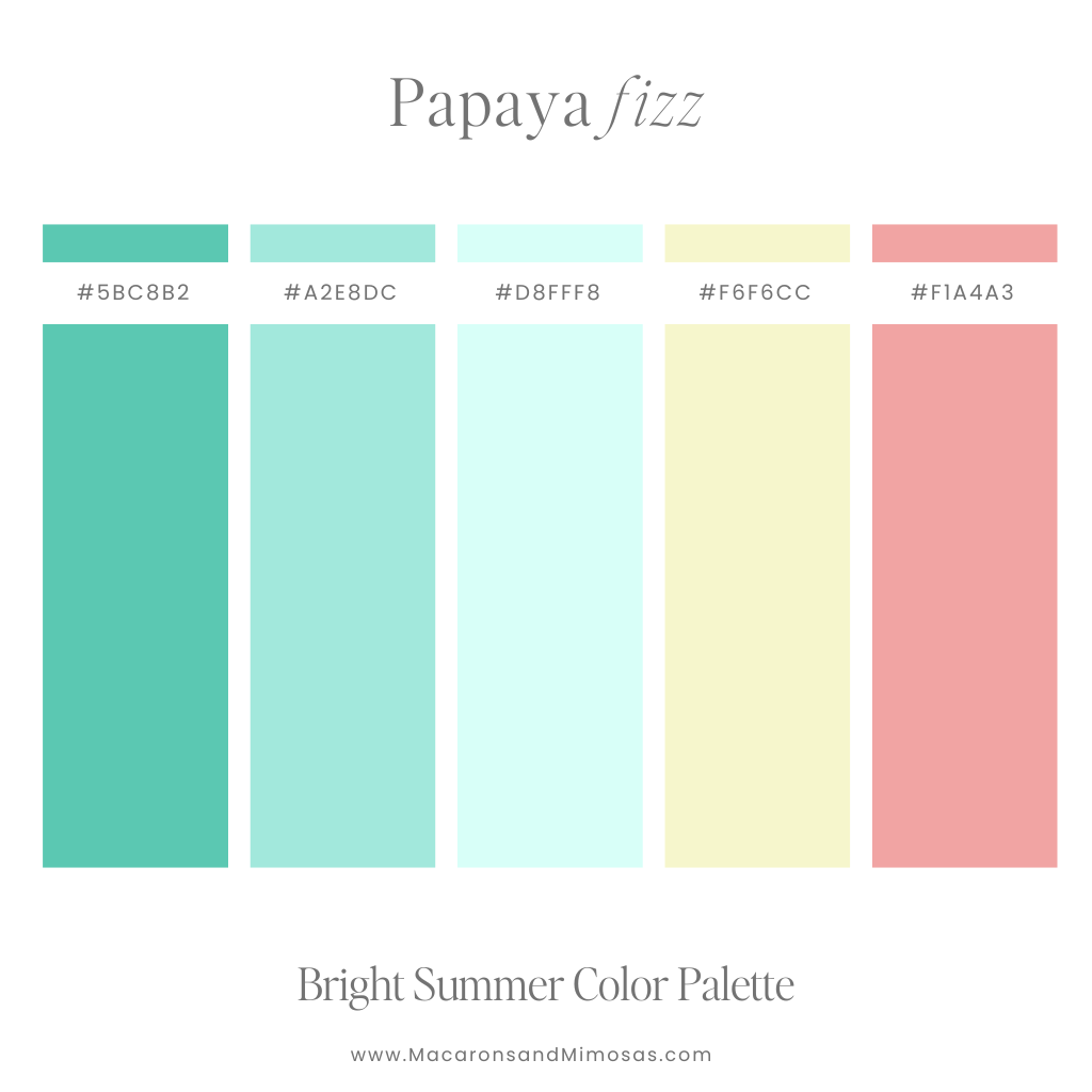
18. Papaya Fizz
Vibe: Pink meets mellow green and citrusy yellow
Use it for: Coaches, course creators, tropical-themed branding

19. Electric Guava
Vibe: Bright pink, orange, and yellow that says LET’S GO
Use it for: Instagram carousels, digital product sales pages, beauty brands
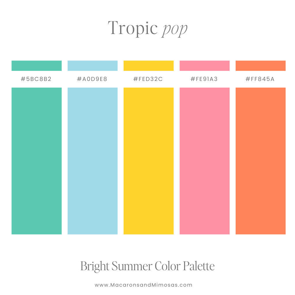
20. Tropic Pop
Vibe: Palm green, sunny yellow, vibrant pink and teal
Use it for: Clothing brands, podcast covers, playful packaging
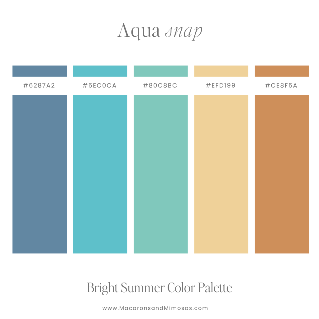
21. Aqua Snap
Vibe: Teal blues, ocean greens, and sandy neutrals
Use it for: Beachy brands, travel blogs, calming but vibrant design
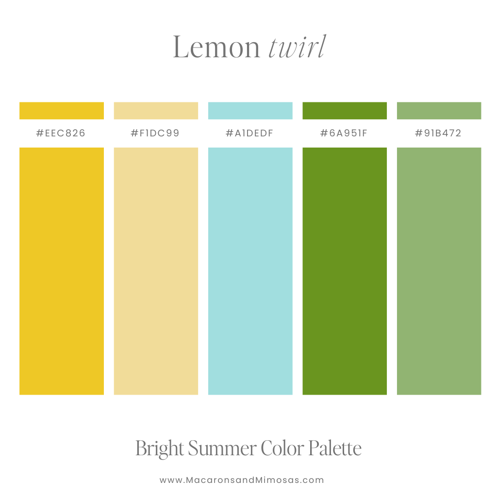
22. Lemon Twirl
Vibe: Bright yellow with cool green and pops of soft blue
Use it for: Wellness sites, online courses, summer product launches
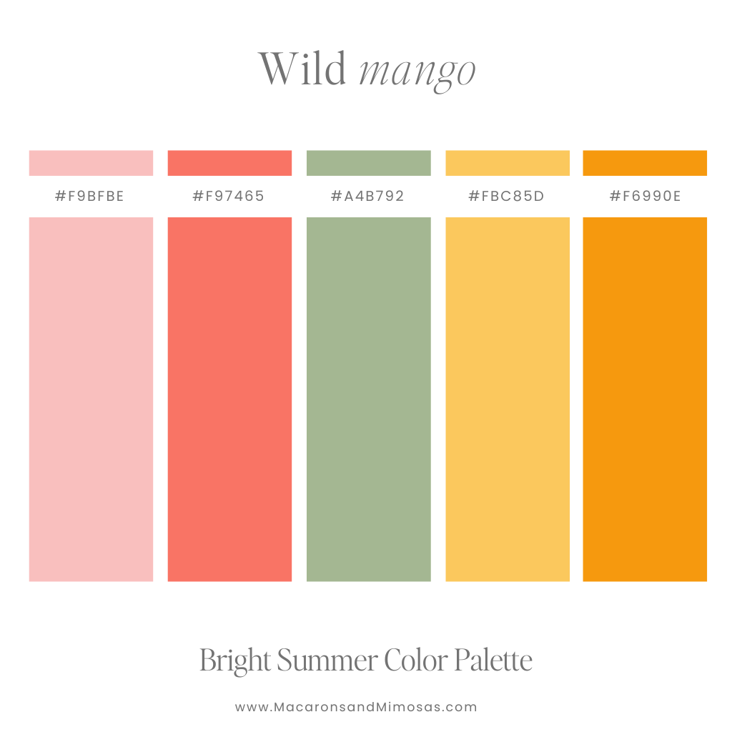
23. Wild Mango
Vibe: Hot pink, coral, green, orange, and yellow — total fruit salad energy
Use it for: Fun-focused brands, planners, food/beverage packaging
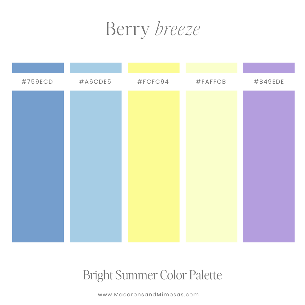
24. Berry Breeze
Vibe: Juicy blues, purples, and a swirl of lemon
Use it for: Beauty brands, journals, feminine sites with an edge
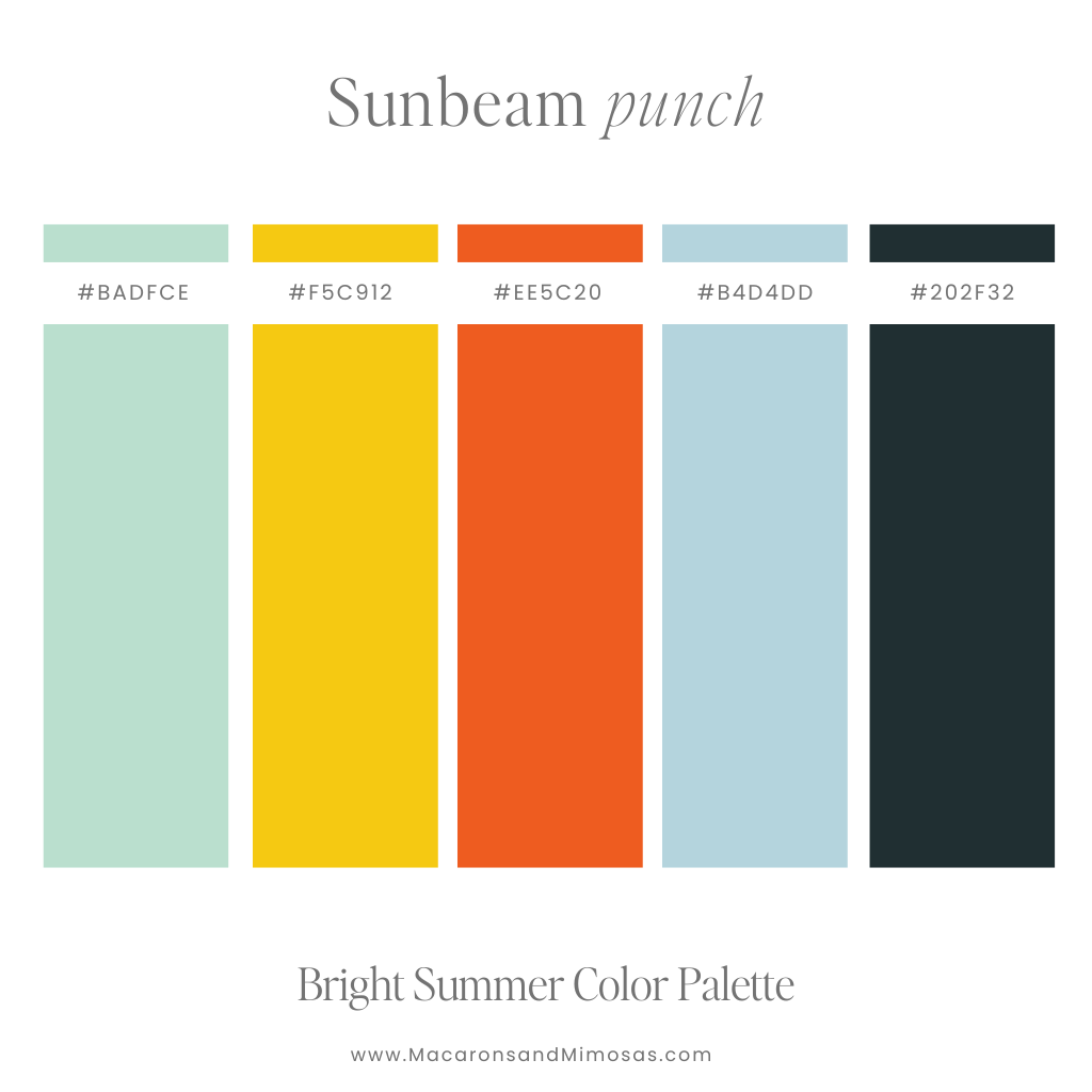
25. Sunbeam Punch
Vibe: Orange, yellow, and blues with a kick
Use it for: Bold business sites, creators, fun printables
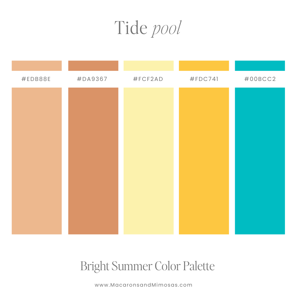
26. Tide Pool
Vibe: Deep teal, sea green, and beachy sand tones
Use it for: Surf brands, lifestyle blogs, sustainable shops
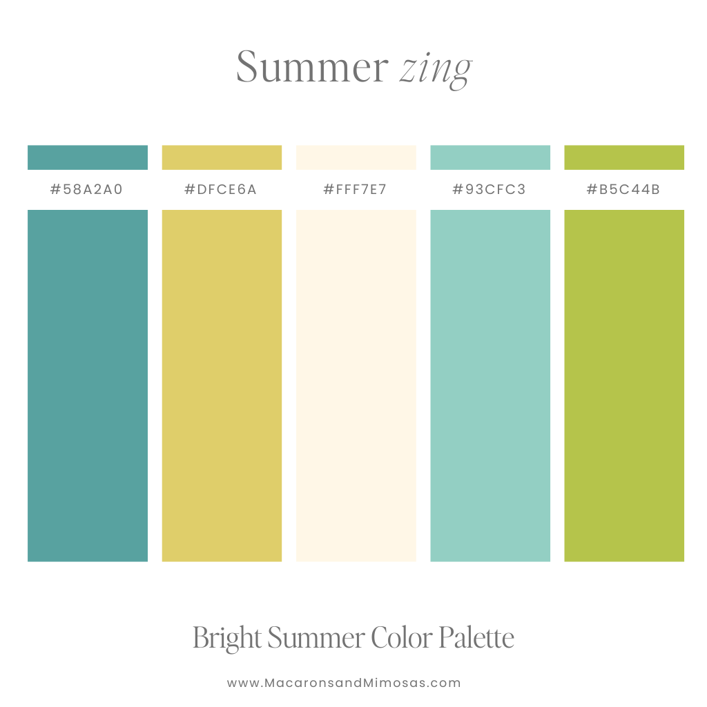
27. Summer Zing
Vibe: Green and teal with citrus undertones
Use it for: CPG brands, Shopify stores, wellness themes
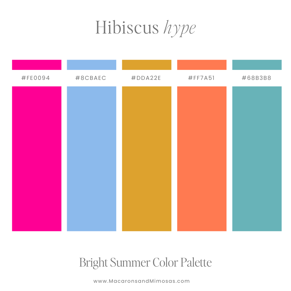
28. Hibiscus Hype
Vibe: Hot pink, coral, and bright blue
Use it for: Bold skincare brands, subscription boxes, sassy social templates
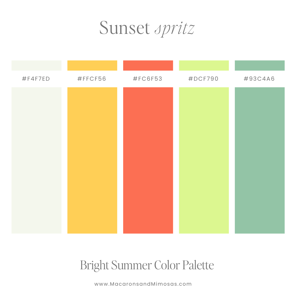
29. Sunset Spritz
Vibe: Oranges and greens with a soft neutral base
Use it for: Calm but colorful brands, travel content, summer promos
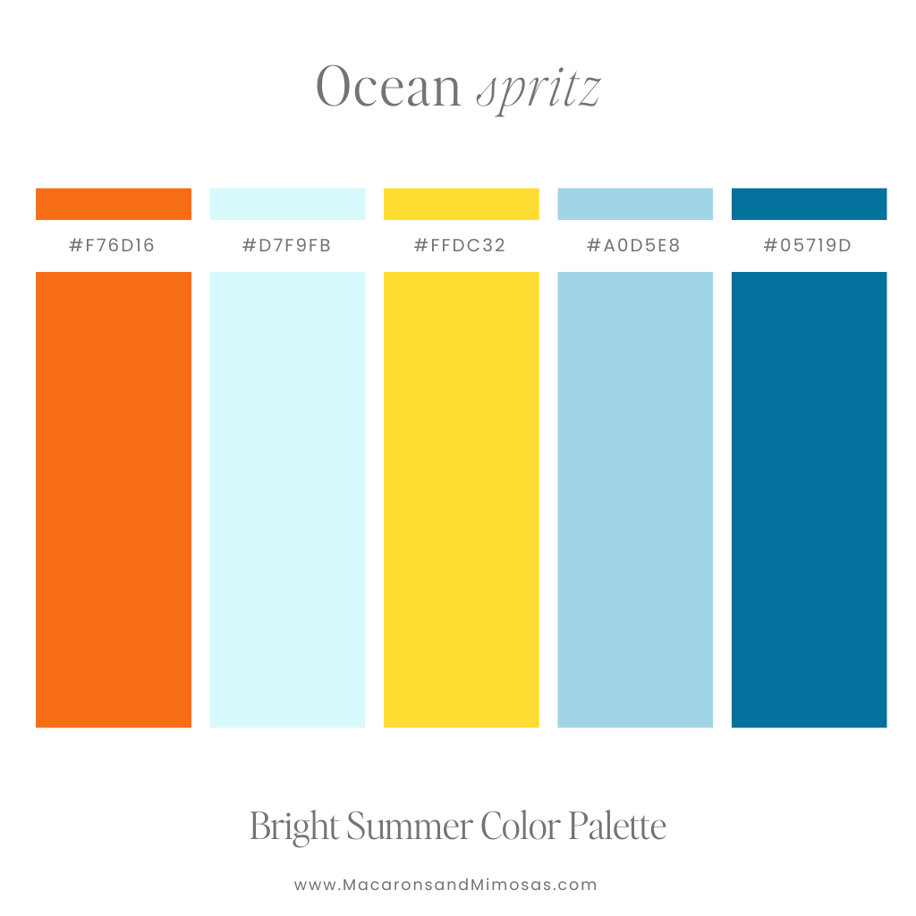
30. Ocean Spritz
Vibe: Blue meets yellow and orange in a seaside sparkle
Use it for: Creative portfolios, content creators, beach-loving brands
Bright Color Combos for Branding
These Bright Summer Color Palettes are your go-to for:
- Bold branding moments (hello, CTA buttons!)
- Launching a product or promotion
- Adding movement to a homepage design
- Highlighting key areas in a social media template
- Creating contrast when paired with soft summer tones
- Pinterest graphics that stop the scroll
And yep, they’re just as fun for summer wardrobes, vibrant email graphics, or tropical flat-lays for your socials.
Color You Later, Summer Lover
Whether you’re Team Soft or Team Bold, one thing’s for sure — your summer just got a whole lot more colorful. ☀️
From breezy beach neutrals to colors with a side of extra, these Soft Summer Color Palettes (and their brighter BFFs) give you all the tools to build a color-forward, scroll-worthy brand. Whether you’re dreaming up a rebrand, launching a product, or just giving your site a glow-up, there’s a pink and green color palette (or 12!) ready to make your vision pop. Check our more Pastel brand colors here.
Need help picking the perfect combo for your site or socials? Drop a comment or email me — I live for this kind of color magic 🌈✨
xoxo, your color-obsessed bestie 💕