The Best Shopify Fonts Pairings

When it comes to creating a memorable and effective Shopify store, every design element plays a crucial role in shaping the customer experience. Among these elements, fonts stand out as a key factor that influences not only the aesthetic appeal of your site but also its usability and brand perception. In this blog post, we’ll delve into why fonts matter, how they impact your Shopify store’s overall design and experience, and explore 18 powerful font pairings that can elevate your brand to new heights.
The Importance of Fonts in Shopify Stores
Fonts are more than just text; they are a visual representation of your brand’s voice and personality. The right font choice can evoke emotions, guide the reader’s eye, and enhance the overall readability of your content. On the other hand, a poor font choice can make your store look unprofessional, confuse visitors, and even drive them away. Here’s why selecting the right fonts for your Shopify store is critical:
- Brand Identity: Fonts help to establish and reinforce your brand identity. Whether you want to convey luxury, modernity, or playfulness, your choice of fonts will communicate these attributes to your audience.
- Readability: A well-chosen font ensures that your content is easily readable across all devices. This is especially important for mobile users, who make up a significant portion of online shoppers.
- User Experience: Fonts play a significant role in creating a smooth and enjoyable user experience. Consistent and well-paired fonts guide users through your site, making it easy for them to navigate and absorb information.
- Emotional Impact: Different fonts evoke different emotions. For example, serif fonts like Georgia Pro can evoke trust and tradition, while sans-serif fonts like Poppins convey modernity and simplicity.
The Power of Font Pairings
Font pairings are essential in creating visual harmony on your Shopify store. For fonts to work well together, they need to offer enough visual contrast to establish a clear hierarchy on your site. Combining two fonts that complement each other can make your content more engaging and aesthetically pleasing. Luckily, the 18 font pairings below are available right in Shopify’s font library, which you can access in the Theme Settings of your theme customizer. This means you don’t need to upload any custom font files—you can pick and use these fonts directly from Shopify’s platform. Plus, some of these fonts are Google Fonts, which you can download and use for free.
Luckily, the 18 font pairings below are available right in Shopify’s font library, which you can access in the Theme Settings of your theme customizer. This means you don’t need to upload any custom font files—you can pick and use these fonts directly from Shopify’s platform. Plus, some of these fonts are Google Fonts, which you can download and use for free.
Looking for a theme that pairs perfectly with your chosen fonts? Explore our collection of Shopify themes designed to complement your store’s unique style.
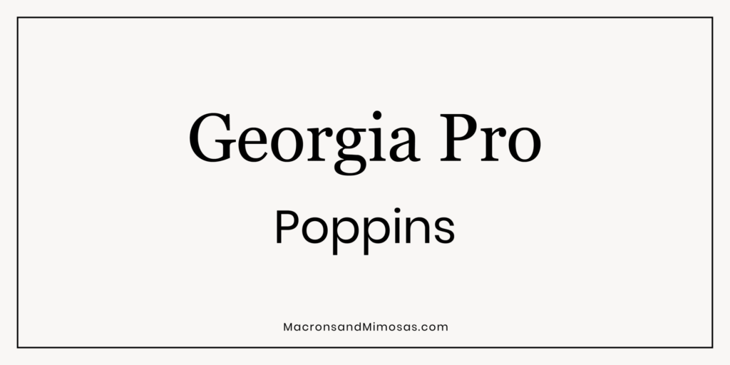
Georgia Pro + Poppins
This classic pairing combines the timeless elegance of Georgia Pro with the clean, modern lines of Poppins. Ideal for brands that want to balance tradition with a contemporary edge.
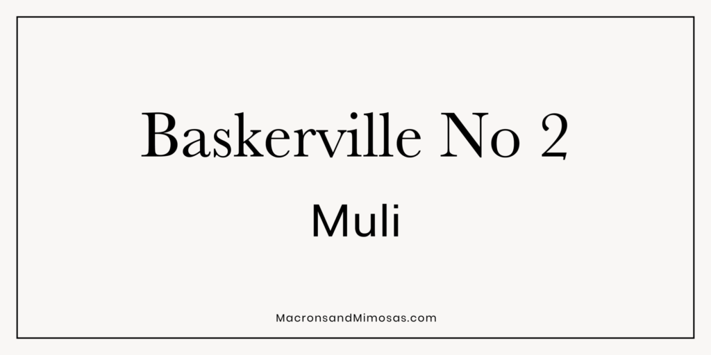
Baskerville No 2 + Muli
Baskerville No 2’s sophisticated serif pairs beautifully with Muli’s minimalistic sans-serif style. This combination works well for stores that want to convey a sense of refinement and simplicity.
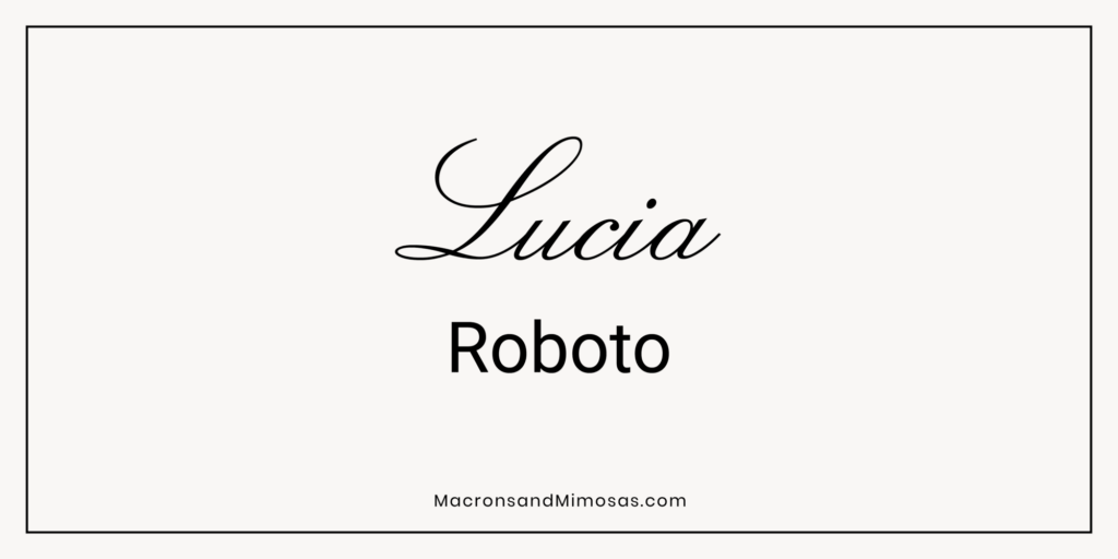
Lucia + Roboto
Lucia’s unique character combined with Roboto’s geometric precision creates a dynamic contrast that’s perfect for brands seeking a blend of creativity and structure.
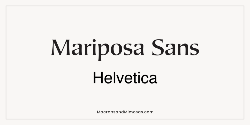
Mariposa Sans + Helvetica
The playful curves of Mariposa Sans contrast nicely with the straightforward and neutral Helvetica, making this pairing great for brands that want to inject a bit of fun into their professionalism.
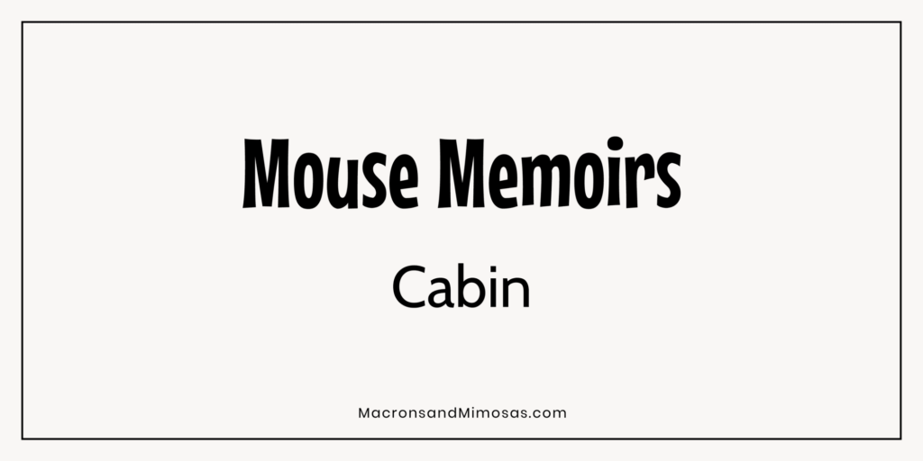
Mouse Memoirs + Cabin
This pairing brings together the whimsical charm of Mouse Memoirs with the robust and versatile Cabin, ideal for brands that cater to a younger, more creative audience.
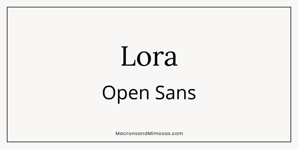
Lora + Open Sans
Lora’s elegant serif pairs with the widely popular Open Sans, creating a balance between classic and modern aesthetics, perfect for versatile brands.
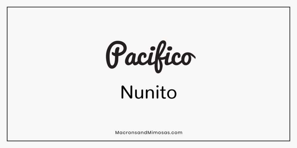
Pacifico + Nunito
Pacifico’s casual script paired with Nunito’s rounded sans-serif style offers a friendly and approachable feel, ideal for lifestyle and casual brands.
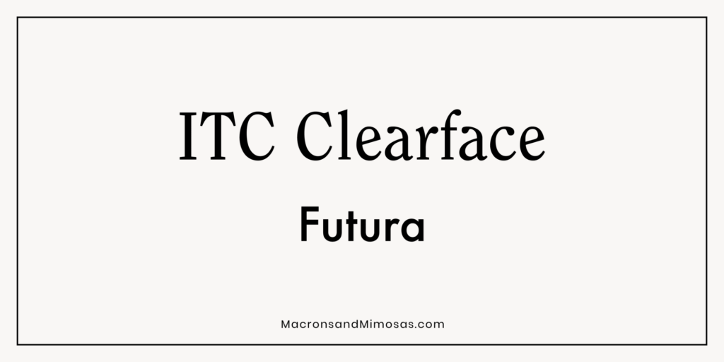
ITC Clearface + Futura
This pairing combines ITC Clearface’s warmth with Futura’s futuristic appeal, making it a great choice for brands that want to convey both heritage and innovation.
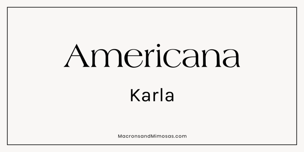
Americana + Karla
The Americana typeface brings a vintage flair that’s perfectly complemented by Karla’s contemporary simplicity, making it a great choice for nostalgic yet modern brands.
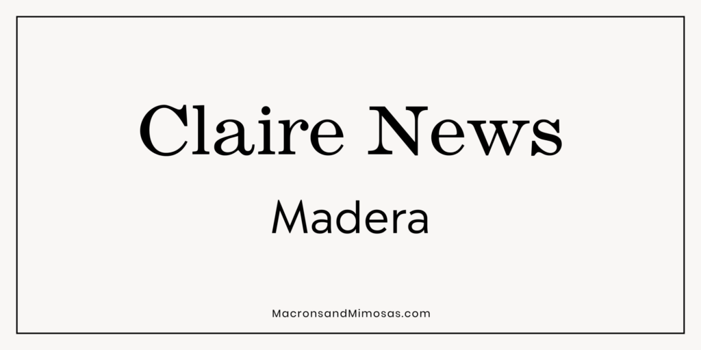
Claire News + Madera
Clarie News’s refined serif style pairs well with the clean lines of Madera, creating a professional yet inviting look, ideal for editorial and informational sites.
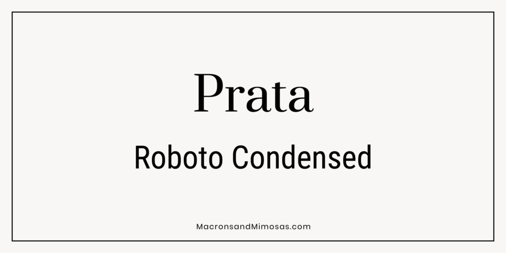
Prata + Roboto Condensed
The elegant, high-contrast Prata combined with the space-efficient Roboto Condensed offers a sophisticated and modern look, perfect for fashion and luxury brands.
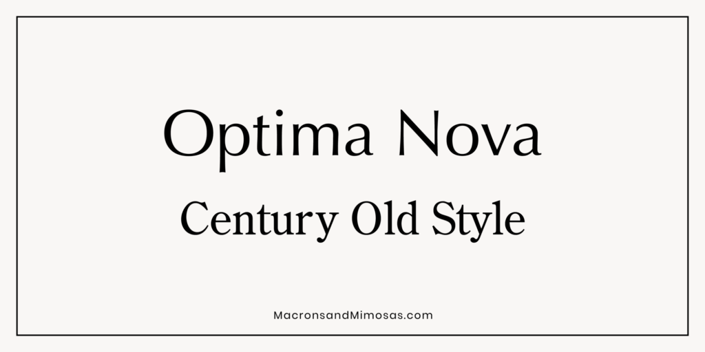
Optima Nova + Century Old Style
Optima Nova’s humanist sans-serif style pairs beautifully with the classic serif of Century Old Style, offering a timeless, elegant look suitable for high-end brands.
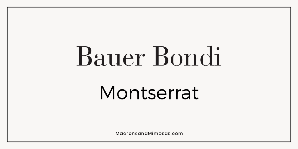
Bauer Bondi + Montserrat
The bold Bauer Bondi combined with Montserrat’s modern sans-serif design creates a striking visual impact, great for brands looking to make a statement.
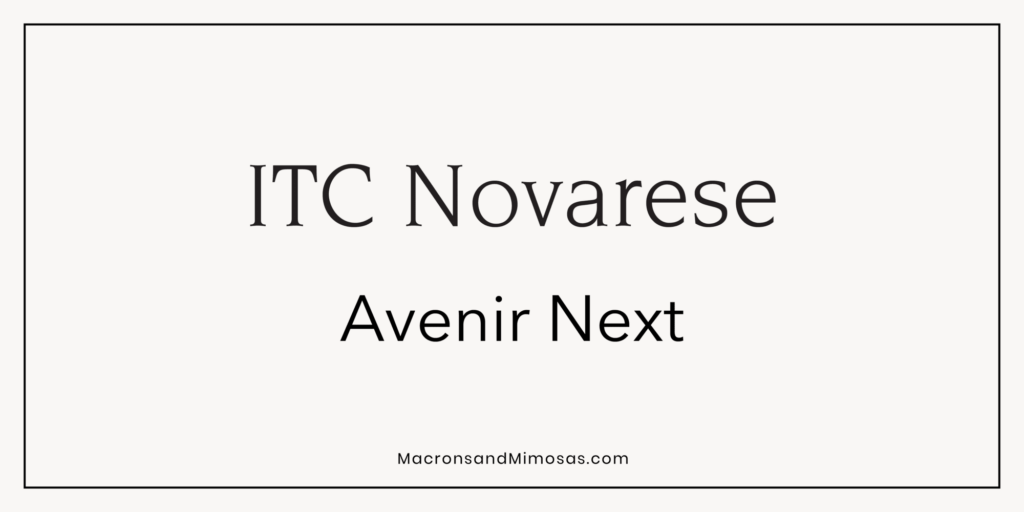
ITC Novarese + Avenir Next
This pairing marries the classic and the contemporary, with ITC Novarese’s traditional serif style contrasting nicely with Avenir Next’s modern, clean lines.
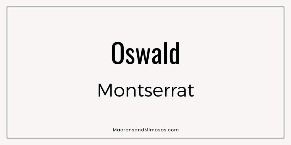
Oswald + Montserrat
Oswald’s condensed form and Montserrat’s geometric sans-serif style create a professional, clean look, perfect for tech and corporate brands.
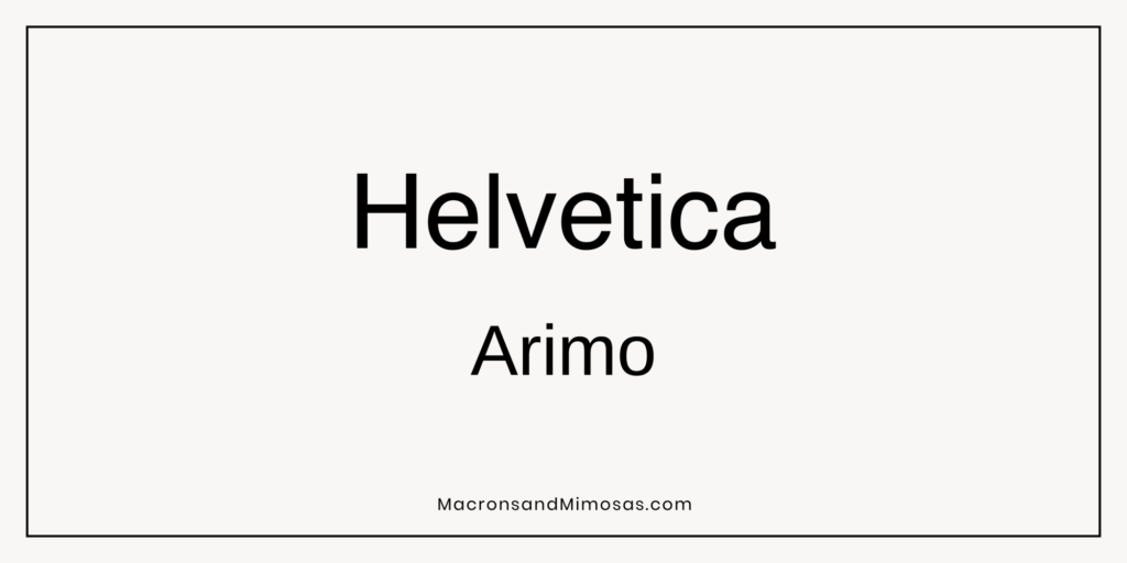
Helvetica + Arimo
The neutrality of Helvetica paired with Arimo’s slightly more rounded forms offers a versatile and highly readable combination, suitable for almost any brand.
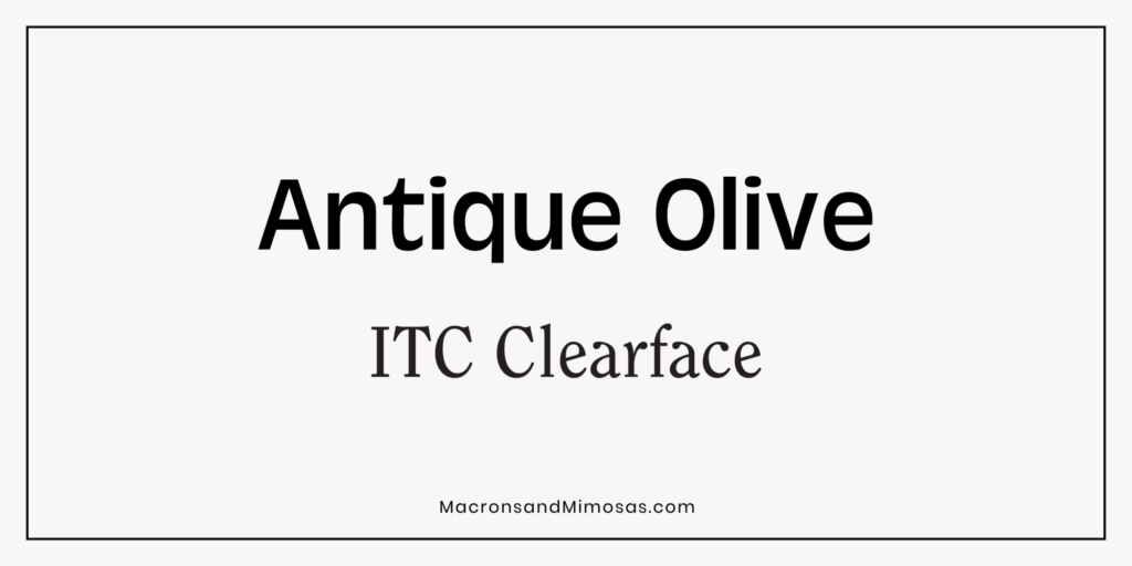
Antique Olive + ITC Clearface
The unique, slightly quirky Antique Olive contrasts well with the warm, approachable ITC Clearface, creating a memorable and distinct look.
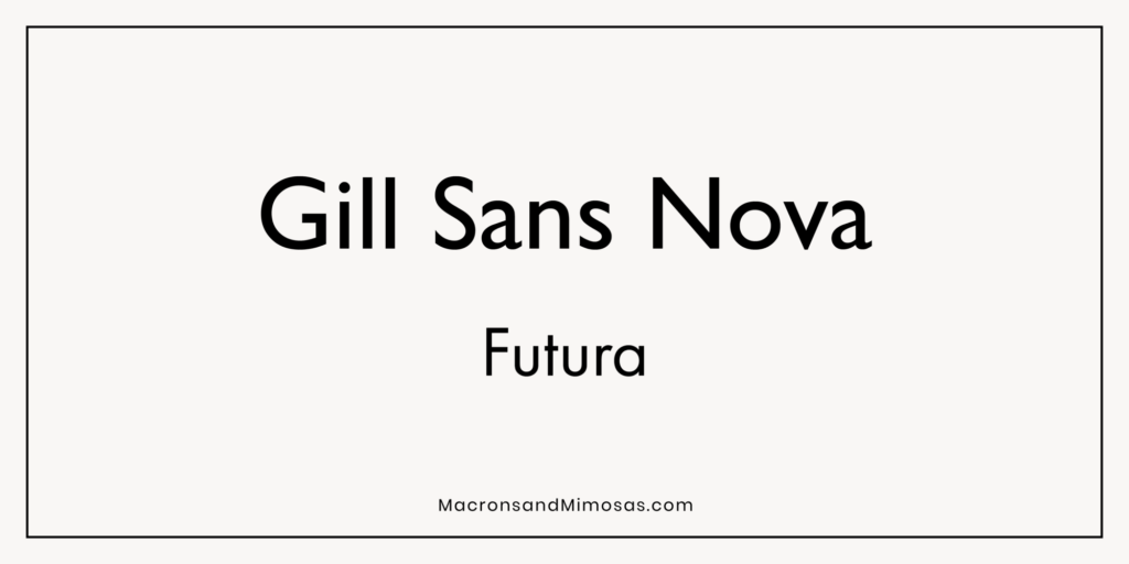
Gill Sans Nova + Futura
Both modern and timeless, this pairing brings together the clean lines of Gill Sans Nova and the geometric precision of Futura, perfect for brands that want to convey both stability and innovation.
Choosing the right fonts for your Shopify store is more than just a design decision; it’s a strategic move that impacts how your brand is perceived and how effectively it communicates with your audience. By carefully selecting and pairing fonts like those mentioned above, you can create a visually cohesive and engaging shopping experience that resonates with your customers.
Whether you’re looking for Shopify Fonts, Shopify Font pairings, or the Best Shopify Fonts to elevate your store, the right typography can make all the difference. Explore these combinations, and watch as your store transforms into a true reflection of your brand’s identity.
If you want to dive even further into other fonts that Shopify offers, check out their entire font library here.
Pairing beautiful fonts with high-quality visuals is essential for a well-rounded store design. Learn how to optimize your images with our Image Optimization Tips to ensure a polished, fast-loading site.
If choosing Shopify fonts is not your forte and stressing you out? Reach out to me, for help… I am your Shopify expert and would live to work together on your project!
More Posts You Might Like…


