What is a Brand Board and How to Create one?

What Is a Brand Board and Why You Need One
Alright, let’s get real for a second. You’ve got a fantastic business idea (or maybe a whole business empire in the making), and you’re ready to shine, right? But how do you make sure your brand stays as consistent as your love for coffee? Enter the Brand Board—your visual cheat sheet to keep your branding on point, whether you’re posting on social media or designing your website!
Imagine it as the ultimate mood board—but instead of Pinterest-style inspiration photos, it’s got your logos, fonts, colors, and all that juicy visual goodness that makes your brand you.
Brand Board vs. Style Guide: What’s the Big Deal?
You might be thinking, “A Brand Board sounds great, but what about a Style Guide?” Well, let me break it down:
- Brand Board: This is your one-stop shop for all things visual. You’ll find your logos, colors, fonts—basically the core essentials. It’s quick, easy, and totally streamlined. It’s like having your brand’s DNA in one place.
- Style Guide: Okay, this is the big sister. It’s like the rulebook that tells you exactly how to use your logo (don’t squish it into a corner!), what color combos are a no-no, and how your brand voice should sound. It’s more in-depth and, let’s be honest, for when you’re ready to dive deep into your brand’s soul.
What Should Be Included? Let’s Make It Fun!
Now, let’s get to the fun stuff: what actually goes on your Brand Board? I’ll break it down into easy-to-digest, not-boring chunks!
1. Your Main Logo: The Star of the Show
This is your brand’s main character. Your logo is what sets you apart, and it’s featured everywhere: your website, social media, stationery…you name it. It’s like your business’ superhero cape! You want it to stand out and shout “I’m here, and I’m fabulous!” across all your branding materials.
2. Secondary Logo: The Backup Diva
Not all logos fit in every space, and that’s where your secondary logo comes in. It’s a slightly altered version of your main logo—maybe it’s more compact, vertical instead of horizontal, or has a fun little icon. Think of it as your logo’s cool sidekick, always ready to step in when your main logo might not fit. It gives your brand that extra oomph and flexibility, like a trusty backup dancer.
3. Submark Logo: The Cutie
We all love a little variation, and your submark logo is the fun-sized version of your main logo. It’s usually smaller and less detailed (hello, monograms and initials!), but it’s perfect for small spaces. Think social media profiles, favicons, and even watermarks on photos. It’s a playful way to add a personal touch without overwhelming the design—like a little heart on top of a cake!
4. Color Palette: Paint Your Brand!
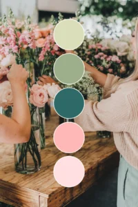
The color palette is like your brand’s fashion style. Is it pastel and soft, bold and daring, or sleek and corporate? Whatever vibe you’re going for, your palette will include around 5 colors that match your brand personality. And don’t forget the HEX codes—because, trust me, you’ll want to know exactly how to match that perfect shade of blush pink for your next Instagram post. A well-thought-out color palette can instantly give your brand that polished, cohesive look.
- Tip for a Romantic Chic Flare: Think soft, dreamy pastels.
- Corporate Power Vibes? Darker shades that scream confidence!
TIP: An easy tool to create color palettes: coolors.co
5. Typography: Font Love
What does your brand sound like? Well, typography is the visual answer to that question. Your primary font is for bold headlines, while your secondary font is for body text and captions. Bonus points if your logo font doesn’t match your brand’s main font—this keeps things interesting! Fonts can be your brand’s secret personality, so choose wisely.
6. Other Visual Elements: Let’s Get Creative
If your brand uses fun patterns, icons, or illustrations, slap them onto your Brand Board! These are the little things that make your brand feel unique. They tie everything together and help you stay consistent across your website, social media, and marketing materials. Maybe you have a custom icon, a special illustration style, or a pattern that screams “That’s SO you!” Add these to your board for that extra creative flair. ✨
How to Use Your Brand Board Like a Pro
Now that you’ve got all the basics down, it’s time to use your Brand Board. Here’s how:
- Design Consistency: Whether you’re whipping up a social media post, tweaking your website, or creating promotional materials, your Brand Board will make sure you’re always on brand. No more last-minute “Which shade of pink was that again?”
- Quick Reference: Whenever you need to pull up your color codes or logo variations, your Brand Board is your best friend. It’s like your own personal branding cheat sheet.
- Collaboration Made Easy: If you’re working with designers, your Brand Board ensures they’ve got everything they need to nail the visual direction of your brand. No more confusion or guesswork—just easy-peasy collaboration!
Why a Brand Board Makes You Look Like a Pro
Consistency equals trust, and with a Brand Board, you’re showing the world that you mean business. When your brand’s visuals are cohesive, you instantly look more professional and put-together. It’s your brand’s visual manifesto, making sure that no matter where people encounter your business, they’ll recognize and connect with it.
Creating Your Board: Easy Peasy Lemon Squeezy
Building your Brand Board doesn’t need to be a headache. Here’s how to make it a breeze:
- Gather Your Elements: Pull together your logos, fonts, and color codes. If you don’t have all the pieces yet, just pick the essentials to start with.
- Use a Tool: Canva, Illustrator, or any design tool will work. Want to skip the legwork? Grab one of my pre-designed Brand Board templates from the Creative Library! 🎨 It’s the perfect starting point to quickly pull your brand together without the hassle. I’ve got your back!
- Keep It Simple: The goal is quick reference, not overwhelming detail. Stick to the basics—logos, fonts, colors—and make it easy to use.
In a Nutshell
A Brand Board is the must-have tool to keep your branding organized, fun, and consistent. Whether you’re just starting out or refreshing your look, this is one of the first steps to creating a brand that stands out, stays memorable, and keeps people coming back for more. Ready to get started? Check out my Creative Library for ready-to-go Brand Board templates, and let’s bring your brand’s visual game to the next level! 💫
More Posts You Might Like…
More Posts You Might Like…
- Flodesk’s New Pricing Is Here… And Why I Still Recommend It for Creative Small Businesses
- Best Holiday Canva Fonts: Spooky Halloween to Christmas Cursive Fonts
- Pink and Green Color Palettes: 10 Preppy Combinations You’ll Love
- How to Sell Art Online: The Best Artist Shopify Themes for Creatives
Updated on April 22, 2025
