
The Best Fonts and Color Palettes for Real Estate Agent Branding

Let’s be honest: a lot of real estate branding starts to look the same.
Navy blue. Gold. A classic serif font. Maybe a house or key worked into the logo somewhere. There’s nothing inherently wrong with any of those things. You’ll actually find a little navy and gold below. But your real estate brand should feel like you, not like a collection of things we’ve decided are supposed to look “real estate-y.”
Think of your brand as your first showing.
It’s often what a potential client sees before they ever read your bio, schedule a call, or meet you in person. Your colors, fonts, photography, website, social media, and marketing materials are already creating an impression of your business. And creating a polished real estate brand doesn’t mean starting completely from scratch.
Two of the easiest places to begin are your colors and your fonts.
Get those working together and it becomes much easier to create a consistent look across your website, social media, listing materials, email marketing, Buyer and Seller Guides, and everything else your clients see.
So I’ve put together six real estate color palettes and eight Canva font pairings to help you find a direction that actually feels like your brand.
IN THIS ARTICLE
What Do Your Real Estate Brand Colors Say About You?
Color does more than make your branding look pretty. It helps set the tone.
Deep navy can feel established and classic. Warm neutrals can make a brand feel softer and more approachable. Greens and earthy shades feel grounded and organic, while blush tones can create something warmer and more boutique. Darker neutrals can push a brand in a more modern, elevated direction.
But here’s the important part: think of your color palette as a system, not five colors you have to squeeze into every design. You might have one primary color, a couple of supporting shades, a light neutral for backgrounds, and one accent color you use when you need it.
That’s also why each of the real estate color palettes below includes five colors. You have enough variety to create contrast and keep your marketing interesting while everything still feels like it belongs together.
6 Real Estate Color Palettes to Inspire Your Brand
There isn’t one “best” color palette for a real estate agent.
Your colors should reflect the type of brand you’re creating, the clients you want to attract, and the way you want your business to feel. And no, they definitely do not all need to be navy and gold.
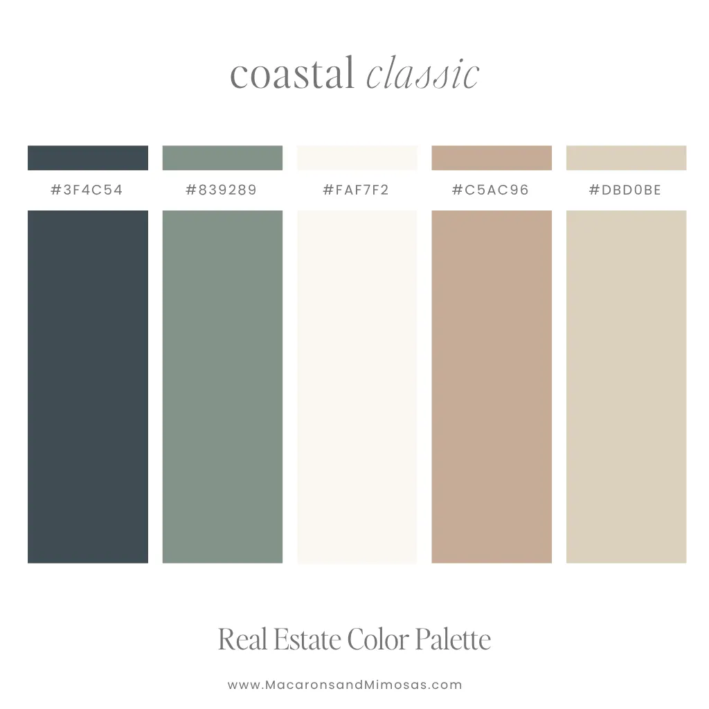
Palette 1: The Coastal Classic
Soft, calm, and sophisticated without feeling overly beachy.
- Primary: Deep Moss
- Secondary: Sage Mist
- Neutral: Ivory
- Accent: Warm Tan
- Accent: Sand Linen
The green-gray and muted sage give this palette a polished, organic feel, while warm beige and cream keep it light and approachable. It’s an easy choice for a relaxed real estate brand that still feels established and professional.
Try it for: coastal markets, residential agents, relocation specialists, and softer lifestyle-focused brands.
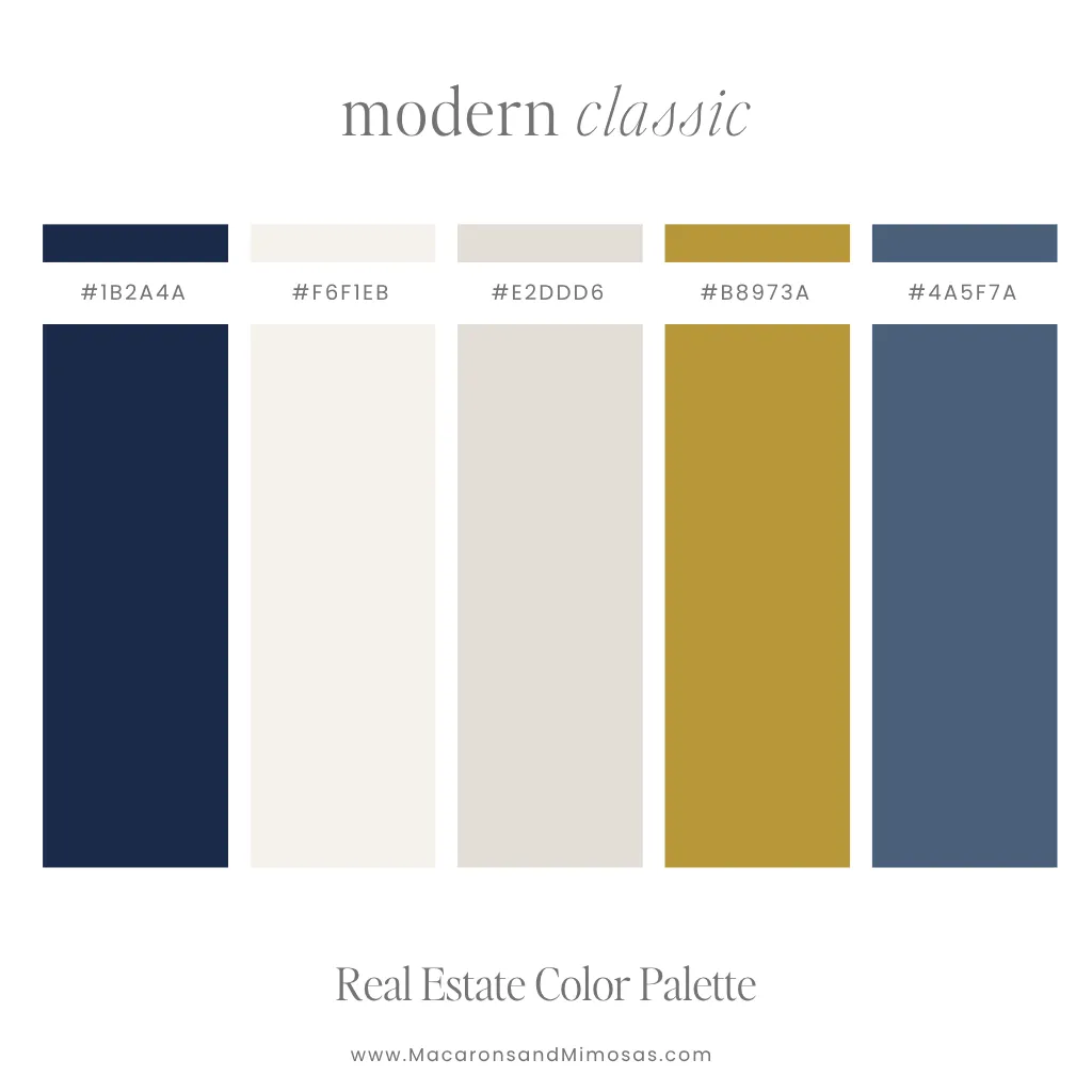
Palette 2: The Modern Classic
Classic real estate colors, just a little more interesting.
- Primary: Deep Navy
- Secondary: Warm White
- Neutral: Light Stone
- Accent: Antique Gold
- Accent: Steel Blue
Deep navy gives this palette an established feel, while cream, warm taupe, muted gold, and slate blue keep it from looking overly traditional. Use the navy as your anchor and save the gold for smaller accents.
Try it for: established agents, real estate teams, higher-end residential brands, and traditional-meets-modern styles.
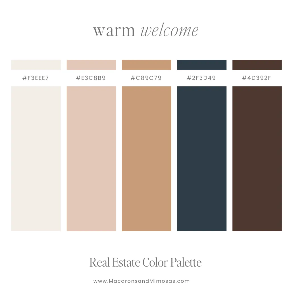
Palette 3: The Warm Welcome
Approachable, polished, and made to feel like home.
- Neutral: Soft Ivory
- Secondary: Blush
- Accent: Warm Camel
- Accent: Deep Navy
- Primary: Deep Berry
Cream, blush-beige, and caramel bring warmth, while blue-gray and dark berry plum give the palette enough contrast to stay professional. It’s a softer alternative for agents who don’t want their branding to feel corporate.
Try it for: residential agents, first-time buyer specialists, relocation agents, and relationship-focused brands.
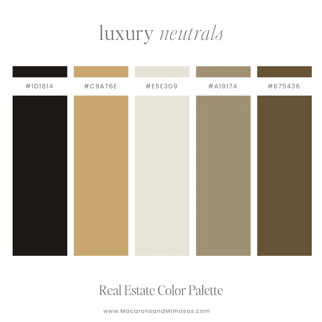
Palette 4: The Luxury Neutral
Warm, refined, and quietly luxurious.
- Primary: Near Black
- Secondary: Brushed Gold
- Neutral: Warm Linen
- Accent: Warm Khaki
- Accent: Deep Tobacco
Deep espresso and warm brown create contrast, while stone, taupe, and muted gold soften the overall look. It feels elevated and editorial without relying on the typical stark black-and-gold luxury palette.
Try it for: luxury agents, high-end listings, architectural properties, and refined personal brands.
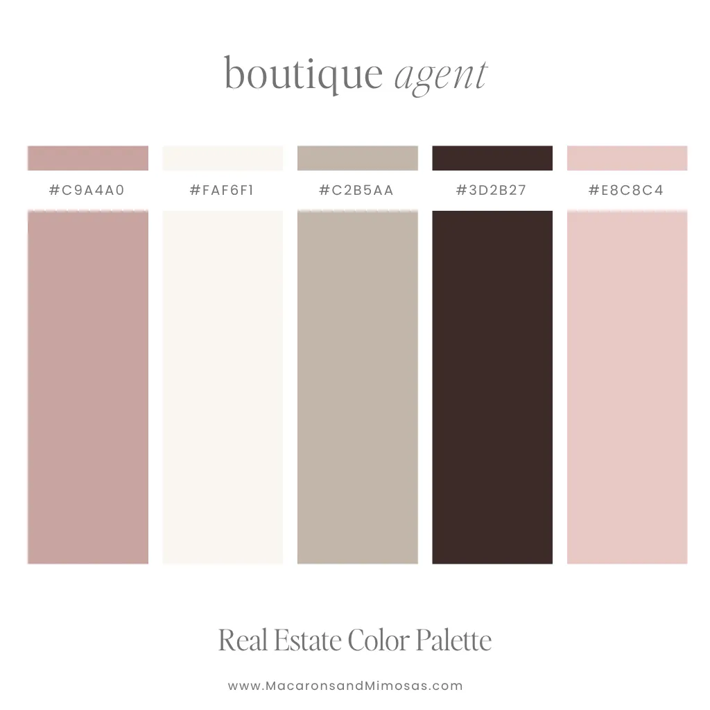
Palette 5: The Boutique Agent
Feminine real estate branding without turning everything hot pink.
- Primary: Dusty Rose
- Accent: Cream
- Neutral: Warm Taupe
- Secondary: Deep Mocha Berry
- Accent: Blush Mauve
Dusty rose, blush, cream, and taupe create a softer look, while deep berry espresso keeps the palette grounded and sophisticated. It feels personal and warm without becoming overly sweet.
Try it for: personal agent brands, boutique real estate businesses, lifestyle-focused agents, and feminine brands.
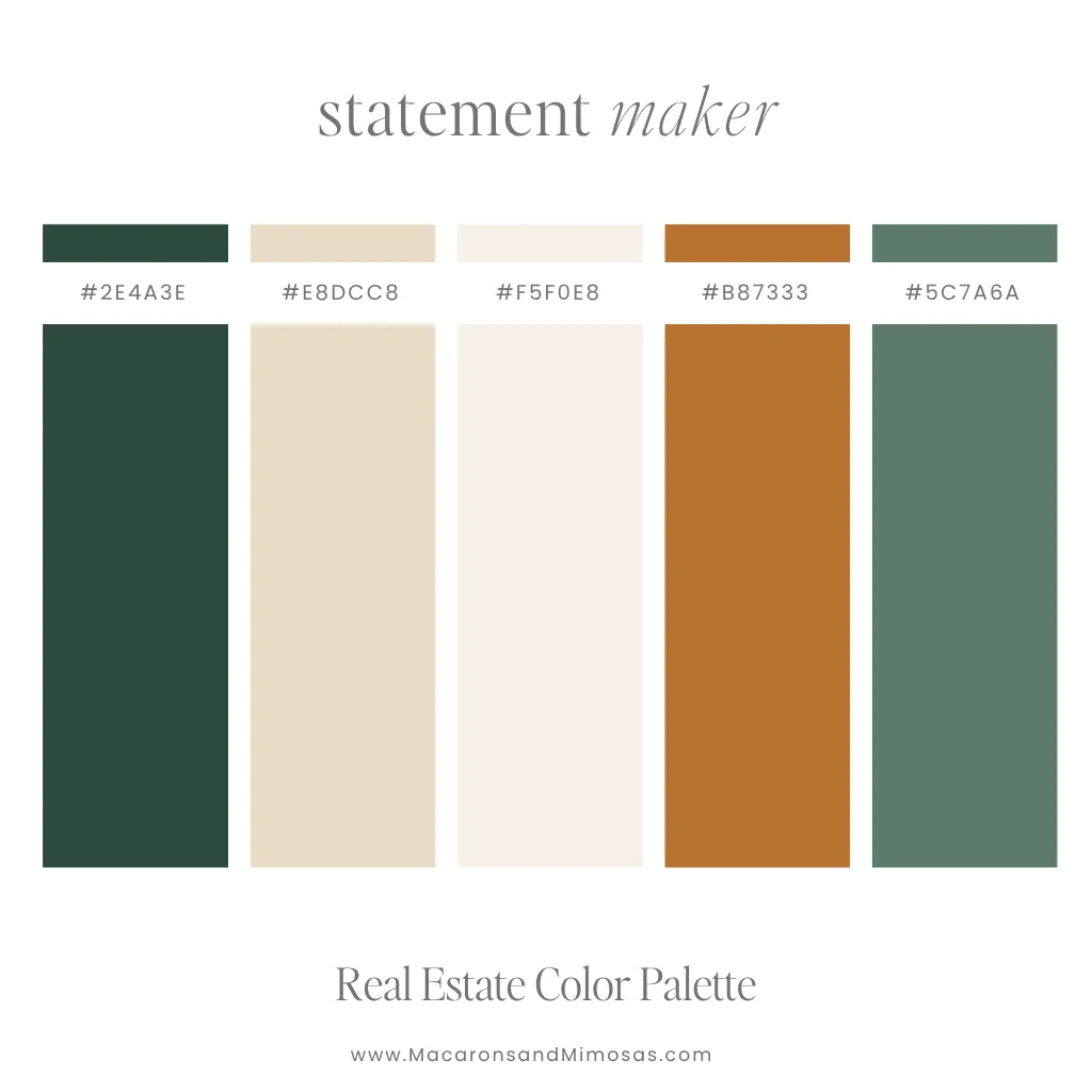
Palette 6: The Statement Maker
Professional does not have to mean boring.
- Accent: Deep Forest
- Neutral: Warm Sand
- Accent: Soft Ivory
- Primary: Burnished Copper
- Secondary: Sage Green
Deep forest green and sage feel grounded and polished, while warm cream and copper give this palette more personality. It’s distinctive without relying on bright colors or something that could quickly feel dated.
Try it for: design-forward agents, boutique teams, nature-focused markets, and distinctive personal brands.
How to Use Your Real Estate Color Palette
You don’t need to use all five colors every time you create something. In fact, please don’t.
Choose one primary color that becomes recognizable in your branding. Add one or two supporting colors for variety, a light neutral for backgrounds and breathing room, and an accent color for smaller details you want to draw attention to.
And don’t choose your colors based on your logo alone.
Your palette needs to work with property photography, headshots, social graphics, your website, presentations, Buyer and Seller Guides, printed materials, and everything else your clients see.
A good color palette should make your marketing easier to create, not harder.

8 Canva Font Pairings for Real Estate Branding
Color sets the mood. Typography gives your brand personality.
And no, you don’t need twelve fonts!
A strong display font paired with something simple and readable is usually plenty. If you add a third font, especially a script or signature style, give it one specific job. Here are eight Canva font pairings to get you started.
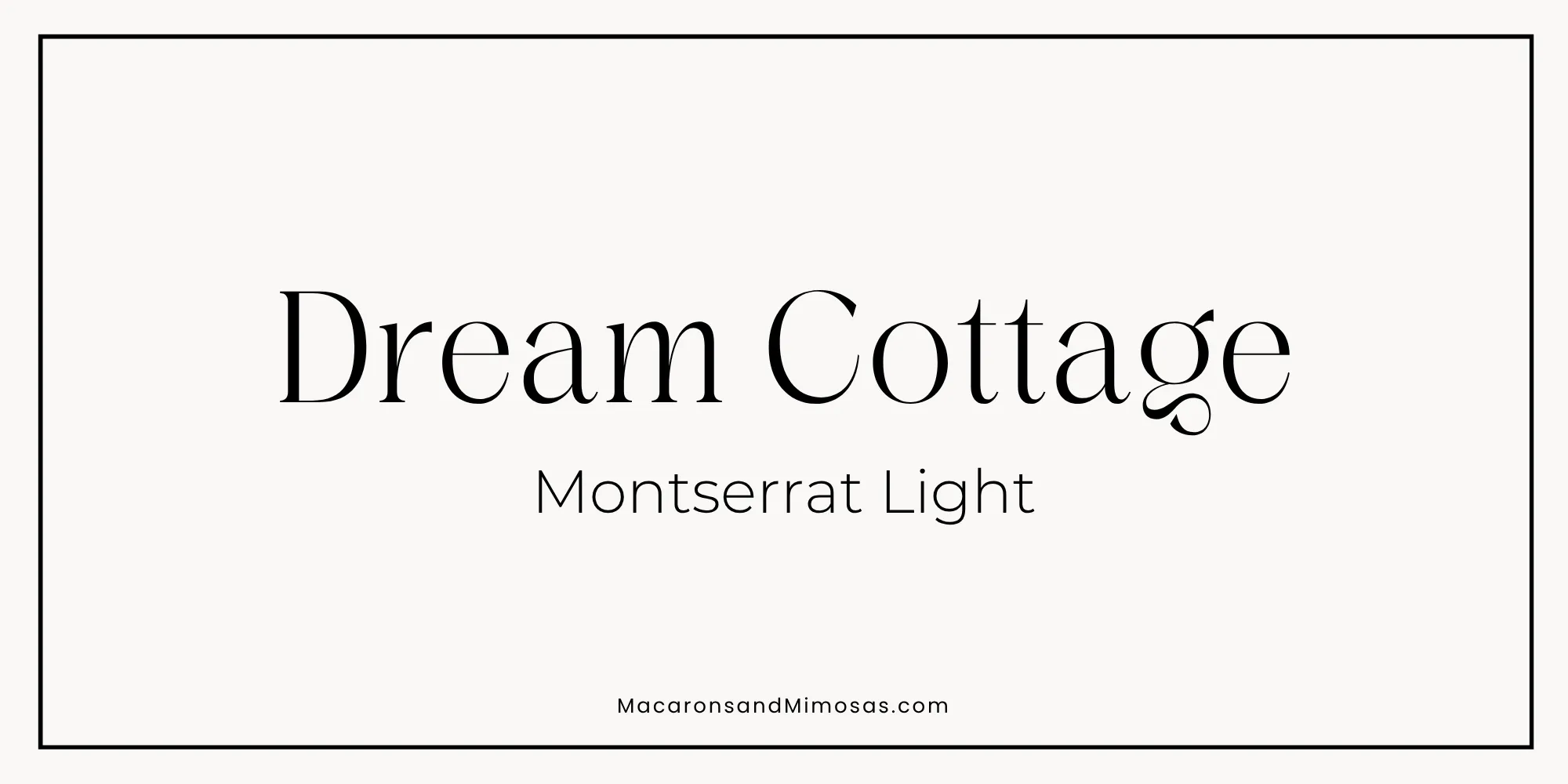
Pairing 1: The Classic Authority
Headline: Dream Cottage | Body: Montserrat Light
Dream Cottage brings the personality while Montserrat keeps the overall brand clean. This pairing works particularly well when you want something feminine or lifestyle-focused without relying on a traditional script font.
Because Dream Cottage has such a distinctive look, give it room to breathe. Large headlines and plenty of white space will make it feel much more intentional. Use Dream Cottage for headlines and feature moments, and Montserrat Light for supporting copy, labels, captions, and contact information.
Try it with: Boutique Agent or Warm Welcome.
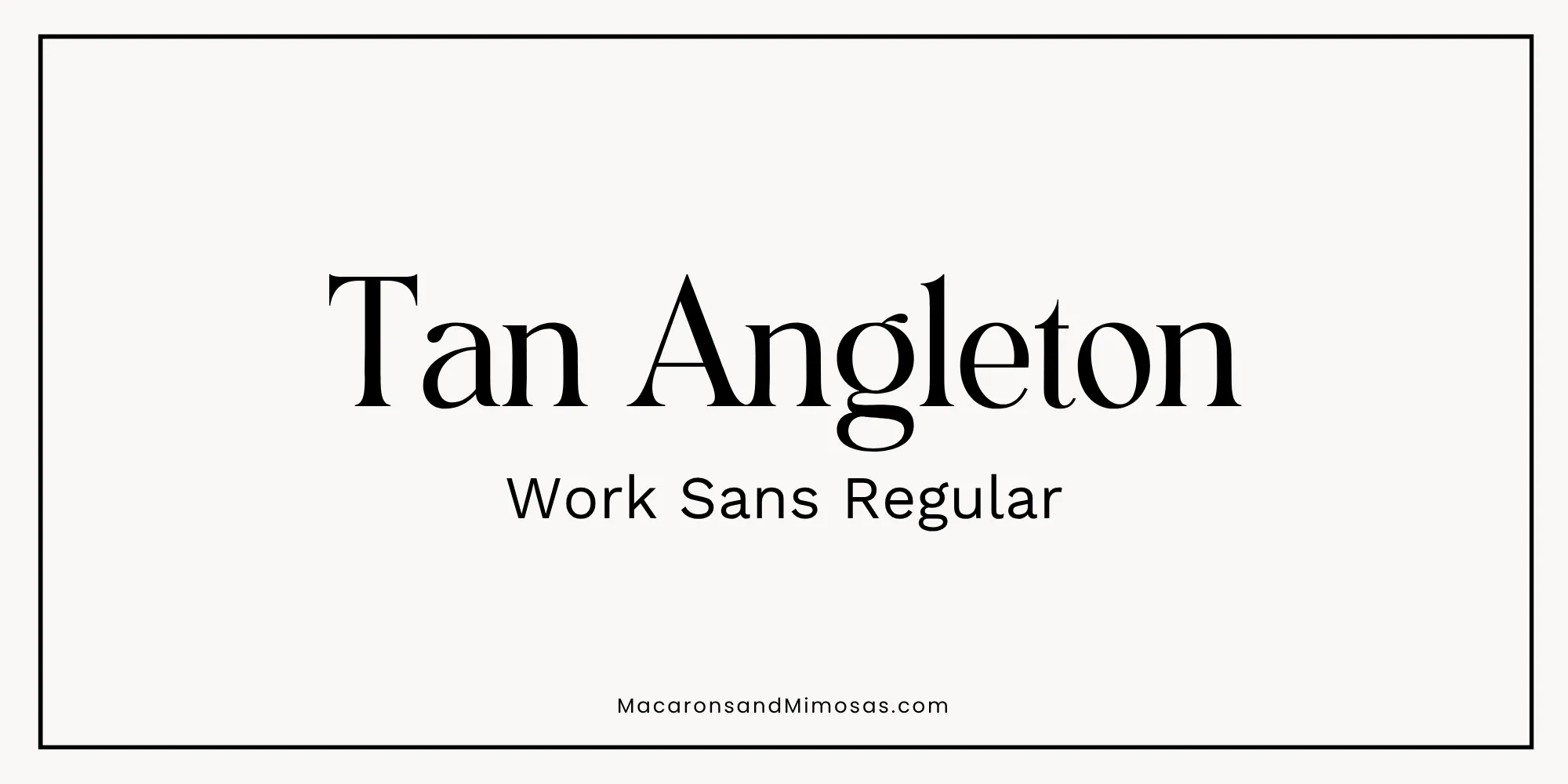
Pairing 2: The Modern Authority
Headline: Tan Angleton | Body: Work Sans Regular
Tan Angleton has enough personality to make a brand instantly feel more design-conscious. Work Sans balances it out.
This combination could work especially well for an agent whose marketing leans heavily into architecture, interiors, modern homes, or editorial property photography. Use Tan Angleton for larger headlines and covers, then let Work Sans handle the practical information.
Try it with: Statement Maker or Luxury Neutrals.
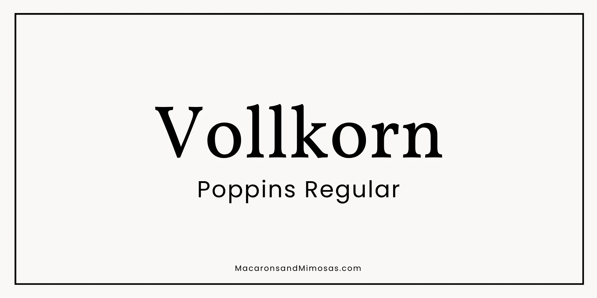
Pairing 3: The Approachable Expert
Headline: Vollkorn | Body: Poppins Regular
Not every real estate brand needs to look like a luxury fashion magazine. Vollkorn gives you the warmth and personality of a serif while Poppins keeps everything modern, friendly, and easy to read.
This pairing feels established without being stiff, which makes it particularly good for a personal real estate brand centered around relationships, education, and approachability.
Try it with: Warm Welcome, Coastal Classic, or Statement Maker.
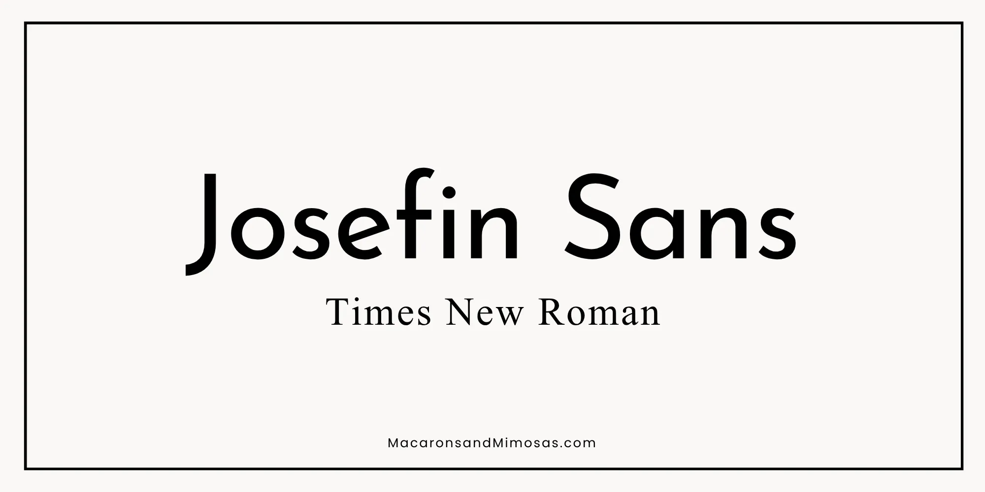
Pairing 4: The Confident Minimalist
Headline: Josefin Sans | Body: Times New Roman
Yes. Times New Roman. Before you close Canva in protest, hear me out.
Paired intentionally with a clean sans serif like Josefin Sans, Times New Roman can feel classic and editorial rather than like you forgot to change the default font. That’s really the point of font pairing. A font doesn’t exist in isolation. The typography around it changes how it feels.
Josefin Sans keeps this combination crisp and contemporary, while Times New Roman adds familiarity and contrast.
Try it with: Modern Classic, Coastal Classic, or Statement Maker.
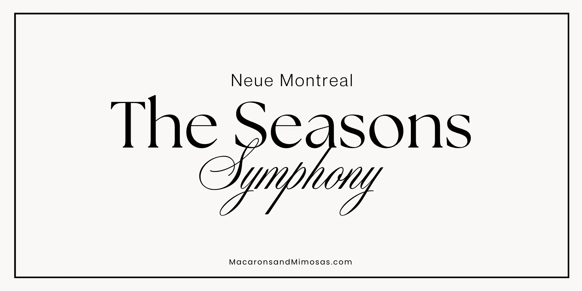
Pairing 5: The Elegant Statement
Headline: The Seasons | Body: Neue Montreal | Script Accent: Symphony
This combination is for someone who wants their real estate branding to feel a little more like a beautiful magazine. The Seasons handles the primary editorial typography. Neue Montreal gives you a clean sans serif for all of the practical information. Symphony becomes the decorative accent.
Again, don’t let the script take over. A little goes a long way.
Try it with: Luxury Neutrals or Boutique Agent.
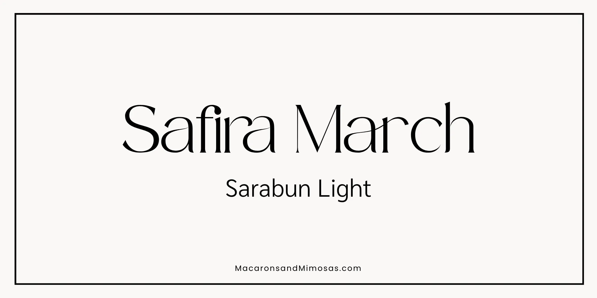
Pairing 6: The Editorial Luxury
Headline: Safira March | Body: Sarabun Light
Safira March gives you a beautiful editorial serif while Sarabun Light keeps everything else quiet and readable. This is a great pairing when you want your real estate branding to feel elevated without becoming overly formal.
Use Safira March for large headlines and statement typography, and Sarabun Light for body copy, details, captions, and supporting information.
Try it with: Coastal Classic, Boutique Agent, or Luxury Neutrals.
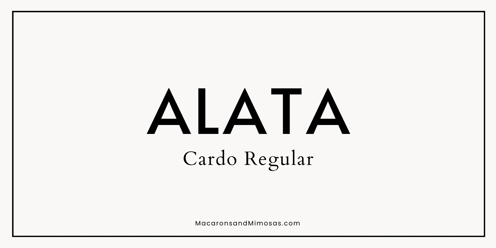
Pairing 7: The Statement Brand
Headline: ALATA | Body: Cardo Regular
Alata is modern, straightforward, and easy to read, while Cardo adds a traditional serif element that makes the pairing feel a little more established. This is a great option if you want something clean and contemporary without going ultra-minimal.
Use Alata for headlines, buttons, and short statements. Let Cardo handle subheadings, supporting text, or editorial details.
Try it with: Coastal Classic or Modern Classic.
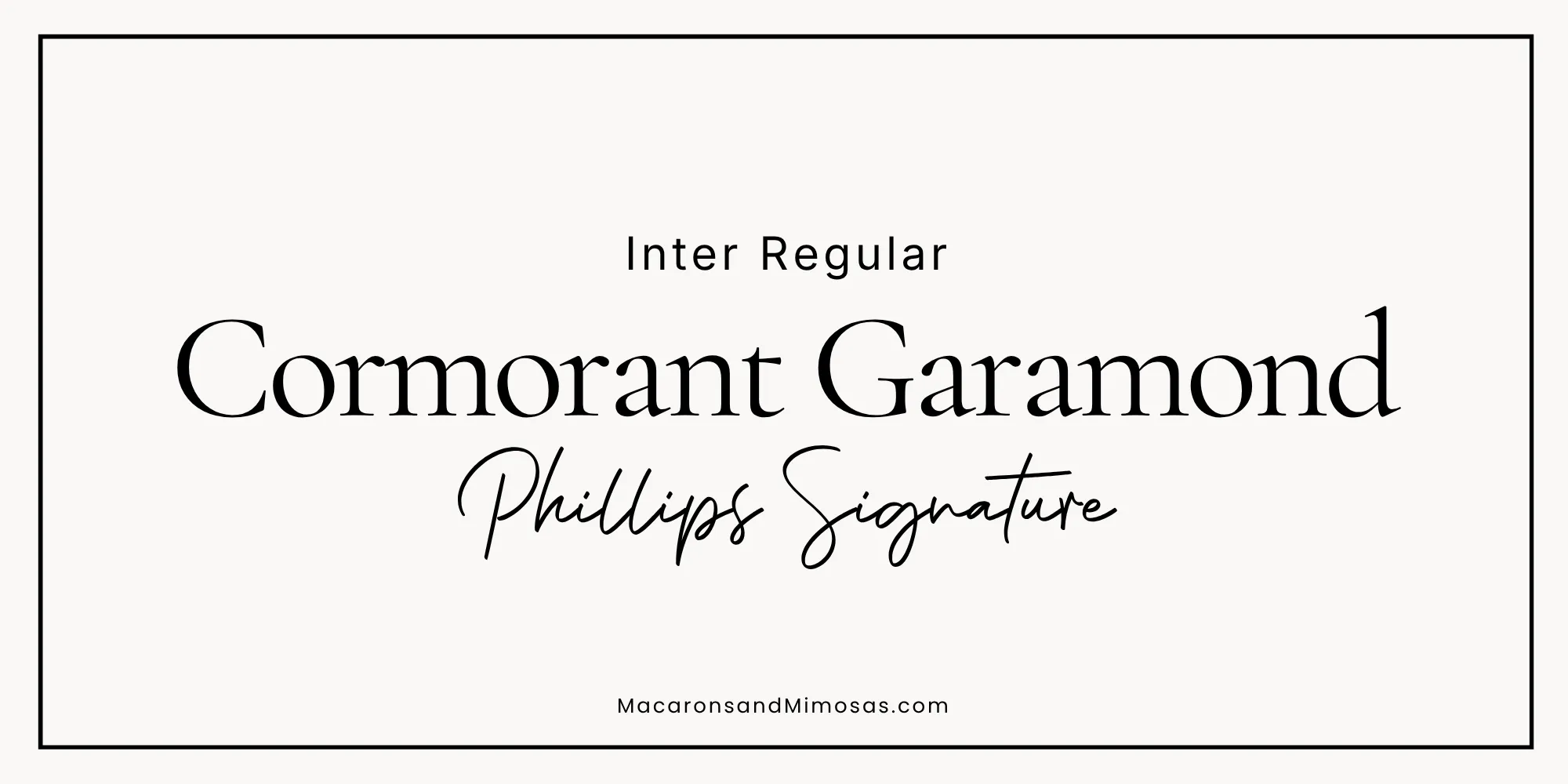
Pairing 8: The Signature Touch
Headline: Cormorant Garamond | Body: Inter Regular | Script Accent: Phillips Signature
Cormorant Garamond gives this pairing its editorial feel, while Inter keeps all of the practical information clean and readable. Phillips Signature adds a personal handwritten detail without taking over the entire design.
Use Cormorant Garamond for feature headlines, Inter for body copy and practical information, and Phillips Signature for small accents.
And if you’re wondering why I chose Phillips Signature instead of Brittany Script…
Can We Talk About Brittany Script for a Second?
If you’ve spent any amount of time looking at Canva templates, you’ve probably seen Brittany Script.
A lot.
There’s a reason it’s popular. It’s pretty, easy to use, and instantly gives you that handwritten signature look.
The problem is that everyone else discovered it too.
There’s nothing wrong with Brittany Script, but when you’re trying to create distinctive branding, choosing something a little less recognizable can help your designs feel more like your own.
That’s why I like Phillips Signature as an alternative. You still get that warm, handwritten personality, but it feels a little fresher and less expected.
And whichever signature font you choose, use it as an accent. Your name, a short phrase, or one word in a heading? Beautiful.
Your mortgage-preapproval paragraph? Maybe not.
How Many Fonts Should a Real Estate Brand Use?
For most real estate brands, two fonts are plenty: one font that creates personality and another that’s easy to read.
A third font can work beautifully as an accent, particularly a script or signature style, but it should have a specific job.
Your fonts don’t all need to be interesting. Sometimes the supporting font’s entire job is to stay out of the way and let the pretty font be pretty.
Pairing Your Real Estate Colors + Fonts
This is where things get fun.
The exact same color palette can feel completely different depending on the typography you pair with it. For a few easy starting points:
Coastal Classic + Alata / Cardo
Clean, calm, and established.
Modern Classic + Cormorant Garamond / Inter
Classic with a more editorial edge.
Statement Maker + Tan Angleton / Work Sans
Bold, modern, and design-forward.
Boutique Agent + Dream Cottage / Montserrat Light
Soft, personal, and approachable.
Luxury Neutrals + The Seasons / Neue Montreal / Symphony
Elevated and editorial.
Warm Welcome + Vollkorn / Poppins
Friendly, polished, and professional.
These aren’t rules.
Swap things around. Experiment. Try your favorite font combination with two different palettes and see how dramatically the personality changes.
The goal is to find a combination that feels like your business, not to follow a formula for what a real estate agent’s brand is supposed to look like.
Bring Your Real Estate Brand Into Your Buyer and Seller Guides
Once you’ve chosen your colors and fonts, the next step is actually using them consistently.
And not just on Instagram.
Your Buyer and Seller Guides are some of the most important branded materials you give your clients. They’re something people actually sit down and read, save for later, and refer back to throughout the buying or selling process.
They should feel just as polished and intentional as the rest of your brand.
That’s exactly what the Macarons and Mimosas Real Estate Buyer and Seller Guide Templates are designed to help you do, without starting from a blank Canva page.
Each guide comes professionally designed with pre-written content and styled stock photography already included, so you’re not spending hours figuring out what to write, hunting down photos, or designing every page yourself.
Everything is fully editable in Canva. Add your logo, change the colors, swap the fonts, personalize the content, replace photos if you’d like, and make the entire guide feel like your own brand.
And if you fell in love with one of the color palettes or font pairings above?
You’ve already got your starting point.
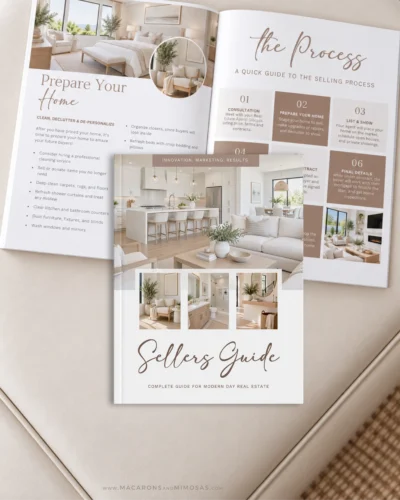
Grab the FREE Moving Guide for Your Clients 🏡
Want an easy place to start?
Grab the free editable Moving Guide and customize it with your own real estate branding in Canva.
Add your logo, change the colors and fonts, personalize the information, and share it with your clients as a helpful resource before moving day.
It’s useful, it’s already designed, and you don’t have to start from scratch.
FAQs: About Real Estate Agent Branding
The best real estate brand colors reflect your style and the clients you want to attract. Navy feels classic, earthy greens feel grounded, warm neutrals feel approachable, and darker neutrals can create a more elevated look.
Choose fonts that are professional, readable, and consistent with your brand style. Pairing a serif or display font with a clean sans serif is an easy way to create a polished real estate brand.
Two fonts are enough for most real estate brands: one for personality and one for readability. A third script or signature font can work well as an occasional accent.
Brittany Script can work for real estate branding, but its popularity means it may not give your brand a very distinctive look. Try a less commonly used signature font, such as Phillips Signature, if you want something a little less expected.
Use the same core colors, fonts, photography style, and design direction across your website, social media, Buyer and Seller Guides, and marketing materials. Everything doesn’t need to match exactly. It should simply feel like the same brand.
Your Real Estate Brand Should Feel Like You
There isn’t one right way for a real estate brand to look.
It can be warm. Minimal. Feminine. Traditional. Editorial. Colorful. Luxury. Coastal. Modern. The goal isn’t to make your branding look more like everyone else in your industry.
It’s to create a visual identity that feels like your business and then use it consistently enough that other people begin to recognize it, too.
Pick your colors. Choose your fonts. Keep it simple. And make it yours.
More Posts You Might Like…



Leave a Reply