Bright Colors for Bold Branding: 28 Color Palettes to Make Your Website Pop
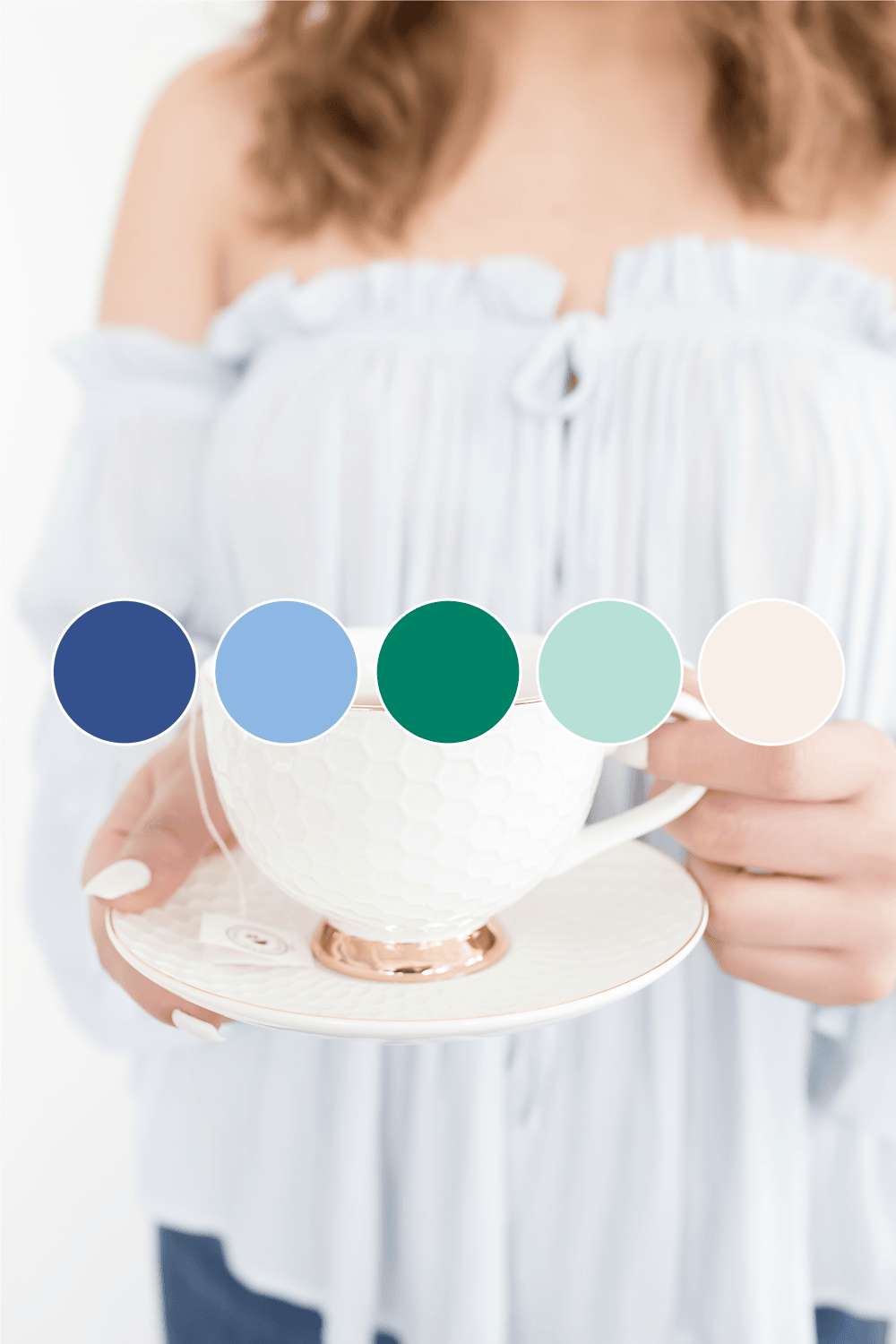
Who doesn’t love a splash of bright colors to bring life and personality to a brand? Bright colors have a special way of making websites feel vibrant, welcoming, and unforgettable. Whether you’re looking for a bright spring color palette to show off fresh energy or a bright winter color palette to brighten up those cozy days, the right hues can transform your brand.
Ready to find the perfect palette? Let’s dive into some color combos, swatches, and pro tips to make your brand shine!
Why Bright Colors Work for Your Brand
Bright colors aren’t just pretty—they’re powerful! The right shades can draw in your audience and set the mood from the first glance. Here’s why vibrant colors are a top choice for business owners who want a memorable brand presence:
- Instant Impact: Bold colors catch the eye and create a lasting impression, making them ideal for brands that want to be noticed.
- Emotional Connection: Bright shades evoke happiness, energy, and warmth—perfect for brands looking to make a positive impact.
- Stand Out from the Crowd: In a sea of websites, bright palettes give you an edge, helping your brand stand out with style and confidence.
Pro Tip: Consider matching a bright color palette with a unique logo design to really cement your brand’s look. Our logo designs can help you create a logo that’s as bold as your palette!
Adding Vibrant Colors to Different Brand Elements
Bright colors don’t just work for your website; they can extend to your entire brand presence. Here’s how to incorporate these hues into different areas of your business for a unified, impactful look:
- Social Media: Use bright colors in your Instagram stories, Canva templates, and other social media graphics for a consistent look.
- Email Marketing: Carry your palette into your email campaigns for a professional touch.
- Brand Materials: Business cards, packaging, and merchandise are all great places to add pops of color that match your website.
If you’re looking for pre-made designs, check out our selection of social media templates on Macarons and Mimosas for an easy way to get started!
Tips for Picking and Using Vibrant Colors
Ready to dive in but unsure where to start? Here are some quick tips for choosing and applying your bright color scheme effectively:
- Stay Balanced: Pick one or two main colors and add accent shades to avoid overwhelming your viewers.
- Contrast is Key: Use contrasting colors for text and backgrounds to ensure readability.
- Test Across Devices: Colors can appear differently on screens, so preview them on mobile, tablet, and desktop.
- Mix It Up Seasonally: Don’t be afraid to change up your palette with the seasons, just like we’ve done here with our spring and winter examples!
Choosing the right colors isn’t just about what looks pretty—colors impact emotions and perceptions, too! If you want to dive deeper, check out our post on how color psychology can shape your brand’s message and make it resonate with your audience.
Bright Spring Color Palette: Fresh, Fun, and Fabulous
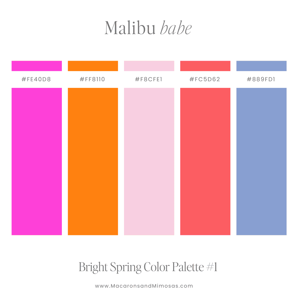
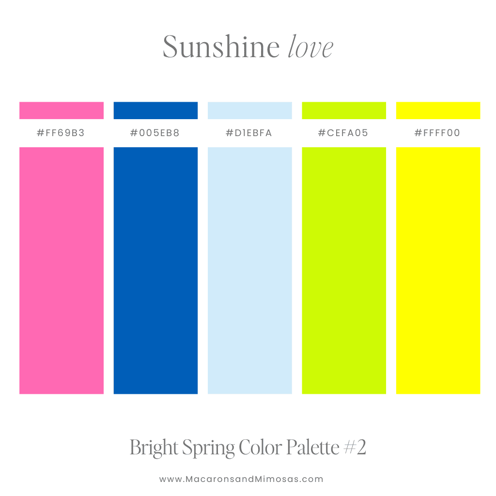
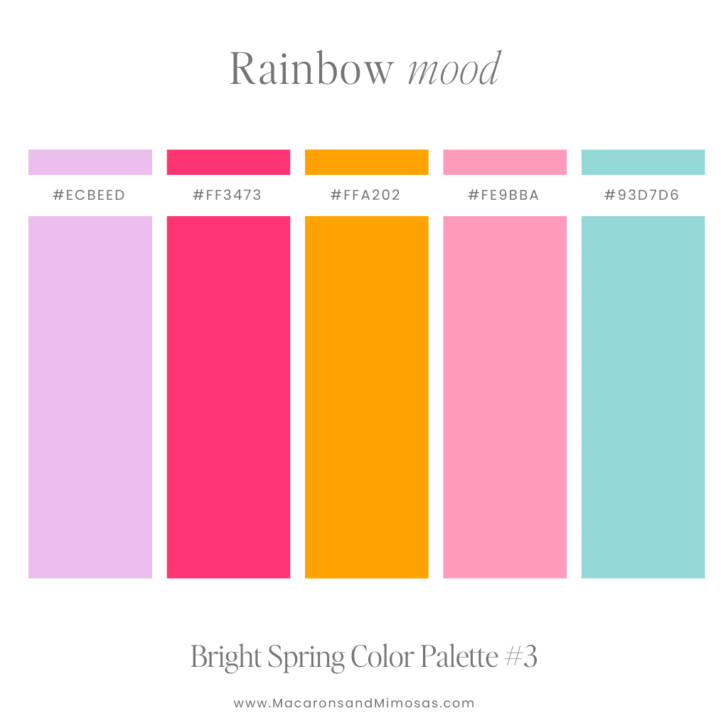
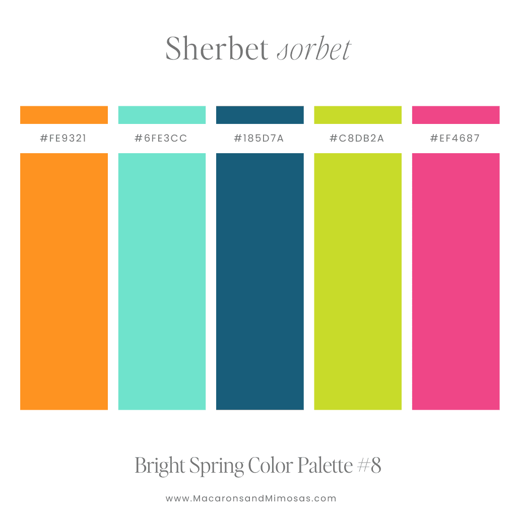
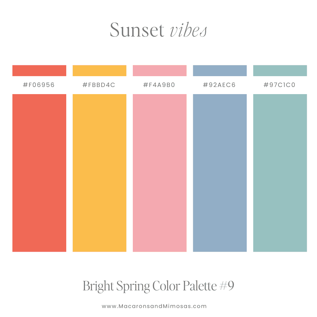
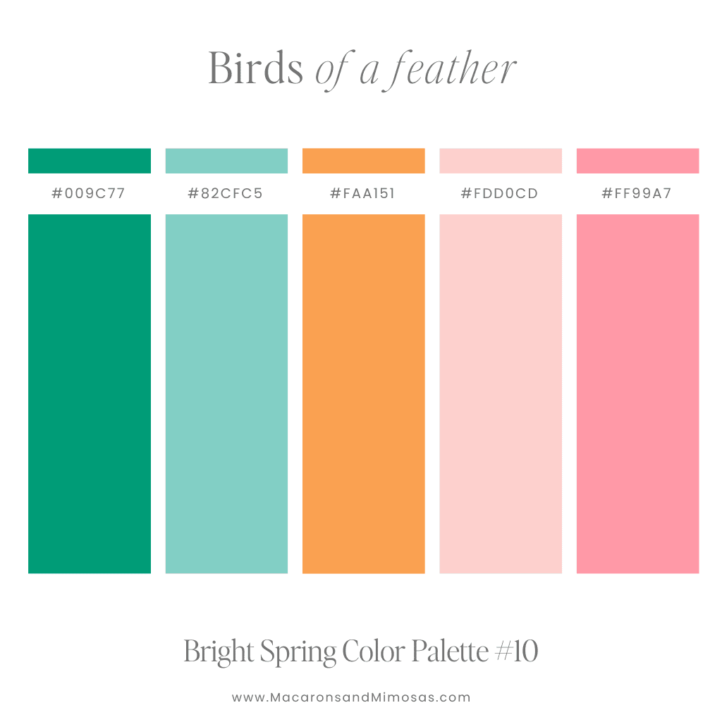
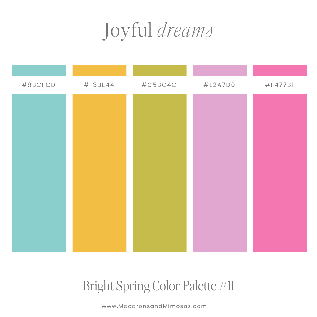
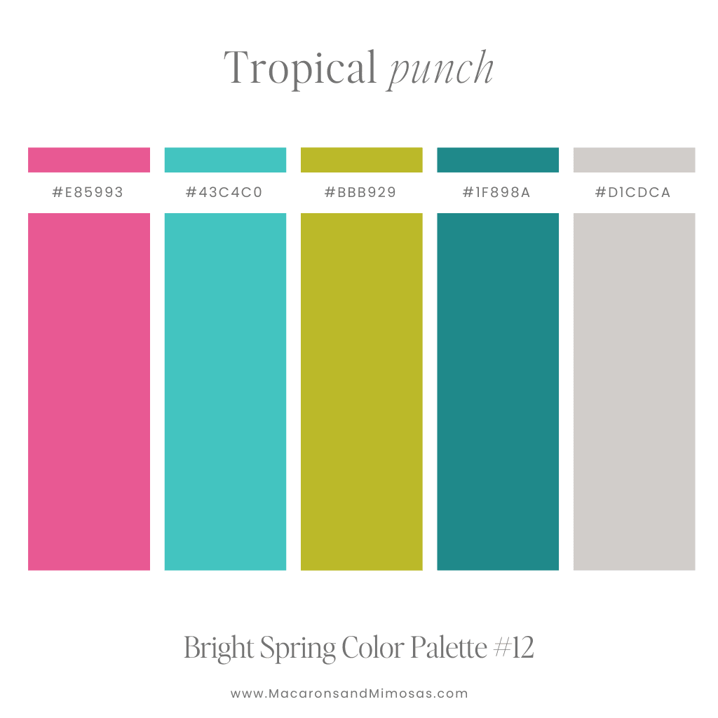
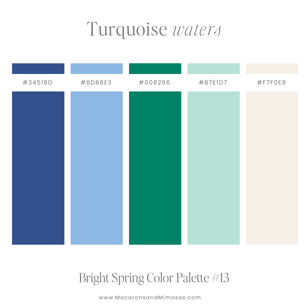
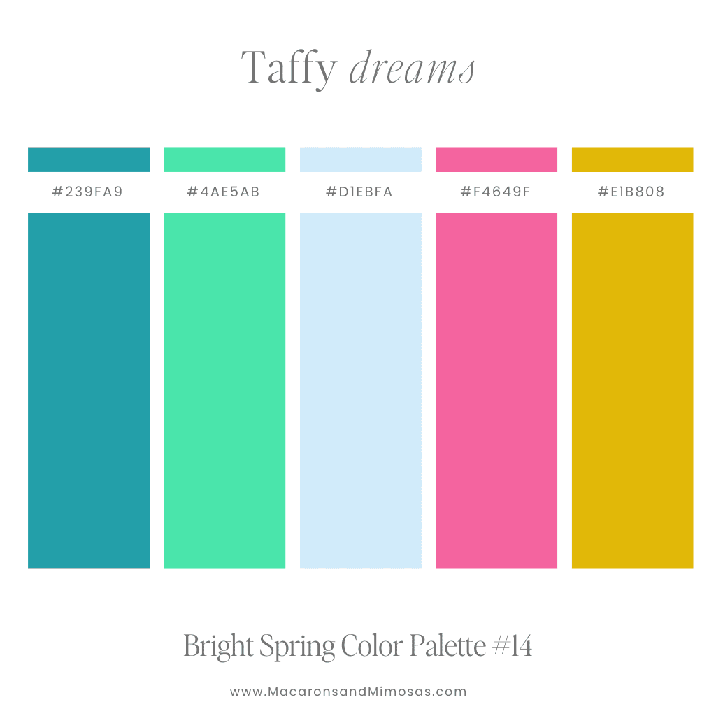
Spring is all about new beginnings, and what better way to capture that than with a bright spring color palette? Think soft yet vibrant shades like lavender, coral, mint, and lemon that radiate warmth and freshness. These colors are perfect for brands that want to exude positivity and approachability.
Pro Tip: Spring colors are perfect for wellness brands, lifestyle blogs, or any brand that wants a fresh, friendly feel. If you’re using Shopify, we have some fantastic Shopify themes to get these colors flowing across your site with ease!
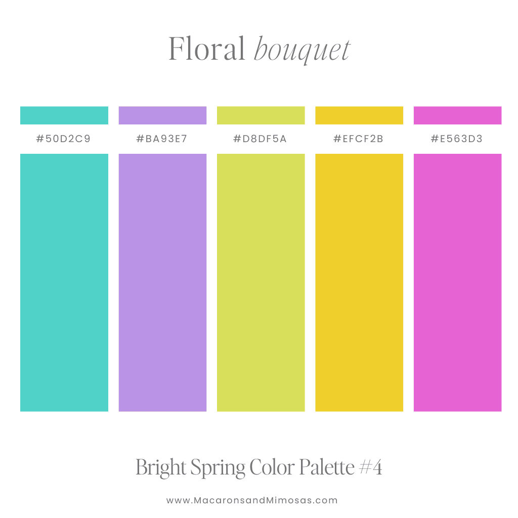
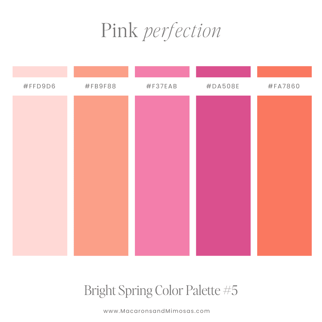
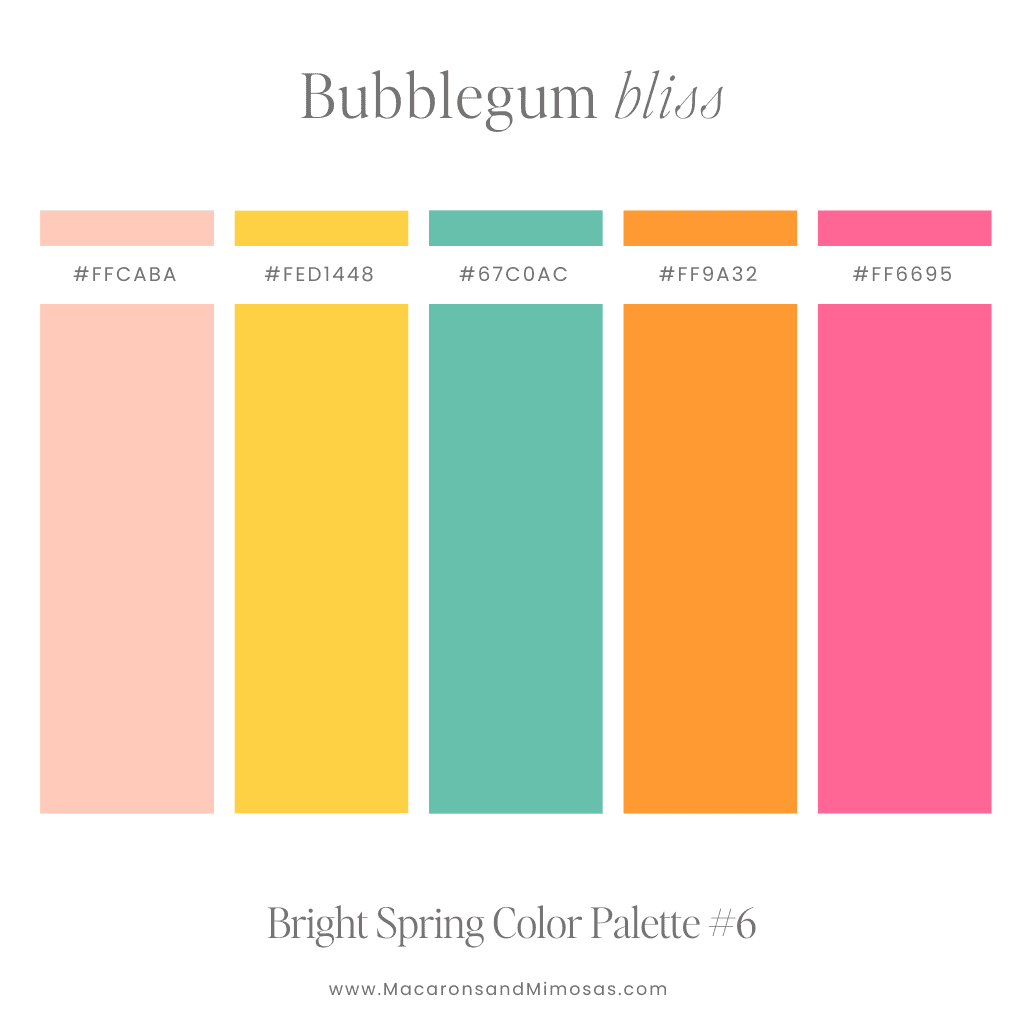
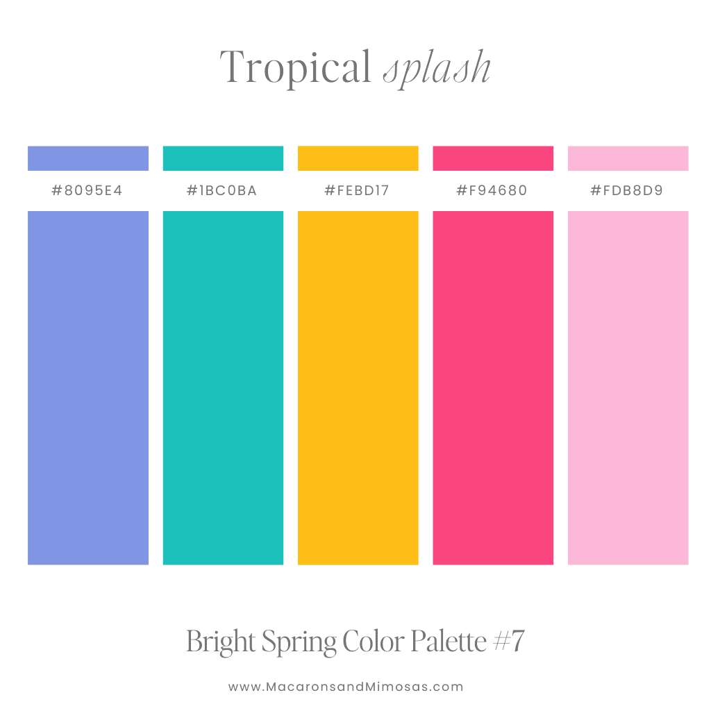
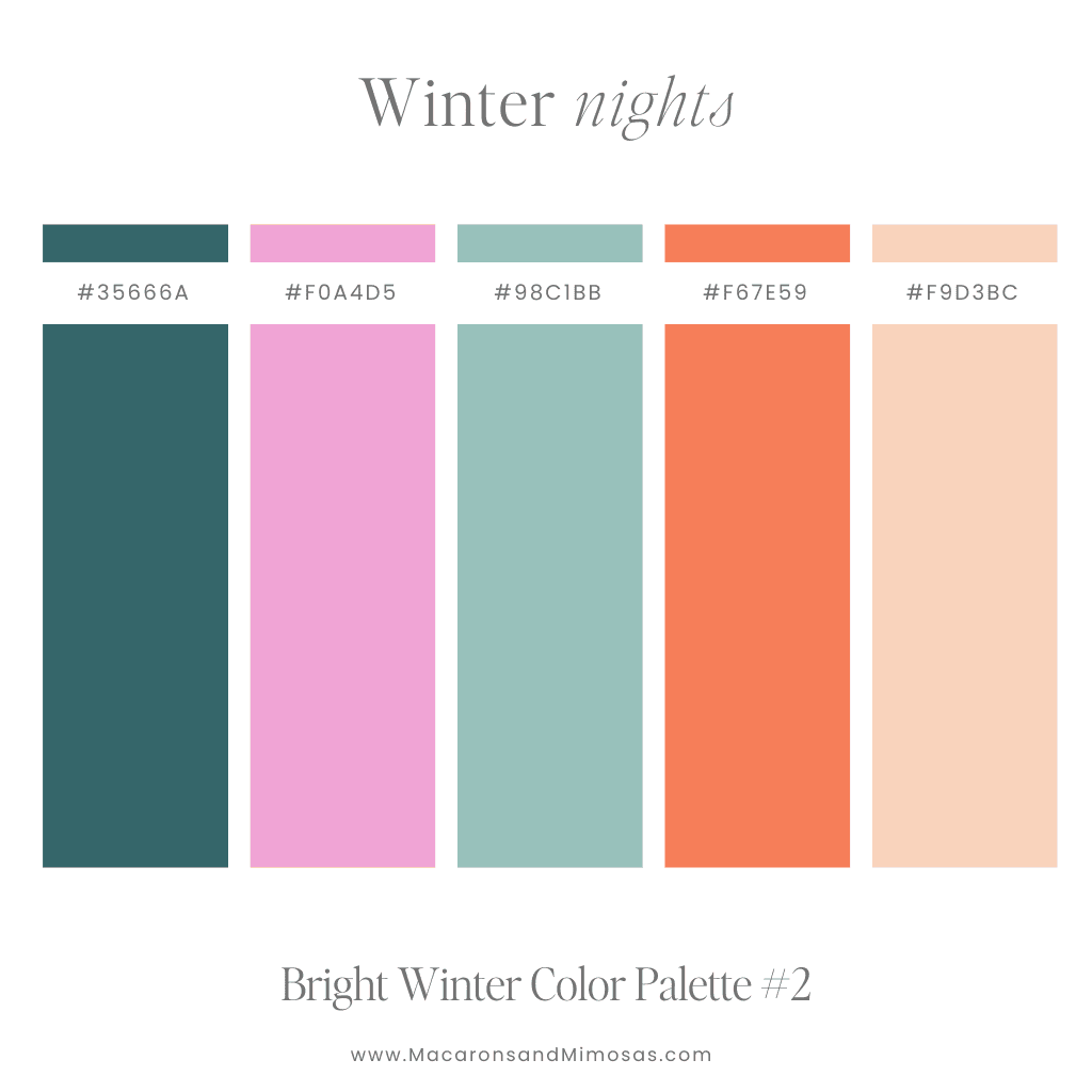
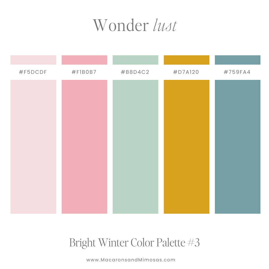
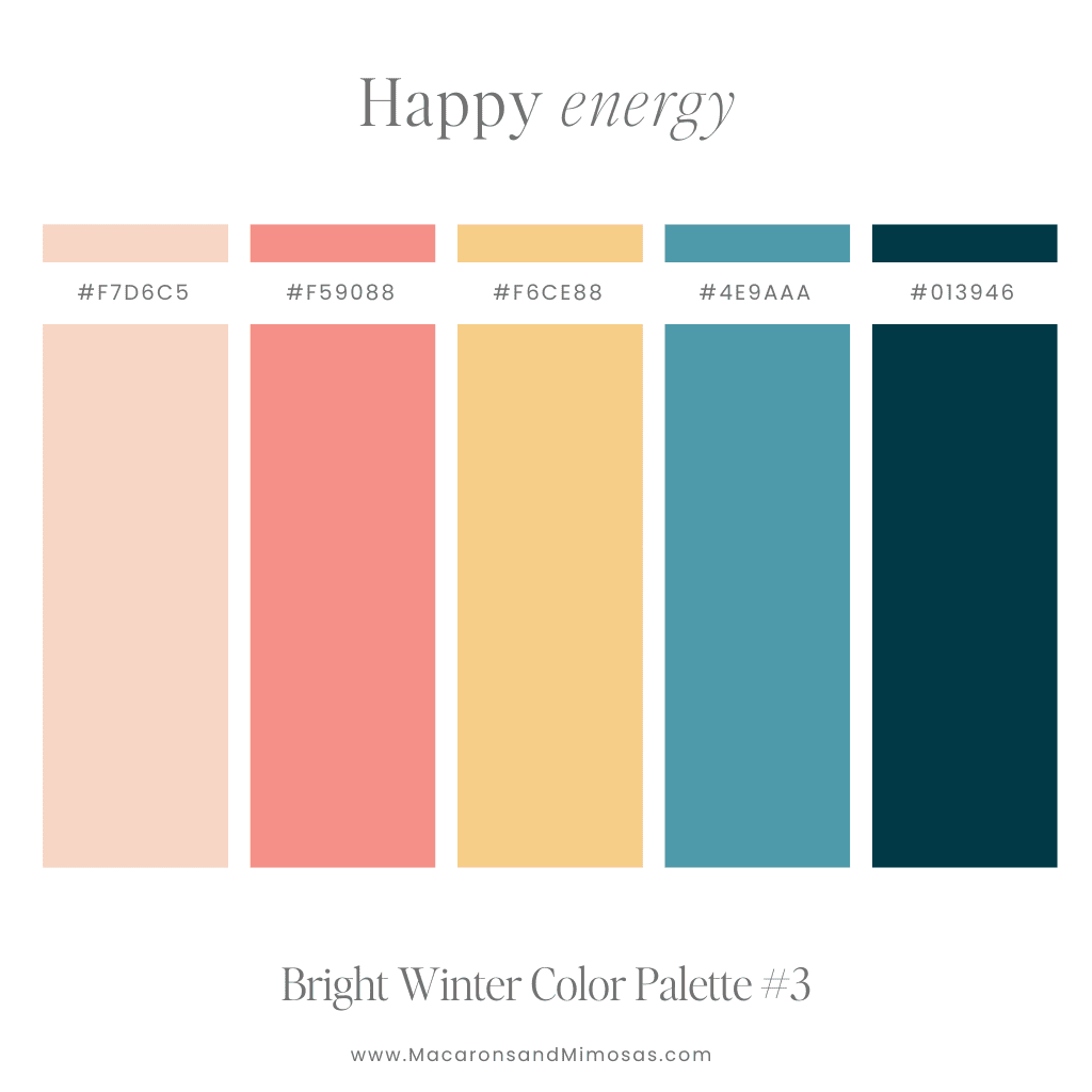
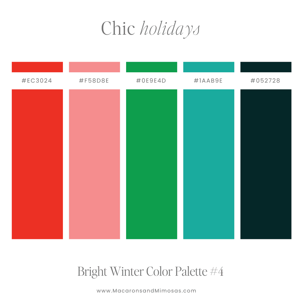
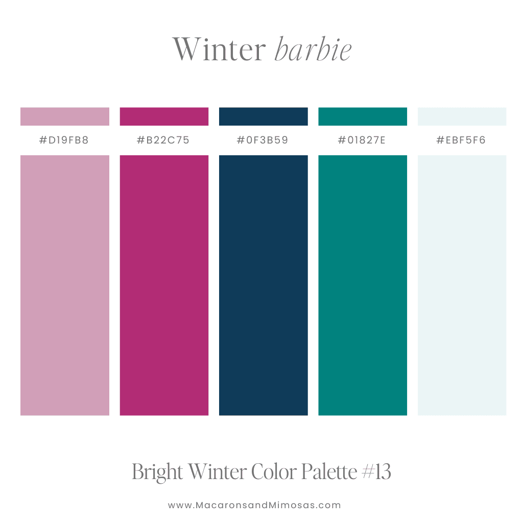
Bright Winter Color Palette: Cozy with a Pop
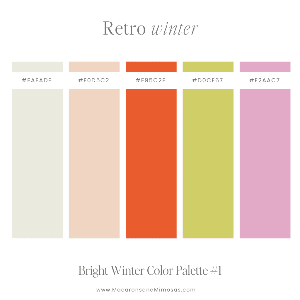
Winter doesn’t mean you have to settle for dark tones. A bright winter color palette brings warmth and energy to the cooler season, making your brand feel alive and dynamic. Pair frosty blues with rich reds, jewel tones or golden hues to create a palette that’s as refreshing as it is cozy.
Pro Tip: Winter shades are perfect for holiday promotions or brands that want to bring a little cheer to the colder months. Our Canva templates make it easy to incorporate these seasonal colors into social media posts, giving your brand a polished, cohesive look.
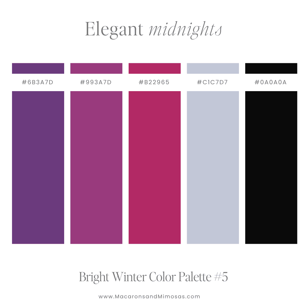
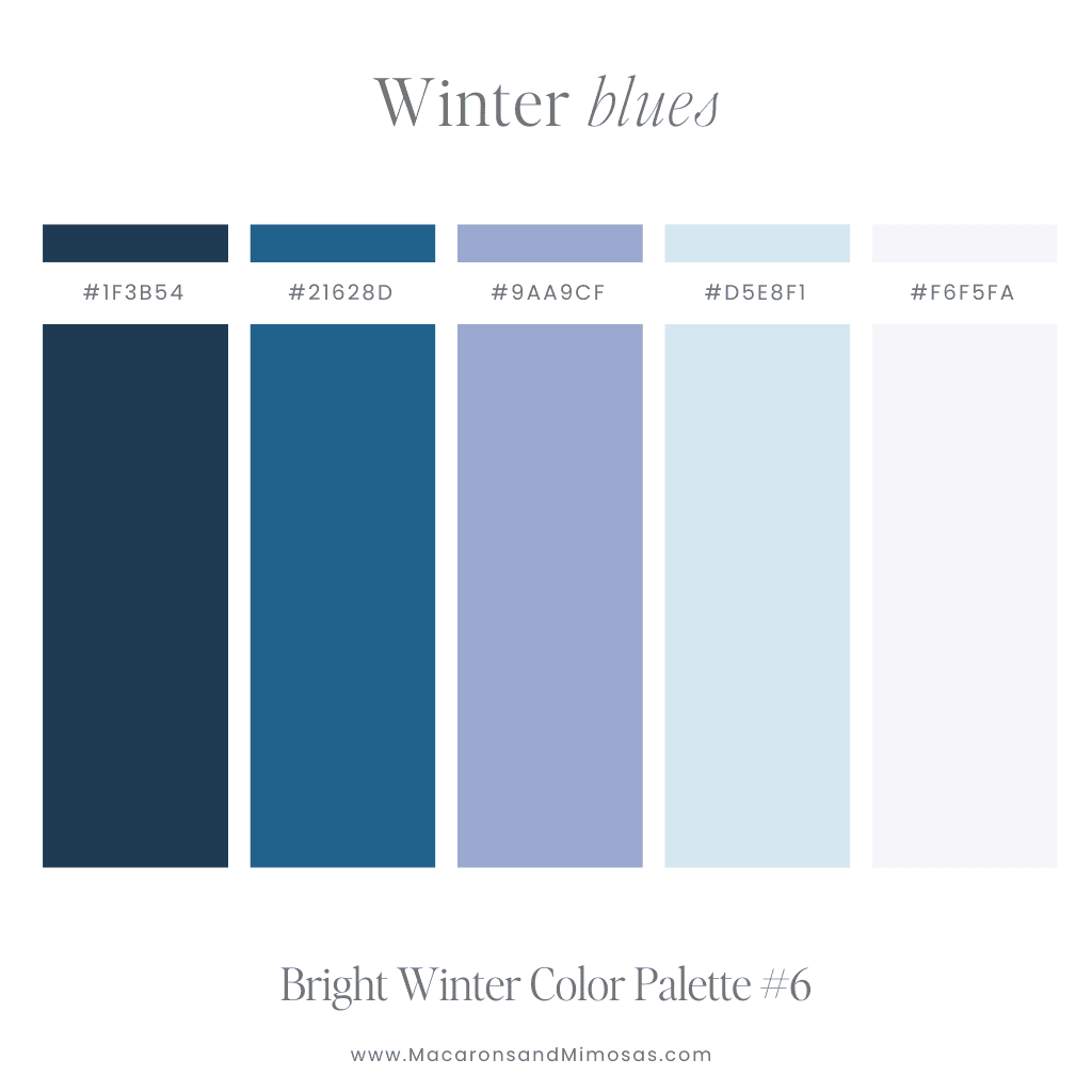
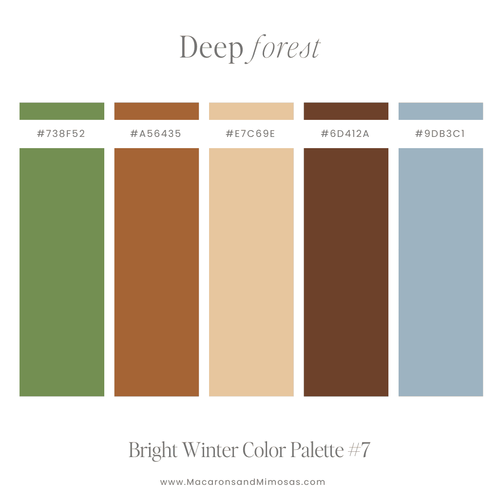
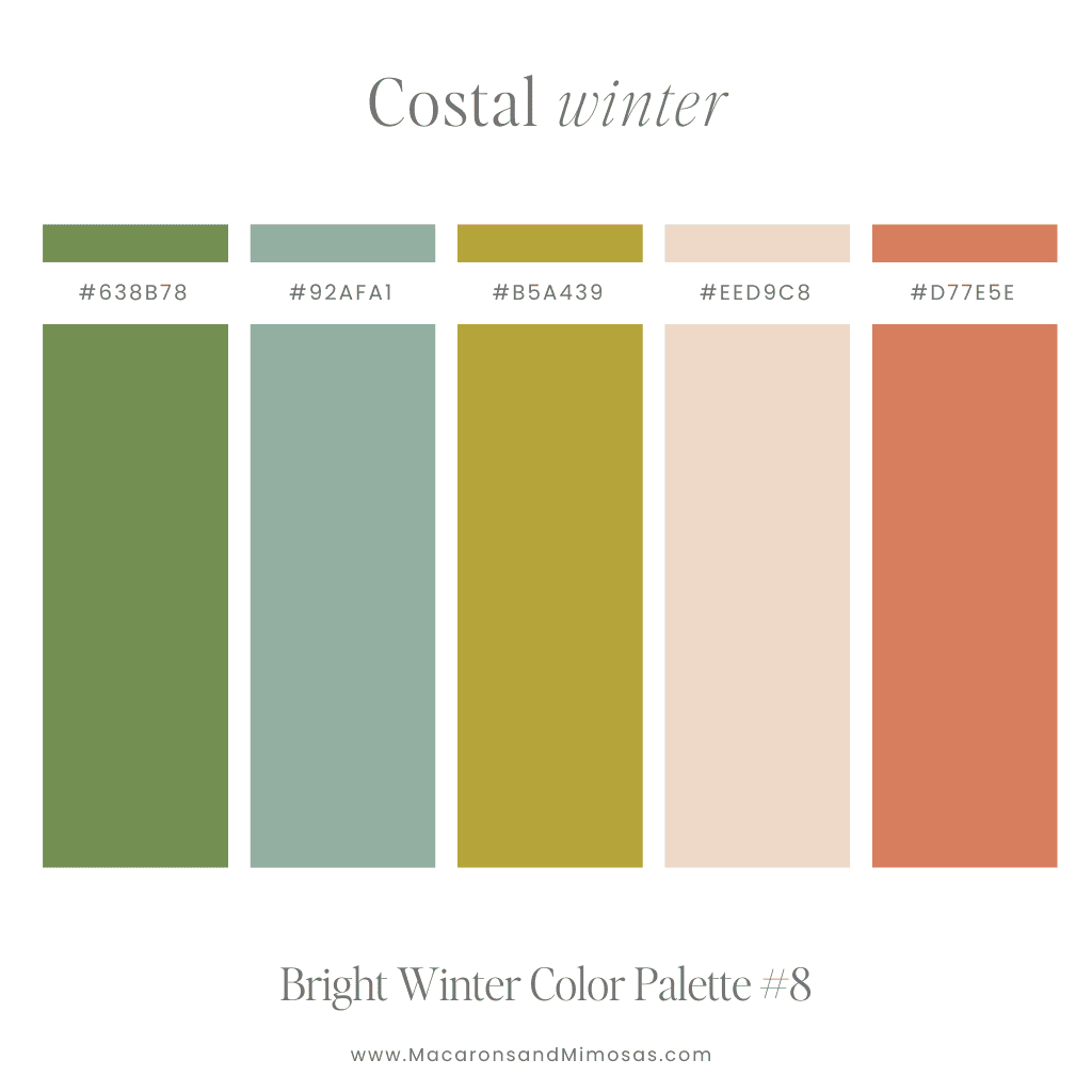
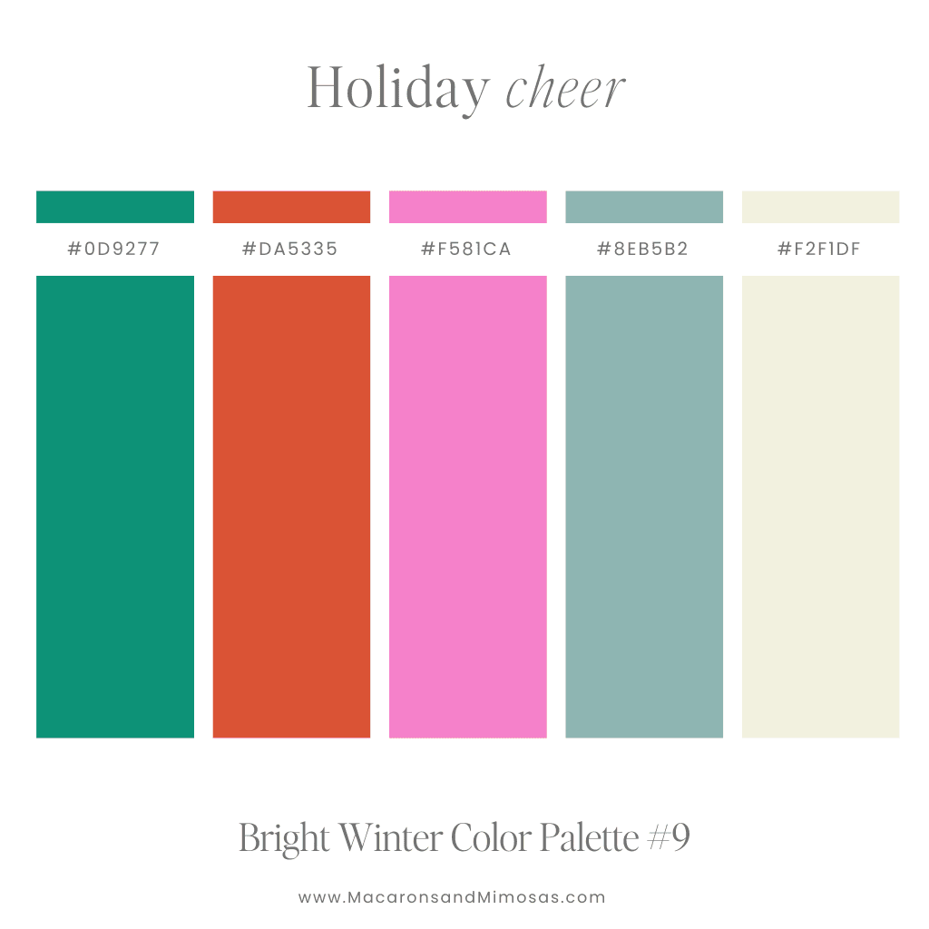
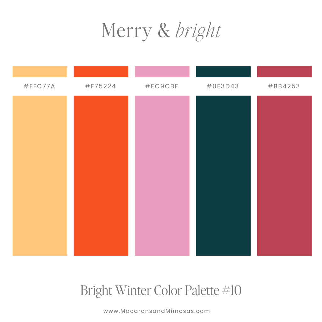
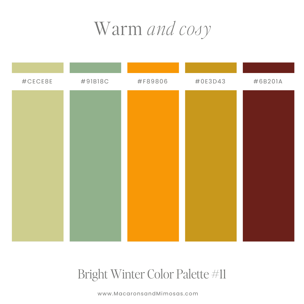
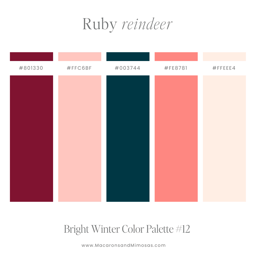
Bright colors can take your brand from ordinary to extraordinary. Whether you’re building a new website or refreshing your existing look, adding a touch of vibrant color can make all the difference. If you’re ready to create a standout website, explore our custom design services to get a site that perfectly matches your unique vision. Let’s make your brand shine—vibrant colors and all!
If you love these fun colors, you might also enjoy our blog on feminine color palettes or even our pastel color palettes— packed with ideas for soft and vibrant combinations. Perfect for brands looking for a chic yet professional look.
Updated on April 22, 2025
