
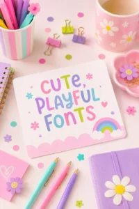
Why Your Brand Needs Alternative Logo Variants

Okay, let’s be real. When it comes to logo design, it’s easy to get caught up in just having a single logo and thinking, “That’s all I need.” But hold up—times have changed! Especially if you’re juggling social media, running a website, diving into email marketing, and throwing your logo on everything from t-shirts to tote bags. One logo just won’t cut it anymore. Your brand aesthetic absolutely needs those Brand Design Logo Variants.
IN THIS ARTICLE
What Exactly Are Alternate Logos (And Why Do You Need Them)?
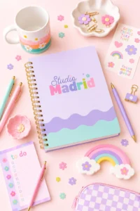
Think of an alternate logo as a sibling to your main logo—it’s related but slightly different. It’s not a total reinvention, just a variation that keeps the vibe of your primary logo but adapts it for different situations. We’re talking about keeping the same fonts, colors, and brand style, but maybe switching up the layout or structure. For example, if your primary logo is a long, horizontal design, a great alternative could be a square logo or even a circular design. This way, you’ve got the flexibility to use your logo across all sorts of spaces—whether it’s your website header, a square social media profile picture, or even a small mobile icon.
Reason #1: Versatility—Your Logo’s New Best Friend
Let’s face it, having just one version of your logo is like trying to use the same shoes for both a marathon and a fancy dinner—you’re not doing either one justice. A single logo might look amazing on your website, but what about your social media, your email marketing, or as your website’s favicon? Not every platform is going to play nice with that one size fits all design. That’s where logo variations come in. It’s like having a toolkit for your brand, and trust me, you’ll want at least one alternate logo to fit into those tight spaces, like your Instagram profile pic or even that tiny corner on your business card. I always recommend at least two logo variants to my clients—think of it as an insurance policy for your brand. Trust me, you’ll thank me later!
If you’re looking for a full branding package that includes logo variants, check out my branding packages here!
Reason #2: Small Spaces, Big Impact—Because Size Does Matter!
Now, not only do we need logo variations for those awkward space constraints (hello square profile pics), but what happens when you want to use your logo in teeny tiny spaces? Picture this: You want your logo as a favicon for your website or a super cute sticker for your product packaging, but that long tagline? Not so legible in a 32px icon. Here’s where an alternate logo swoops in to save the day. With a simplified version of your main logo, you can drop the text or streamline the design, making sure it still packs a punch without losing any brand recognition. And if you’re going for something that stands out—like a rubber stamp or wax seal? You’ll definitely need that alternate logo in your back pocket.
Reason #3: Strong Impact—Your Logo, But Make It Powerful
Alright, so you’ve got versatility, you’ve got small-space magic… but what about that wow factor? The impact? The thing that makes people stop scrolling and say, “Whoa, I need to know what this brand is all about!” Sometimes, your primary logo might be super detailed or colorful, and that’s awesome—until you need to use it in a situation where you can’t afford to lose any of that detail. That’s where logo variations really shine. You can create a simplified version of your logo in a single color, keeping it sleek and recognizable without sacrificing any of that brand personality. Imagine using your logo as a watermark, or even on a wax seal for your packaging—it’s got to stand strong, right? And that’s where your alternate logo becomes your brand’s secret weapon.
Reason #4: Stand Out in Style—Where to Use Your Brand Design Logo Variants
Alright, now that you know why you need logo variants, let’s talk about where to use them! Aside from the obvious—social media profiles, website headers, favicons—don’t sleep on these other fun options:
- Newsletters: Use a smaller, alternate logo as a neat little header for your email marketing campaigns.
- Product Packaging: Stickers, tags, or even custom stamps can showcase your brand in a way that doesn’t crowd your designs.
- Special Promotions: Want to stand out during a sale or a special launch? Use your alternate logo to create limited-edition items or promotional graphics.
- Brand Watermarks: You can even use your alternate logo as a watermark on your images, keeping your brand visible without taking over the picture.
So, does your brand currently have Brand Design Logo Variants? If not, it might be time to think about how having an alternate logo could really elevate your brand’s versatility and impact. Whether you’re using it for small spaces or just need something sleek for a social media profile, having options ensures you can get the most out of your logo—wherever it goes.
Remember, your brand is more than just a pretty face. It’s about being flexible, adaptable, and showing up in a way that’s as unique as you are. Ready to make your brand logo work for you in every situation? Let’s do it!
More Posts You Might Like…
More Posts You Might Like…
Comments are closed.
4 Comments
I’m so happy to know that alternative logo is relevant. I sort to justify my alternative logo and that led me to search the topic online. I developed a single colour outline out of the primary logo for stamp purpose, printing ease on small brand items and fabric.
Thanks for the post